Remodeled kitchen now occupies a light-filled, breezy space
With textured laminate cabinetry, a blued metal rangehood and LED-lit glass splashback, this sculptural kitchen shows off form and hides away function

Great design sometimes requires stepping back from a project and seeing a broad stroke that will change the feel and flow of a space.
Prior to its reinvention by interior designer Lauren Levant, this home's original kitchen had been a cramped, builder-grade workspace with a splintered, inefficient layout.
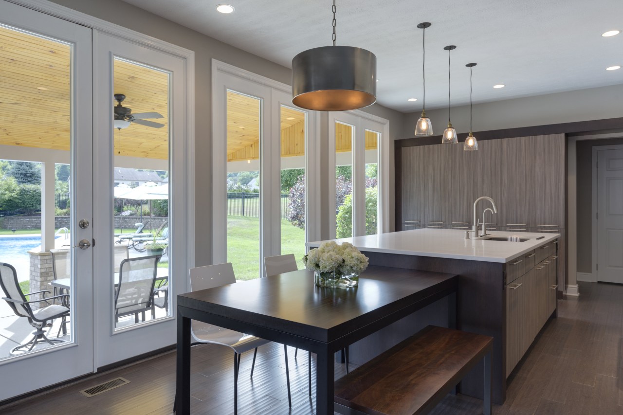
"The owner had a very clear picture of what she was looking for in its place," says Levant. "This was a space that would be light-filled and breezy sort of California-clean looking with some exciting transitional details."
At the same time, the owner wanted to be sure that, beyond upping the form and function of the space, this upgrade would also add energy and interest.
A master stroke in the design was Levant relocating the garage entry door in pursuit of achieving a much more effective layout.
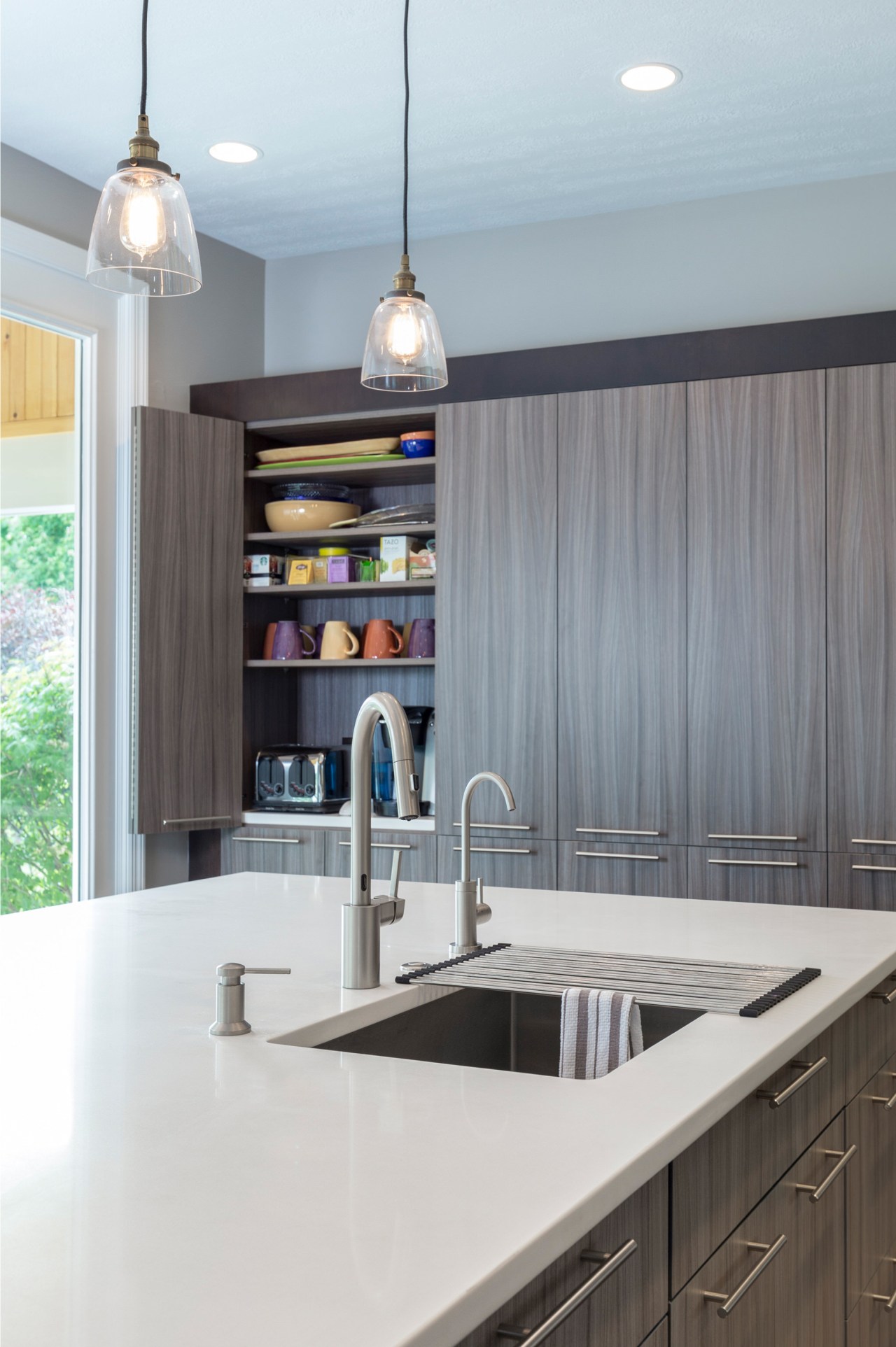
"This relatively small construction change allowed for the addition of a continuous wall of cooking equipment and storage," Levant says.
The large range is flanked by an integrated fridge on one side and a pantry on the other. The pantry's shallow depth allows space behind it to accommodate the existing and immovable ductwork and plant in a discreet fashion.
"A second wall of storage at the side of the space finishes short of the ceiling bringing a feeling of openness, and creating a transition down to the third element, which is the large centre island," says Levant.
With all the storage and dedicated work areas established, the interior and kitchen designer was able to introduce dramatic floor-to-ceiling windows on the remaining wall.
This feature element within the room moves the eye outside and makes the kitchen volume seem twice as large as it actually is.
"A mix of tactile, interesting finishes in this design helps soften the lines of the space. A rolled steel hood, made by a local metal artist, has a natural mill-scaled patina with eye-catching hues of blue and grey."
Textured laminate finishes on the cabinetry are contrasted by the sleek touches of steel and the gleaming glass splashback, which is edge-lit by imbedded LED lights.
"Boasting clean lines, sophisticated modern finishes, and surprise detailing, this kitchen has achieved everything the owner sought after for this central hub within her home," says Levant.
Credit list
Kitchen and interior designer
Builder
Benchtops
Splashback
Faucets
Ventilation
Refrigeration
Windows
Story by: Charles Moxham
Photography by: Dave Bryce Photography
Home kitchen bathroom commercial design
Thrice as nice
Marvellous in marble
The beauty of understatement
Home Trends Vol. 33/2
The design of your home is the result of your style preference, your requirements – and the influences of your site. The...
Read More