Relaxed welcome
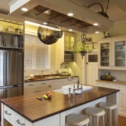
This fresh country kitchen by Debra Lorenzo optimises storage and display
When a kitchen is central to several adjacent rooms, creating easy connections between them is likely to be an integral part of the remodel agenda.
Before this renovation by designer Debra DeLorenzo, the existing kitchen had a dated 1980s rustic aesthetic. Due to a pantry wall beside the entrance to the conservatory and a large oven near the back door, movement around the space was slow and awkward.
The size of the island also needed to be addressed, as floor and counter space had been overly restricted, says DeLorenzo.
"For the new design, the homeowners wanted a fresh take on the country kitchen look as well as improved access.
"To set about resolving these issues, we first removed the jutting wall the ceiling beam shows where it was situated and then introduced a new Falcon range. This traditionally styled appliance is set further back than the original pantry, increasing available pedestrian space. We chose the colour red, as this fitted with the concept of a light, breezy space.
"The laundry, formerly alongside the old pantry, was moved downstairs, which freed up space for a large walk-in pantry," says DeLorenzo.
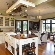
In addition, the new island is in a slightly more forward position and on a grander scale contributing to a more natural pedestrian flow and extending the available work surfaces.
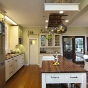
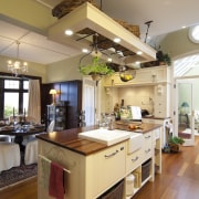
DeLorenzo retained an existing dresser featuring tongue-and-groove panels as a display and storage unit. The designer then echoed the same cabinetry finishes on the oven surround opposite, but with different handles. The new island is also in tongue-and-groove but without the bead borders of the wall cabinets for a more pared-back effect.
Alongside the panelling, a hanging pot rack, a substantial farmhouse sink and suspended baskets all contribute to the country-kitchen flavour.
"I kept the rimu benchtop on the dresser, but decided to use a darker kwila wood for the new benchtops," says DeLorenzo. "Too many rimu surfaces would have looked overdone. This way, the dark wood makes a dramatic contrast with the light-toned floors."
With the conservatory, walk-in pantry, backdoor and entry to the formal living room through lead-glass French doors all opening to the kitchen, the rearranged space is also on show from several angles.
"With most of the storage relegated to the walk-in pantry, I expanded the display options creating several open shelves and glass-fronted cabinets to help show off the owners' prized collectibles," says DeLorenzo.
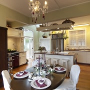
Open to the living and dining spaces, the kitchen area has been given a furniture-like appeal. Recessed toekicks on the wall cabinets and legs on the island add to this effect.
Story by: Trendsideas
Home kitchen bathroom commercial design
Silver moons rising
Vibrant spiral stairs improve penthouse connections
Sculptural centrepiece

