Reflecting on the city below
This grand, Hollywood Hills home pays homage to Mid-century Modern style while taking its design line cues from the Los Angeles city grid far below
Designed by SAOTA
From the architects:
This home, a private residence in Los Angeles, is situated above Laurel Canyon Boulevard on a cul-de-sac in the Hollywood Hills.
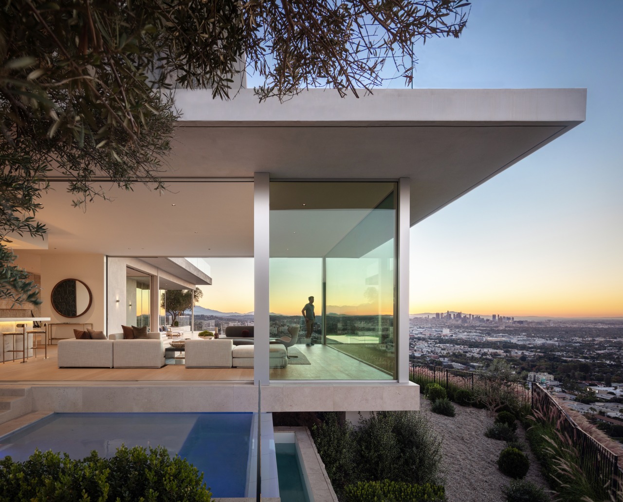
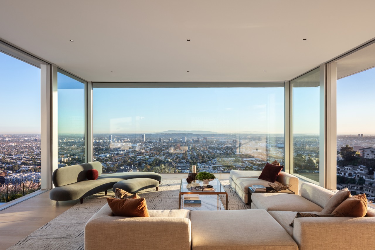
With its elevated position at the edge of a steep promontory, the site offers unobstructed panoramic views from downtown Los Angeles to Santa Monica.
Its north-south orientation aligns with the grid of the city basin below, and the tone for its architectural context is set by Mid-century landmarks such as Pierre Koenig’s landmark Stahl House, which can be glimpsed on a nearby promontory to the west.
Cape Town-based architects SAOTA engaged with the Modernist precedent set by the Stahl House and other ground-breaking Los Angeles Case Study Houses in the design of this home, reprising and advancing some of their pioneering innovations that forged the distinctive indoor-outdoor lifestyle that became synonymous with the city itself, and a distinctive, climatically appropriate regional Modernism.
By raising a platform on pillars and caissons, the architects lifted the house towards the view and established a series of intersecting and overlapping horizontal planes that project outwards from the cliff edge.
The horizontal emphasis of the terraces and over-sailing eaves reflect the city’s wide horizons, with a sense of volume and compression that responds to its distinctive character.
In a sense, the back of the house can be understood as a giant viewing platform.
The home's main lounge is positioned in a cantilevered glass box at the front of the house that projects outwards to embrace the view.
A rim-flow pool along the edge of the deck appears to extend beneath it, reinforcing the sense that the house is ‘floating’ while fusing the foreground with the distant views of the Pacific Ocean.
The straight-lined city grid below is picked up as an ‘ordering principle’ for the structure and programme of the house.
Its geometry is at once ‘in alignment’ with the urban activity below yet floating above the bustle.
This spatial order also forms the basis of the interlinking arrangement of spaces throughout the house.
Interior and exterior spaces are similarly fused.
Elements of the landscaping, such as the sculptural olive trees, create focal points, anchoring the experience with indoor and outdoor 'destinations'.
These range from al-fresco dining areas and poolside lounging areas to the dining and lounge.
Interior and exterior volumes are modulated to create more intimate spaces to counterbalance the vast scale of the views.
The bedrooms are on the upper level, creating similarly elevated experiences floating above the city.
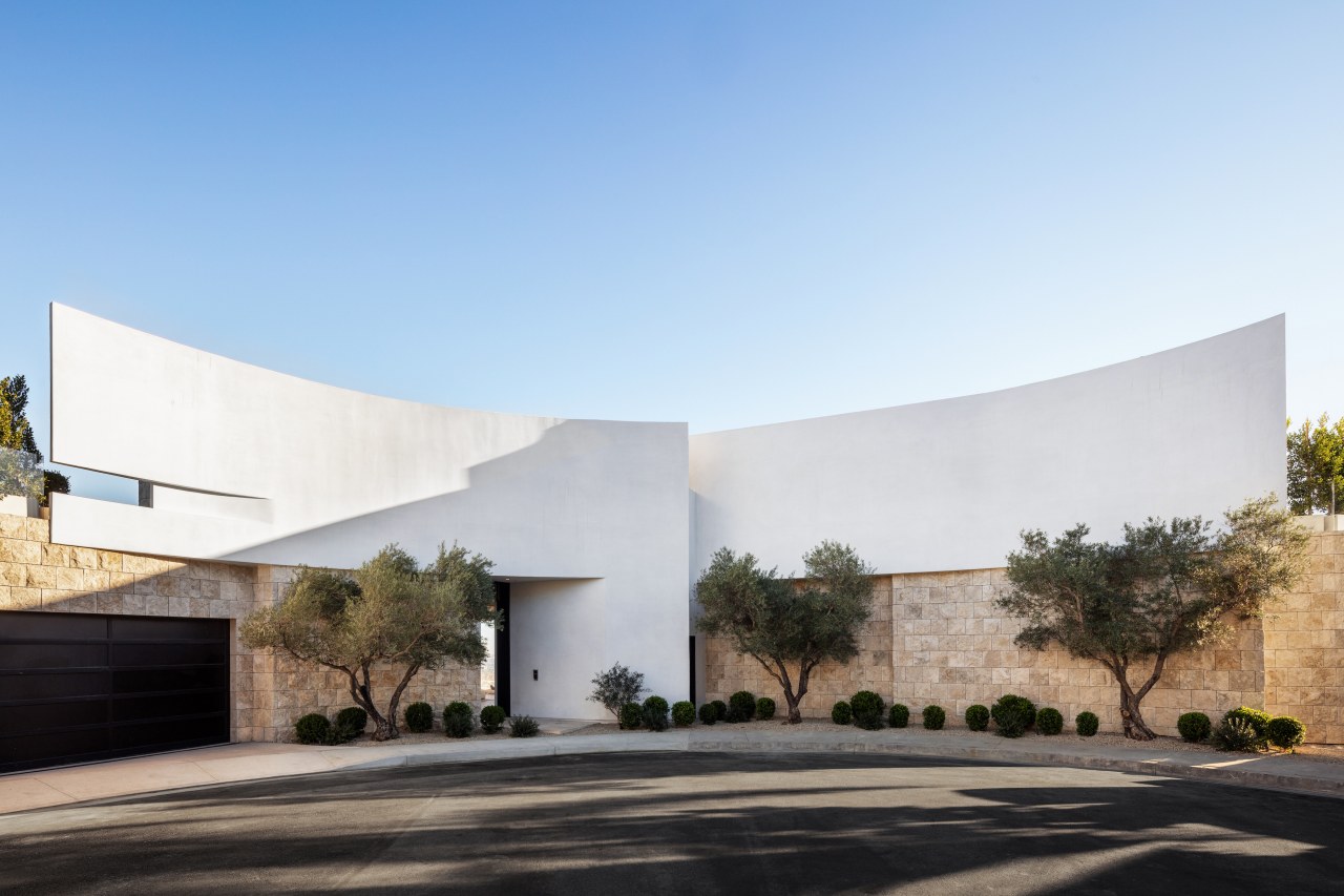
The entrance at the end of a cul-de-sac, by contrast, has been designed with high, arcing walls that create a sense of enclosure and ‘held space’ while standing as a powerful sculptural marker at the end of the street.
Slices between the intersecting curves function as openings for the entrance, allowing light to filter through to the stairwell while maintaining privacy.
The walls are deliberately unadorned to act as screens for the theatrical shadow patterns cast by the light through the trees in front of them.
These curvaceous lines and the sense of embrace they create at the entrance give way to the rectilinear layout of the main living spaces as you progress into and through the house and towards the view in a sequence from a grounded, enclosed experience to airy and elevated.
The restrained material finishes throughout the house in general honour the architectural fabric of Mid-century Los Angeles.
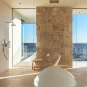
Stucco, travertine and timber floors establish a neutral, honest and unadorned palette that is richly textured, warm and sensual.
The abundant use of chiselled Jerusalem limestone is a more specific nod to the nearby J. Paul Getty Museum, complementing the Mediterranean-inspired landscaping, which like the architecture, is well suited to the local climate and associated lifestyle.
As a contemporary evolution of some of the traditions associated with California mid-century modernism, the house simultaneously pays homage to its architectural precedents while looking forward and advancing the possibilities of the pioneering examples of the approach.
Credit list
Contractor
Civil/structural engineer
Landscaping
Architect of record
Interior designer
Electrical engineer
Lighting design
Home kitchen bathroom commercial design
Small space, big impact
Continuity meets subtle separation
'Worthy of Architectural Digest'
