Rambling rose
This home's unusual layout results from a renovation that linked two adjacent apartments

The press and bustle of hopeful teacher trainees might be the sounds of history that echo through a training college re-invented as modern-day apartments. When two of these apartments are in turn transformed into one larger residence, the history of change continues.
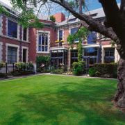
This teachers' training college gained a new lease of life under just these circumstances. Architects Stewart Ross Team Architecture sensitively renovated the interior of the heritage-protected college to form the new Peterborough Apartments.
"The training college was originally built with large classrooms set over two levels," says architect Stewart Ross. "In the renovation, each classroom was bisected with structural concrete walls one classroom providing enough space for two apartments."
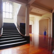
The grand staircase was retained, floors were lowered on the ground floor, and ceilings raised on the upper floor. These adjustments stretched an already tall stud to accommodate additional mezzanine levels for the new apartments on both floors of the building.
In addition, space in the original college attic allowed for the top-floor apartments to become three levels.
Another upstairs apartment was created out of the attic space situated directly above the original staircase. At a later time, this was bought and then joined with another upper-level apartment procured alongside it. A character-filled home, replete with nooks and crannies, is the result shown here.

Michael Mertz, interior designer for Stewart Ross Team Architecture, explains some of the further changes made to the two apartments to create one home and the themes that link the spaces together.
"In the apartment over the building's stairwell void, we reworked a large set of stairs into a more demure access to a music room," says Mertz. "Other structural changes in this apartment included introducing a screening element in front of a private elevator entrance that had opened directly to the living room. In addition, the original kitchen was reworked for use as a cocktail bar area."
While this half of the new, expansive apartment is largely on one level, the other half, separated by a fire-safe door, runs down over three levels.
"The original apartments had been distinct fire cells, so the fire door was a prerequisite to the merger," say Mertz. "We also lightened the feel of the staircase that drops down through the levels. Finally, two mid-level bedrooms on this side were merged to create a large home gymnasium and bathroom, complete with a steam room, plunge pool and showers."
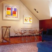
The apartments had attic beams and angled ceilings in common already, so the aesthetic merger of the two apartments was less complicated.
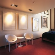
"Having decided to retain the decor of the already-painted single-level apartment, we followed this colour palette through when marrying the two spaces. Colours are neutral as the client wanted the materials' natural hues to act as a backdrop for the art collection," the interior designer says.

The main kitchen, for example, has a matched sapele veneer cabinetry, and this finish is also found in the master bedroom.
Another linking motif was the custom stainless steel detailing with the specified picture rails and light fixtures.
As the owner is a music buff in possession of more than one sound system, the acoustic-backed carpets on the lower level were a neighbour-friendly inclusion.
"The owner had always had a dream of a rambling apartment set in an old, historic building and that vision is well realised here," says Mertz.
Credit list
Interior designer
Kitchen manufacturer
Carpet
Lighting
Picture hanging system
Home theatre
Speakers
Timber veneers
Pulls and handles
Story by: Trendsideas
Home kitchen bathroom commercial design
With deep affection
Curvaceous and connected
Radical yet respectful
