Past, present and future
The fit-out of this heritage-listed building celebrates its origins, facilitates its current public use and allows for future change
Renovating a protected building requires a balance of priorities its valued origins need to shine through the makeover, while at the same time, it needs to achieve modern functionality. Sometimes a bold central design stroke can contribute to both.
When this heritage-protected warehouse was reinvented, just such a central design stroke was employed. Woodhead International, led by project architect Jason Pruszinski addressed the base structure. They worked closely with Woods Bagot led by David Spencer, who handled the fit-out for the new tenant, The State Records Department.
Woodhead International's decisive stroke was to introduce a stair and liftwell down through the centre of the four-level space.
The brief had been to create a flexible, long-term space for modern office use within the heritage shell, says Pruszinski. "Attendant to this was promoting an easy connection between various areas of the building. We decided to introduce an open void housing lift and stairs through the heart of the structure as a modern insertion that wouldn't be confused with original heritage elements."
While the insertion needed a distinctive, contemporary appearance, Pruszinski took his inspiration from the building's original industrial use. Rugged-look stainless steel and glass were chosen for the insertion, with the stairwell standing independent of the adjacent wall to accentuate the difference between old and new.
"We wanted this central introduced feature to contribute to the on-going heritage value of the building," Pruszinski says.
Other important modifications to the base structure were the introduction of a false floor to house cabling and other services and the location of all toilet facilities in pod-like structural insertions at the rear of the building. All three elements, the central stairwell, false floor and marginalised toilets allow for flexibility of layouts should the tenancy change hands in the future.
The refurbishment also had to deal with the bulky air conditioning ducting which could not be tucked away under the false floor. Like the stairwell and lift, these services stand out in modern contrast to the original raw interior.
The structure's exterior was left largely untouched. A previous renovation had seen large shop front-style windows punched into the original facade. Woodhead International replaced these windows with frameless glazing and introduced large stainless steel awnings over the windows in keeping with the rhythm of adjacent frontages.
Woods Bagot collaborated with Woodhead on most aspects of the interior's look and finishes, says Woods Bagot's project leader.
"We were in constant liaison with Woodhead regarding the look and feel of the fit-out. Even stripping the brick and stone wall back to its origins and the choices of stairwell meshing were jointly considered," says Spencer.
Achieving the right balance between a welcoming public venue and the need for reasonable privacy for researchers was central to the project.
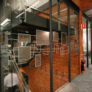
Woods Bagot created layered tiers of graphic displays that allow glimpses into the space to encourage patronage, while at the same time avoiding a fish bowl effect for those searching the state records.
"Drawing people into the building was important and the prominent graphic elements further advertise the tenant's presence and evoke the nature of its work," says Spencer. "To this end, the three strategically placed translucent glass panels incorporate fragments of historic records, images and research documents."

These graphic elements are used in a layered, fragmented way to evoke the process of looking through historic data. The three 2m x 10m panels are situated on the lower and ground floors. As well as advertising the State Records presence, the glass walls signify the change of usage from public spaces to staff-only areas.
"Another element used to heighten the tenant's presence is a target and cross-hair motif appearing alongside the entrance ramp to the building," says Spencer. "Again, this image represents the process of moving through material, homing in on what is central to a visitor's needs whether it's from document research or zooming in on an internet site."
On a physical level, Woods Bagot's fit-out kept step with Woodhead's treatment and detailing of central elements.
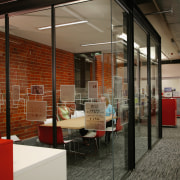
"Glass-walled meeting rooms and offices allow the eye to travel through them and appreciate the warehouse proper," says Spencer. "Detailing by Woodhead on the stairwell was echoed by us on the meeting room's glazing frames the entire interior achieves a strong harmonising feel."
Even the furniture, designed by Woods Bagot, underscores the State Records Department's sense of purpose. The solid, wood pieces are intended to create a library-like, bookish atmosphere.
Story by: Trendsideas
Home kitchen bathroom commercial design
Tranquil waters
Small space, big impact
Continuity meets subtle separation


