Pared back and pivotal
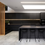
This minimalist kitchen stands at the heart of the home with material choices and layout helping co-ordinate the wider expansion and renovation
Designed by Studio Pacific Architecture
From the architect:
The context
The existing pre 1900’s two storey villa is situated at the southern end of Wellington’s character suburb of Mount Victoria.
The brief was to renovate the existing house and to add a contemporary addition that maximises the connection to the under-utilised outdoor space at the rear of the site for the family of seven.
Challenges included reconfiguring the existing house, taking advantage of the narrow and sloping site; and to balance the desire for a contemporary space with the heritage fabric of the original structure.
The result is a series of dynamic spaces that transitions between old and new as it traverses the long, cascading site.
Entry is through the original front before arriving at a new study at the top of a contemporary living pavilion.
The materiality is an interplay of the black stained raw timber that is an expression of the new and the white painted rusticated weather boards of the old.
The black stained timber that screens the exterior is carried through into the new pavilion where it seamlessly fuses the architectural elements together.
New interventions with the original house are clad in black and contrast the white of the existing villa while interior finishes are well-considered and drawn from a limited colour palette.
The kitchen
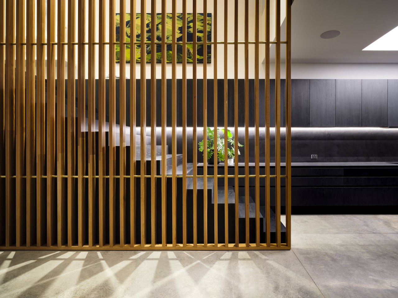
The kitchen’s layout flows from the internal stair as a hub between formal dining, living and adjacent alfresco dining area.
Careful planning ensured that the crafted stairs and kitchen datums form a seamless marriage of geometry and materials, with special attention paid to the finishing of the timber stair and cabinetry fronts.
The final finish was site-applied to both stair and kitchen cabinetry to ensure a perfect match of colour depth and clarity – giving them a bespoke and hand finished feel.
Black glass and fully integrated Miele appliances were selected to blend in with the hand finished black cabinetry.
This created a monolithic and minimalist look that is punctuated by a 5m high oak floor-to-ceiling screen and the family sized Sub-zero fridge.
The outcome is a large functional, family kitchen with a bespoke and modern minimalist look that feels in tune with the overall house aesthetic.
Credit list
Architect
Contractor
Cabinetry
Benchtops and splashback
Taps
Lighting
Cooktop
Refrigeration
Awards
Project team
Stair and cabinetry timber site finishing
Kitchen sink
Floors
Oven
Ventilation
Dishwasher
Designed by: Stephen McDougall, Studio Pacific Architecture
Story by: Trendsideas
Photography by: Jason Mann
Home kitchen bathroom commercial design


