Out of the past classic Milvia Hannah kitchen
This Milvia Hannah kitchen melds with its surroundings

A traditional kitchen design has to tread a fine line, offering the clean lines and surfaces of a brand new workspace, while at the same time giving the impression that it belongs with its much older surroundings.
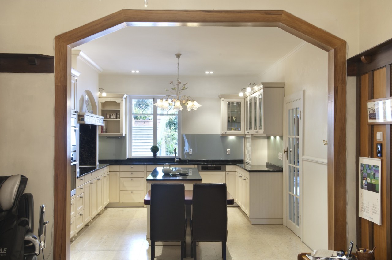
The sometimes tricky balance was achieved in this new kitchen in a 1930s residence. Kitchen designer Milvia Hannah says the setting played a part in the colour scheme.
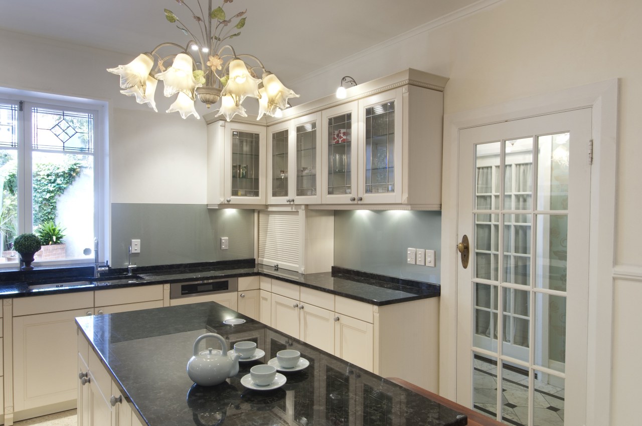
"Positioned near the centre of the house, the kitchen only has one window. To lighten the space, we chose light-toned cabinetry and pale cork floors. Additional light is reflected from the backpainted metallic-look glass splashback.
"Blending in with the existing home was also important. We didn't want an obviously brand new kitchen it had to belong. The cabinetry is finely detailed to work with the interior finishes. Leadlight glass in the cabinets was designed to match the stained glass on the windows, and matching cornices on the ceiling and cabinets were added to draw them together."
The cabinet doors have been given an antique finish, meaning they have a worn look round the edges, as if from years of use. Pilasters on the under-bench and upper wall cabinetry add another layer of detailing to the design.
The cooking alcove forms an eye-catching feature. This has granite on three sides, to match the benchtops and splashback, and a stainless steel ceiling for easy cleaning.

The stone-topped island steps down to a wood tabletop, a softer surface for the owners' young children to have breakfast on.
"This warm, natural surface connects with a wood archway that surrounds the opening to the living area," says Hannah. "In addition, the step down provides a gentle transition from the kitchen area to the living spaces."
Story by: Trendsideas
Home kitchen bathroom commercial design


