Modern language
Both the materials and the design of the new Landscape Architecture building at Lincoln University reference the historic 19th-century buildings on campus, which wrap around picturesque, landscaped courtyards
New buildings for a 130-year-old university need to have a foothold in two centuries while meeting 21st-century design requirements, they also need to respect the existing architectural heritage on campus.
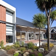
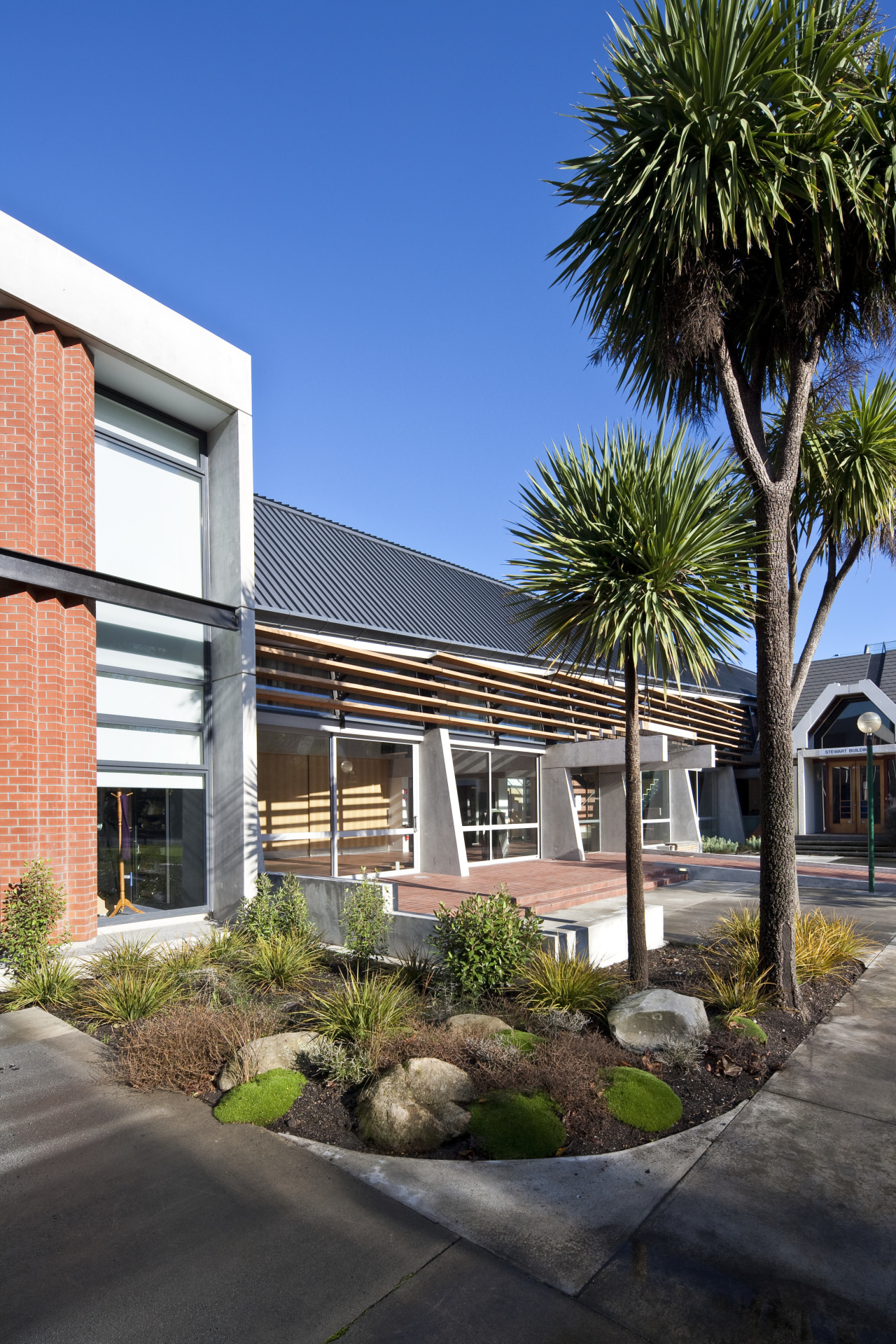
In designing the new Landscape Architecture building at Lincoln University in Canterbury, architect Jasper van der Lingen, director of Sheppard and Rout Architects, took his cue from the university's historic red brick and concrete buildings.
"These much-loved 19th-century buildings, including the renowned Ivey Hall, feature economical, unadorned materials," he says. "The Landscape Architecture building reinterprets these materials to provide a learning environment tailored to the needs of students today."
Opening up the building to provide a transparent interior with a close connection to the outdoors was a critical element and a key point of difference.
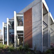
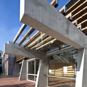
"The older architecture on campus presents enclosed, small-windowed structures," says the architect. "For this building, the design team employed a much more open design and a distinctive tectonic strategy that is particularly appropriate in an earthquake-prone country such as New Zealand. An exposed concrete frame allows the brick to be freed from its traditional structural role, and become more of a textile-like infill fabric."
Van der Lingen says the brickwork is hung, like curtains, from the concrete frames, and pulled apart and pleated at openings to reveal what is normally locked away inside.
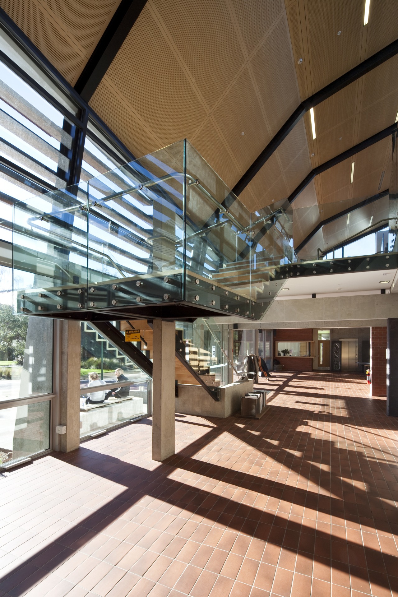
"This folding and pleating is then extended through the building. For example, it can be seen in the floating, canopy-like timber ceilings. The design also works to direct the eye and define key circulation areas. It allows for unexpected views and subtly directs pedestrian flow, widening and narrowing spaces where appropriate. In doing this, it provides variety and a spatial richness fitting for a design school environment."
Van der Lingen says the building was designed to encourage social interaction and the interchange of ideas, in both a formal and informal way. Circulation paths, stairs and landings are generous spaces, open to the studios and the rest of the campus.
"The building was designed on the premise that learning takes place not only in the classrooms and lecture halls, but also through informal discussions and chance encounters in corridors, lobbies and courtyards."
An internal street is the key space for interaction. It forms the crossroads of the building's internal circulation, and the circulation patterns of the campus as a whole it is on the route between the main car park, student accommodation and major university buildings.
"This is a place where separate faculties can come together, and the traditional boundaries of strictly defined academic disciplines can dissolve," says van der Lingen. "It also connects the interior to the outdoors, essentially creating an external space within the building."
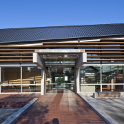
The palette of exterior materials, which includes brick, recycled slate, concrete and courtyard tiles, reinforces the sense of the internal street being an external space. It also ensures the street appears to merge seamlessly with the outdoors.
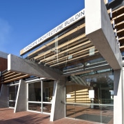
"Large sliding doors, and an enveloping, floating canopy provide additional visual continuity," says the architect. "The canopy is a three dimensionally folded screen designed to mitigate and passively control the environment. Automated low- and high-level windows regulate temperature and ventilation through the seasons, which are very distinct in Canterbury."
The canopy screen features transparent glass at ground level, screened glass in the middle band and is fully opaque at higher levels, where it folds diagonally up and over the internal street. Van der Lingen says it also keeps out the heat of the sun in summer, while letting the sun warm the interior in winter.
"Through these means, air conditioning has been omitted in all the main spaces. And, after almost a full year of operation, the open studio, housing 120 students, has proved to be a very pleasant light and airy work environment, with an even temperature."
The internal street is open to all the major spaces, including design studios, a seminar room, main stairwell, lift, and the staff area. Van der Lingen says that in terms of its size, the space is generous enough to be used as a venue for both impromptu and organised events and gatherings.
Sliding panels between the street and the main presentation room provide additional flexibility.
"There are also pivoting panels in the studio that can be used to form a variety of different sized spaces," says the architect. "The adaptability afforded by the pivoting, sliding and moving elements allows the building to be multifunctional and respond to a world undergoing rapid change."
Story by: Trendsideas
Home kitchen bathroom commercial design
'Hygge' in the highlands
Playing with blocks
Holidaying at home
