Modern addition to traditional California bungalow
Contemporary extension to traditional Californian bungalow in major renovation project provides large open-plan family living area, lap pool

The truth will out. That could well be the new mantra for a renovation.
It's all about architectural honesty. The new is seldom disguised as old, and the old is appreciated for its traditional character. In fact, so strong is this belief that even local government regulations are stipulating clear divisions between traditional structures and contemporary additions in areas where there is a heritage overlay or protection.
Designer Angie Florence of Space For Life says an addition planned for her own family's 1928 California bungalow needed to be a stark contrast to the original house.
"Not only did it need to read as a modern addition, it also had to be hidden from the street," she says. "We were able to have just a very small part of the top of the structure visible above the roof of the house, but it's a subtle element that is not too noticeable."
Florence says the house retains its traditional street appeal even the original tiles remain on the roof. The existing leadlight windows, including those in the front door and sidelight were restored, and the high ceilings were retained right through the house.
"We enlarged the existing living room slightly by taking space from the room behind, and this has become the formal living room," the designer says. "The dark-stained European oak flooring continues up one wall."
White shelving and white walls contrast the dark wood and a coffee-toned feature wall. And with brown and white leather furniture, the room introduces the bold, monochromatic palette that features throughout the house.
The master suite, opposite the living room, has also been enlarged. A bedroom and bathroom behind were absorbed to gain space for an ensuite bathroom and dressing room.
But the key feature that unites the front of the house with the extension at the rear is the extra-wide hallway.
"This is one of the most important features of the house," says Florence. "I wanted to be able to open the front door and see right down the length of the house and out to the lawn at the back.
"I don't like houses to feel enclosed, and fortunately the passage was already high and wide, so it was easy to make the whole house light and airy. We were also able to keep the entire circulation area on the same level, so it flows well."
Although scarcely able to be seen from the street, the addition features two storeys, with family living areas on the ground floor and four bedrooms and a children's rumpus room on the first floor.
"We even managed to have 3.3m-high ceilings on the lower level, which match the bungalow ceilings," Florence says. "On the upper level, they are a respectable 2.7m."
The ceiling height reflects the designer's desire for a light-filled interior the addition resembles a glass pavilion that opens right up to the outdoors at the rear and overlooks a lap pool at the side.
"A home needs to have breathing space," Florence says. "And a green outlook is a crucial part of this."
With this in mind, the designer introduced vertical gardens to the wall beside the pool and another wall outside the master bathroom.
"There is a leafy outlook from every room in the house," she says. "The family room benefits from the reflected light of the pool as well, which throws rippling patterns onto the ceiling. Being in this room is just like being outdoors."
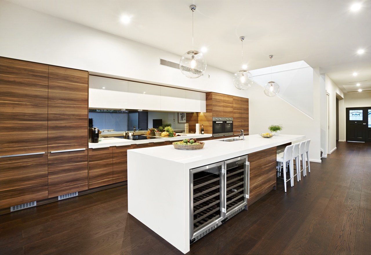
Light is also reflected in the grey smoky mirror glass splashback in the kitchen, as is the vertical garden opposite.

The kitchen cabinetry is a woodgrain laminate, chosen to contrast the white walls and white reconstituted stone benchtops. The island, which has a single waterfall side, provides a large work space, serving and casual eating area.
It also provides plenty of storage and accommodates two wine refrigerators. Further storage is provided by a large pantry behind the kitchen on the right side.
Michael Mu, from M2 Building Design, who worked on the design, took care to ensure the addition would not look too monolithic on the exterior. Consequently, the materials used on the upper level were varied. The main part of the addition is clad in cedar boards that were triple stained and rubbed down to create a weathered look.
The corner that pops out towards the rear of the property is wrapped in a silvery coloured Alucobond. And a ribbon of Enviroslat battens wraps down the opposite side of the upper level, curving under the eaves to form a wide soffit above the pool before extending down to the ground.
"We have positioned a wall between the house and the bundary at this end of the pool," says Florence. "This is made from toughened glass with a privacy film to screen the master bathroom on the other side. This room has an entire wall of glass, so we can look out to the vertical garden and a pond beside the house while showering."
Not surprisingly, the house is well equipped for entertaining. Special lighting features include blue LED lights in the pool, spot lighting on the vertical gardens, and individual lights on the trees along the perimeter of the property.
There are digital dimmers and LED lights throughout the house, and the entire system is automated, making it easy to change the ambient settings.
Story by: Trendsideas
Home kitchen bathroom commercial design
Curvaceous and connected
With deep affection
Radical yet respectful
Renovations
Renovating your home is an opportunity to refresh, expand and renew. Here's all the inspiration, ideas and information y...
Read More


