Minimalist two-tone kitchen
this minimalist, two-tone design is by Mac Interactive

The creation of one long open volume from front door to back yard is not always ideal when shaping public spaces in a terrace house. Introducing an intermediary feature can bring intimacy to both front and rear areas. The big question is, how to ensure overall harmony?
Such was the scenario here. Architect Andy Macdonald was asked to avoid an extended, open-plan ground floor when he designed the light-filled, end-of-row house. The owners requested, instead, a separation between the living room at the front of the home and the kitchen, dining area and rear yard. To achieve this and to make good use of the space, a pod structure was created, which contains a laundry, toilet and stairwell.
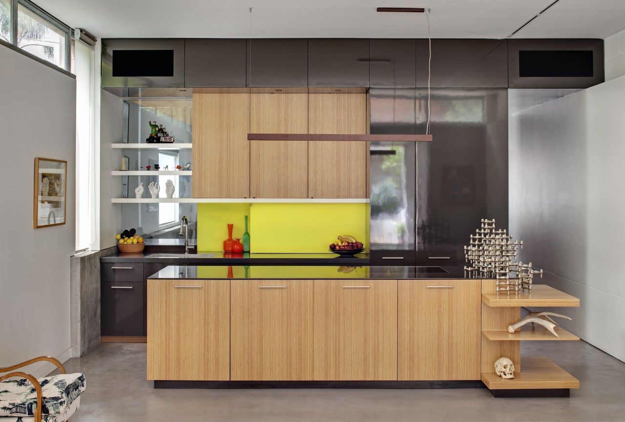
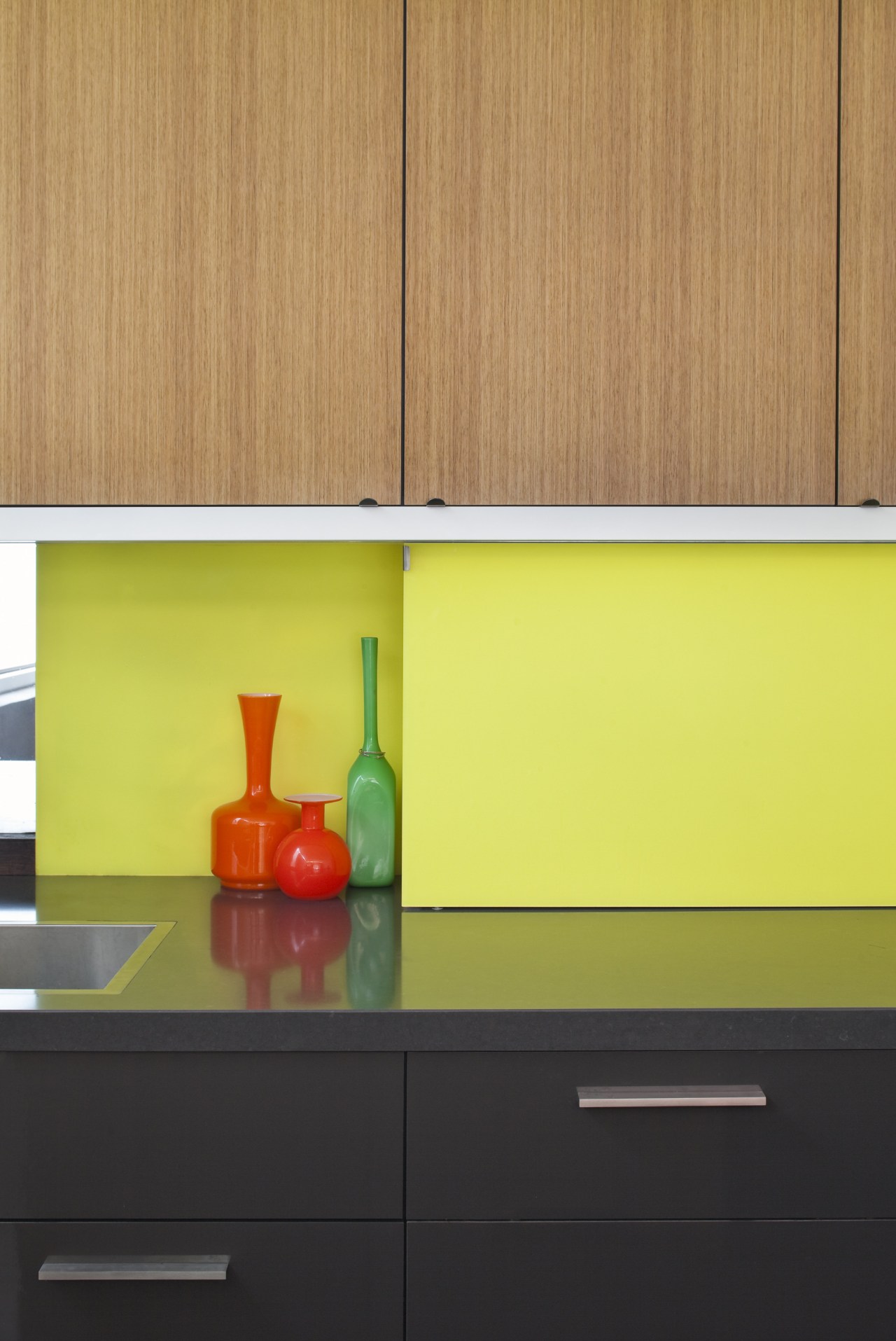
"To create the minimalist aesthetic another request of the owners and link the two areas, I designed the pod and kitchen cabinets with a simple material palette," says Macdonald. "This comprises a custom two-pack in shiny black, with a rich contrasting surface of Tasmanian oak veneer to bring warmth."

The principal materials seen in the kitchen continue down the corridor and on the side of the pod that faces the living space, forming visual links between these areas. Standing at the front door, a keyhole vista leads the eye past the pod, through open shelving and out past the dining area to the rear yard.
"Working with a simple material palette was only part of achieving an abstract, planar aesthetic," says the architect. "Most appliances are integrated, or, in the case of the oven, tucked away on the far side of the island. The panels to the right of the brightly coloured splashback conceal the refrigerator and a pantry.
"We even chose an induction hob to ensure there are no gas trivets to break the clean lines."

Besides linking to the living area in material terms, the kitchen connects well to the dining area in the other direction, this time by means of the concrete floor. This highly durable surface has been extended across to the dining area on the floors and walls, and further beyond as an exterior section wall, drawing all these areas together visually.
"Despite the separate volumes, this level has an easy material flow," says Macdonald.
When the pocket sliders between the dining and outdoor areas are closed, the clerestory windows open to help with climate control.
Story by: Charles Moxham
Home kitchen bathroom commercial design


