Light and responsive
The Z Energy head office by Jasmax features versatile, open-plan workspaces
When a start-up New Zealand company takes ownership of the local arm of a global firm, it makes sense to sweep away the look associated with past work practices. An egalitarian, open-plan approach offers improved performance in line with the aspiration to become a world-class company.
This was the scenario when Jasmax principal Tim Hooson was asked to reinvent an expansive first-floor office space for New Zealand company Z Energy. Together with taking the reins from the original owner, Z also took over the tenancy for its own head office.
Gail Calder, asset manager for Z Energy, says the space did not reflect the new company culture.
"The existing offices hindered the way we needed to work together in the future. We wanted our design to provide an environment that felt energised and was connected visually with an open contiguous space that enabled us to work more organically together," says Calder. "The environment is now a visual catalyst for our values coming to life. It shows at a glance our company ethos to be bold, straight up, share everything, have the passion and back our people."
The current head office location was assessed by Dow Property Group for its viability for the fresh environment required. This feasibility study factored in critical changes to the base build with a wider, more inviting entry at ground level, improved, softer light via new windows and changes to the skylights, and an upgrade of the air conditioning system.
The Building Intelligence Group came on board as project managers for the hard and soft fit-outs.
Z then vacated the premises while the transformation took place.
Prior to the refit, the offices had solid dividing structures that ate up the floor plate. Heavy wood portal elements broke up the natural flow of the space pushing existing team areas into corners. This was all stripped out before work commenced, says Hooson.
"Together with the poorly connected layout came closed-off work practices. The new emphasis is on the value of collaborative spaces and connection across all levels of the company.
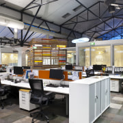
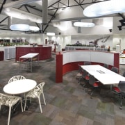
"Close space planning was critical to this job. We identified three distinct types of interaction and created environments that respond to that. Designated meeting areas are available for any business meeting and general desking units take up only around 60% of any open spaces. We also provided more social, informal breakout areas, such as the cafeteria."
Calder says that the configuration of the workspaces is flexible, with no boundaries between different parts of the company, and with staff from various units sitting together or free to move to other areas as their work focus changes.
"This ability to work in an integrated way across the company is an important enabler of being more nimble and efficient."
To achieve the dynamic efficiency required, Hooson identified key value areas within the 2800m² space the central core with its soaring volume and other pleasant areas set by decks, the cafeteria and spaces with attractive harbour outlooks. Meeting areas were allocated to these areas and are used by everyone.
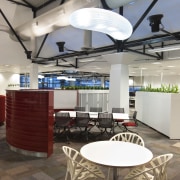
Jasmax designed sculptural S-curve dividing structures that neatly combine a level of privacy with a sense of connection for these locations.
All the meeting spaces in the secure workspace area are designed as open-plan, informal spaces in a wide variety of sizes, from spaces for two people to those suited to large groups. Staff can access a variety of set-ups as soon as they are required from stand-up space, to bean bags, to high bench tables, to more private booths with digital screens at the ready.
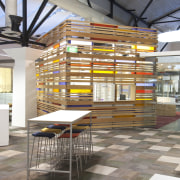
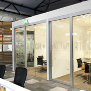
Bar two small rooms, all other formal meeting rooms are located in the front-of-house/reception area, with glass walls to continue the aesthetic of transparency along with visitors being able to freely access the cafeteria. The only element that stands between visitors and workspace is a large wood-batten services structure.
The colourful structure conceals office services such as photocopying from sight but still furthers the overall ambience of lightness and openness.
"The finished offices reflect a glowing optimism that stands at the heart of a company looking to the future," says Hooson. "This egalitarian design is infused with a belief in the power of collaboration that the value of the company rests on the collective energy of its people."
Credit list
Workplace architects
Project manager
Construction company
HVAC peer review
Fire consultant
Fixed joinery
Blinds
Feature lighting
Meeting tables
Reception furniture
Additional furniture
Whiteboards
Property advisor
Change management and communications
Structural, mechanical, electrical engineer
Quantity surveyor
Partitioning system
Hardware
Workstations
Office chairs
Storage units
Kitchen
Story by: Trendsideas
Home kitchen bathroom commercial design


