Lifting your game
This kitchen was remodelled by Natalie Du Bois to fall in line with the traditional house
It is an often told story a grand residence let down by a rather average kitchen. Renovating this key space brings the double opportunity to introduce contemporary cooking convenience and bring the home's interiors into balance.
This was the exact scenario when interior and kitchen designer Natalie Du Bois was asked to create a new kitchen and laundry space for a spacious, classic residence. The existing kitchen and adjacent laundry occupied the same footprint but each had different looks making the modest kitchen appear even smaller and out of register with its surroundings, says Du Bois.
"We retained the existing wood floor and designed the kitchen and laundry afresh both in the same cabinetry style to give the kitchen a more substantial presence. The washing machine and dryer are integrated to further this effect."
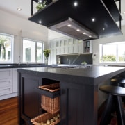
Du Bois wanted the design to match the classic look of the home, so introduced cornices, panelled cabinetry, wicker baskets and a solid, country-style range in the central island.
"The island and custom rangehood play an integral part in achieving a dramatic presence. The black counter, cabinet and hood contrast the grey wall cabinets, creating a two-tone theme."
"Like the oversized rangehood, the wall cabinets also extend up to the ceiling. These are finished with cornices to help accentuate the kitchen's formality and presence," says Du Bois.
The owners had also asked that the design have points of difference. To this end, the designer has provided two highly individual, crafted elements.
"Steel mesh hand-woven in a star pattern features on the front of the island, protected by a glass covering. This element is repeated on the door of the glassware cabinet alongside the refrigerator and on the uppermost windows in the laundry area. However, on the cabinets, the mesh is sandwiched between two panes of glass, creating a transparent effect."
In a further refinement, Du Bois customised all the traditionally styled cabinetry panels for a more streamlined aesthetic.
"I designed narrow finger grips tucked into the beading on the cabinet panels. These make it easy to open the doors and drawers from all angles avoiding the visual clutter of handles."
Story by: Trendsideas
Home kitchen bathroom commercial design


