Less becomes more
This '70s condo was opened up and streamlined for a sense of spaciousness and refinement with some wild inclusions along the way
Interior design by Eolo
From the interior designer:
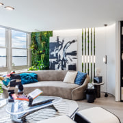
We wanted to incorporate the smooth shapes, curves, and colours of the water and bring the outdoors in.
The design is a mix of Modern, European and eclectic styles to reflect their owner’s travelled lifestyle.
However, our ultimate challenge with this project was to demonstrate that luxury and ultimate comfort are possible to be achieved in units of this smaller square meterage when most of our modern cities, due to increased urban density, demand efficient and creative use of the available space.
This Brickell, Miami, condo renovation was a full demolition and redo of the interior architecture and interior design of the 1970s property.
The project required innovation in every aspect of design and construction.
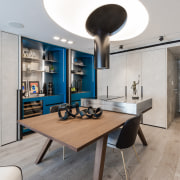
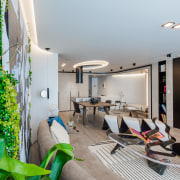
The interior spaces layout and finishes were conceived to transition seamlessly from one another with the help of a curated natural and artificial lighting design, so the guest won’t experience abrupt changes when navigating the different areas of the house – especially the expansive living/dining/ lounge space.
I can describe our creative process as doing a puzzle in space planning – since one of the main challenges was to make the most of this small footprint.
In 3D interior architecture we wanted to introduce curved shapes that would make subtle transitions between spaces.
The curves also helped us in bringing the outdoor bay view inside.
We wanted to maximise the space given the unit is small in square meterage.
The unit had one bedroom and one and a half baths – but we wanted at least two full bathrooms, one den, more living areas and a bigger closet.
Improving the floor plan layout was a must since we wanted to use the unit as a showcase of what we can do for other existing and prospect apartment owners.
Ultimately, we were able to add a den, a full second bathroom, a lounge area, a dedicated laundry, and a master suite with a big master closet – all of this was achieved with ample storage throughout.
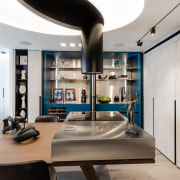
Hidden millwork cabinets, invisible doors, trimless lighting, and linear air conditioning diffusers all help to get rid of visual clutter.
This project also offers the latest in-home automation – integrating lighting control, drapery, climate control, television and audio systems.
The kitchen appliances and door access are also integrated into the home automation.
Designed by: Eolo
Story by: Trendsideas
Home kitchen bathroom commercial design
Classic dovetails contemporary
Tranquil waters
Continuity meets subtle separation


