Kitchen design makes most of indoor-outdoor links
Set amidst glass-walled architecture that maximises natural light on a constrained site, this on-show kitchen had to look its clean-lined best

For this contemporary, terraced home and itskitchen, building council guidelines and a tight site meant a smart solution was required to address the lack of available natural light.
In response, the whole-house and kitchen designer Jason Saunders found several ways to get sunlight into the ground floor of the home and, by extension, into the kitchen.
“We designed the home to emphasise links between indoor and outdoor areas. This included cantilevering the first floor out to the boundary, but leaving one central area open to the skies,” says Saunders. “This created a two-storey void which, together with a roof window over the kitchen, draws the sun into the home.”

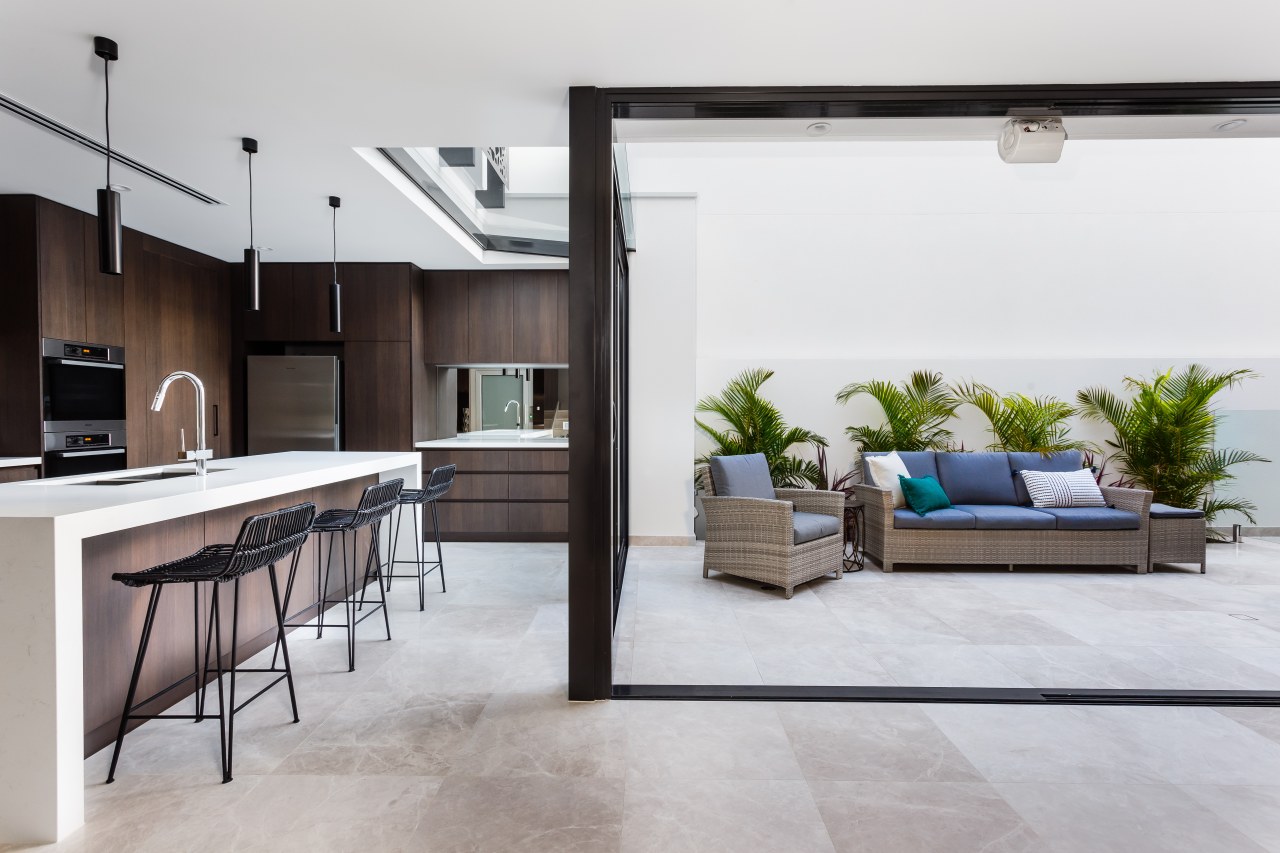
The kitchen, along with a concealed laundry entered from the workspace, takes a prominent position at one end of the ground floor, borrowing space visually and in terms of function from its surroundings. For example, the kitchen can open directly to the outdoor area in front via stacker doors, gaining space as well as sunlight.
Of course, just as someone in the kitchen can look to the outdoor space or across to the dining area, so too is the kitchen on display.
As the kitchen forms a backdrop to these public areas it was important that it achieved a balancing act between being understated – so as to not make the interiors look too busy – and offering a refined presence.”
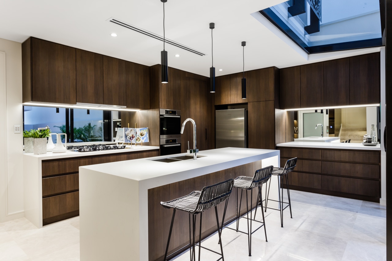
The design outcome was a rich, two-tone kitchen that’s quiet but not minimalist.

“The simple palette is white and brown – the rich brown of textured laminated boards matched with white engineered stone, waterfall countertops,” says Saunders. “While waterfall ends are often seen as a luxurious inclusion, in some ways they simplify the form of the island and perimeter lower cabinetry – enriching and streamlining the kitchen at the same time.”
Recessed cabinetry handles add to the pared back look and also accentuate the presence of the dark cabinetry faces. Mirrored splashbacks contribute to the sense of space, reflect the outside views and, of course, bounce more valuable natural light through the space.
“Limestone floor tiles run right through the indoor and outdoor areas, adding to the overall sense of connection,” Saunders says.
The contemporary kitchen project is green at heart, too, going beyond Western Australia’s sustainability standards for small-lot living.
Credit list
Designer
Cabinetry
Flooring
Oven
Ventilation
Awards
Cabinetry
Benchtops
Splashback
Cooktop
Dishwasher
Story by: Charles Moxham
Photography by: Crib Creative
Home kitchen bathroom commercial design
Classic dovetails contemporary
Continuity meets subtle separation
Tranquil waters
Homes Trends Vol. 34/4
Whether space for your new bathroom is generous or modest, you'll want to create a room that not only looks good but is ...
Read More


