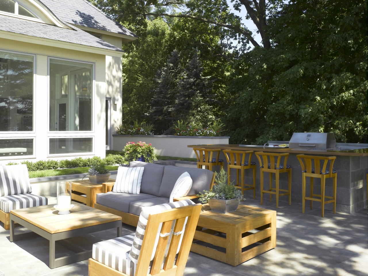
In the vacation spirit
Strong horizontal lines, soothing colors and natural materials provide a calm backdrop for entertaining at this lakeside getaway

Vacation homes often occupy a special place in our memories for many of us, they are where we unwind after a busy week, and enjoy some of our most rewarding times with friends and family.
For this project the remodeling and interior design of a lakeside vacation home the homeowners wanted a relaxing space that could be used for entertaining crowds of friends and family, says interior designer Mary Hickey.
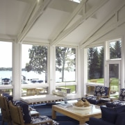
To create a restful ambiance, Hickey brought a sense of order and calm to the space. Repeating horizontal lines have been introduced throughout the home and exterior living areas. Horizontal lines appear on fabrics, and on the 15ft by 20ft custom-made rug that covers most of the living room. Sofas and tables are sized so that the pieces are the same or similar height. The cerused oak coffee table on the right, for example, is the same height as the white Barcelona daybed nearby.
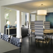
"Layer upon layer of horizontal lines ground the space and help people feel calm and comfortable," she says. "Some items, like the dining room chairs, have exaggerated verticality, and this adds interest and energy. It also encourages the eye to look upwards towards the rafters and the sky outside."
Color is another way that the designer has introduced a calm atmosphere, with a palette of white and dark blues throughout the ground floor paired with natural fibers and wood.
"I wanted a color that would stand the test of time and would always look crisp, which is why I chose dark blue. Also, the entire family has blonde hair, and I thought about how they would look in the space. Why not surround yourself with colors that are flattering to you?"
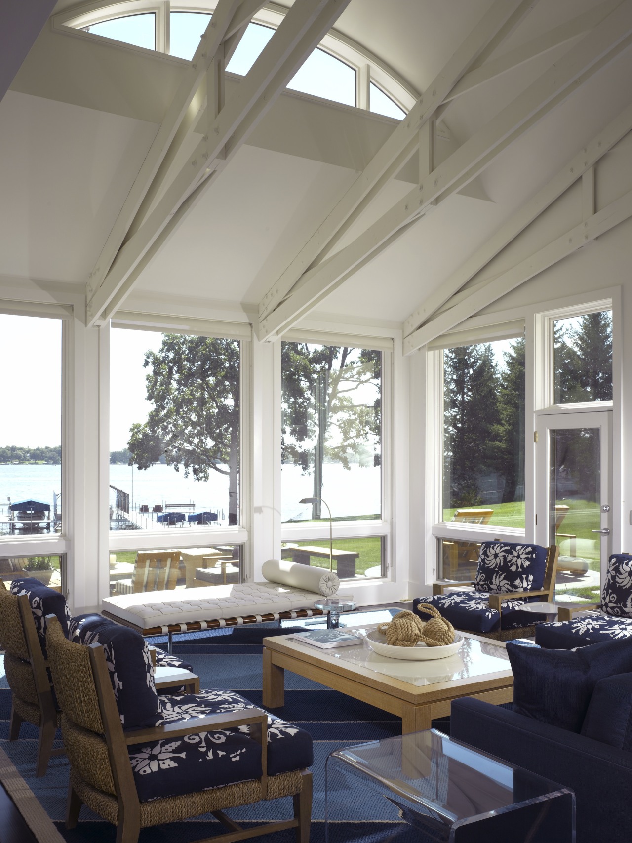
The fresh quality of the blue and white theme is accentuated by the use of natural fabrics. Natural materials take color well and still look good, even after they have begun to wear, says the designer.
On the ground floor, the abundant natural light allowed yellow-toned whites to be used for the walls and double-height ceiling. Downstairs in the media room, where there are no windows, the whites have pink undertones, and the furnishings are paler. Both elements warm and lighten the space.
The textured fabric of the U-shaped sofa and the soft pillows help to create a cozy feel, says Hickey.
"The sofa has been designed so that its height is in proportion with the room's low ceiling the low back encourages people to relax rather than sit bolt upright. I'm very picky about pillows, so I chose ones that will be soft and comfortable."
Fitted cabinetry surrounds the TV screen, to keep visual clutter to a minimum and control the color palette. Blacks and creams dominate, with some flashes of hotter reds and yellows: similar, but not identical to, the blue and white theme upstairs.
"A home becomes cohesive when there is visual flow from room to room," says Hickey. "At the same time, you need to be able to go into each room and think of a different adjective and for this room, I'd use the word playful."
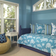
The playful theme is carried through to the children's bedrooms on the second floor, which are themed to reflect each child's color preferences.
The master bedroom has been designed to evoke a spa setting. The use of pale turquoise is a departure from the strong colors elsewhere, says Hickey, and creates a quiet, more private space.
"The homeowners wanted to feel invigorated and refreshed, as if they were in a spa. So, here, the tactile element takes over. The carpet is very thick, and the small sectional sofa is covered with soft chenille that feels like a robe.
"Acoustically, it's also a quiet space. The wall behind the bed has been upholstered in horizontal panels of linen, which means that voices don't reverberate around the room."
Story by: Trendsideas
Home kitchen bathroom commercial design
