In praise of the modern
Mixing the trailblazing architectural style of Ludwig Mies van der Rohe with contemporary technology gave the designer of this house a chance to explore an even purer form of Modernism
From today's standpoint, it is hard to believe just how much was accomplished by leading Modernist architects of the last century. The work of architects such as Ludwig Mies van der Rohe, Walter Gropius and Le Corbusier, lives on and defines a period of architectural history.
With the huge advances in technology since that time, however, it is now possible to push minimalist design even further. This was the challenge designer Steve Hermann posed for himself in designing this house in Montecito, CA.
"I wanted the most minimal design possible, but the house also needed to be large, in keeping with the estate-like nature of the neighborhood," he says. "More than 60 years have passed since Mies van der Rohe designed the renowned Farnsworth house. In theory, changes to technology mean it should be possible to update that original 1200sq ft design to create something much bigger. The difficulty has always been to create a minimalist house on a large scale this house needed to be 14,000sq ft."
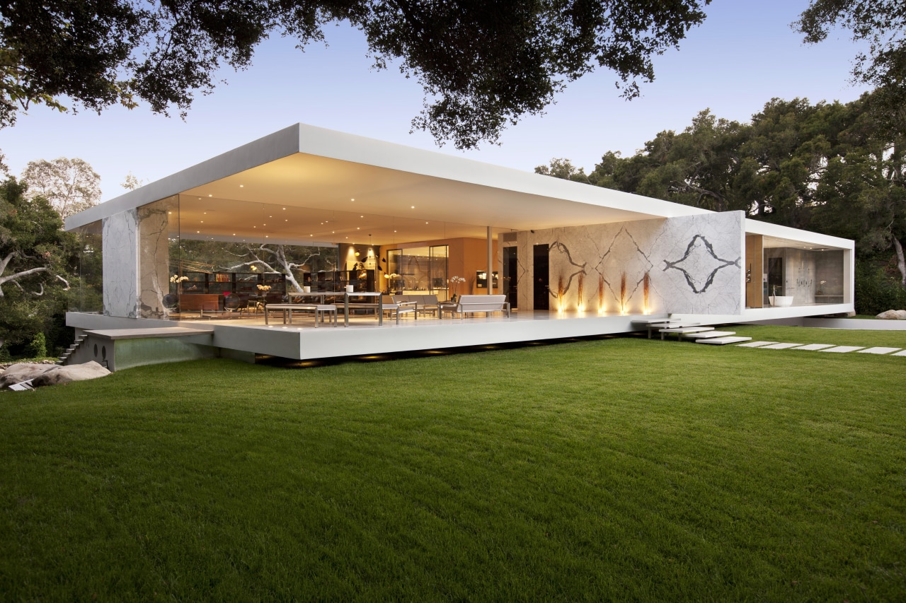
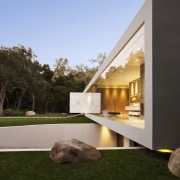
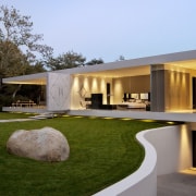
The solution found by the designer involved sophisticated engineering, with technology that allowed the floors and roof of the house to be cantilevered 55ft in two directions.The entire glass pavilion could be designed so it appears to float several inches above the ground.
"Effectively, there is just one interior spine supporting the whole weight of the cantilevered section," says Hermann. "It's the things you don't see that make it all possible. And because this is an earthquake zone, it is engineered to meet the required structural standards there are concealed shear walls in the basement."
The main living floor is sandwiched within a low, horizontal, C-shaped steel-and-concrete shell that wraps around the top, side and bottom of the house.
"There is a uniformity of scale and proportion to the form," says Hermann. "Essentially, the house was designed as a work of art first, and a residence second. But it was also important to ensure it was liveable and workable these things could not be compromised."
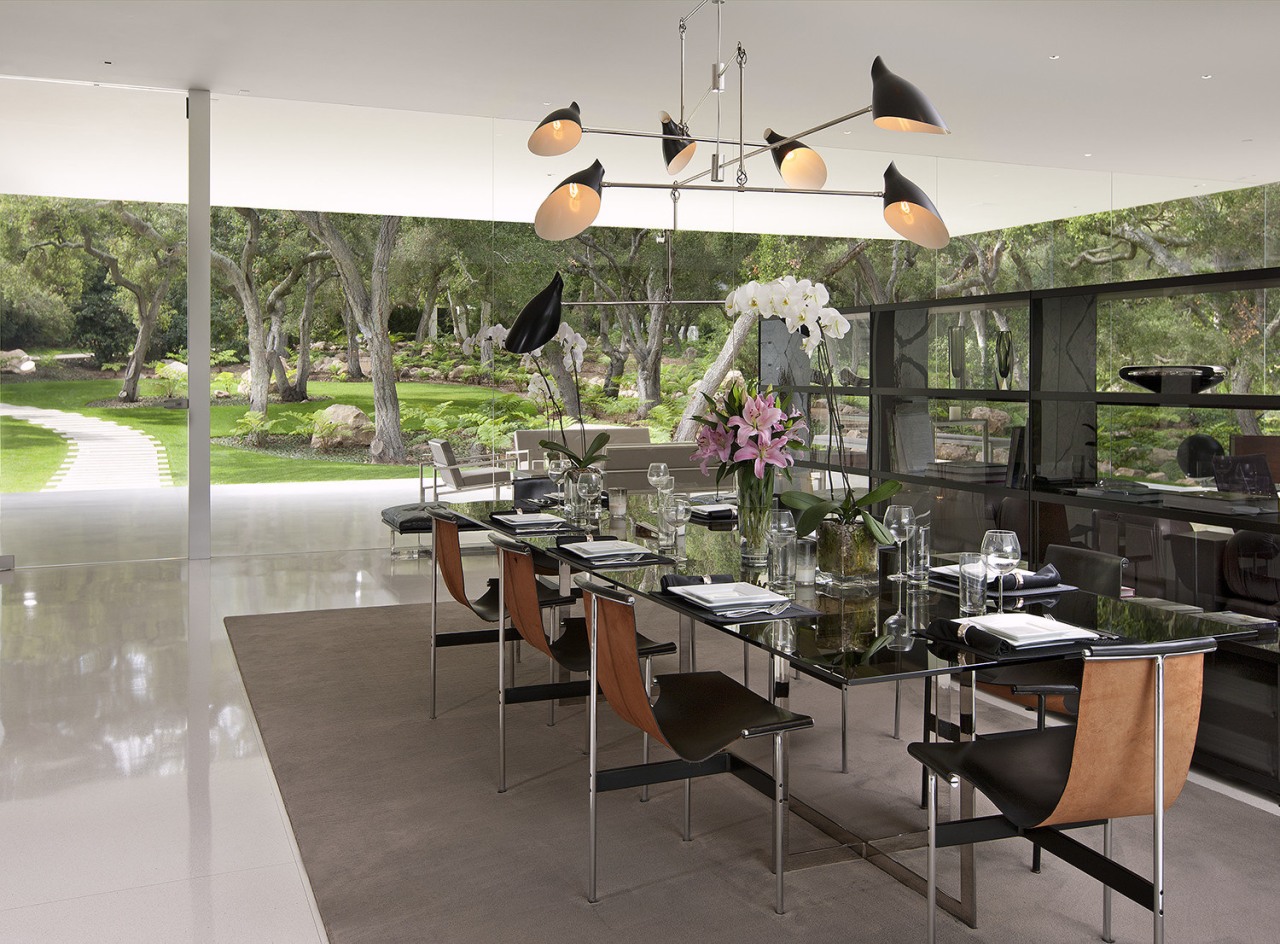
The house is further defined by a strong transparency. Walls feature full-height butt-jointed glass, with the framework concealed within the ceiling. Starfire low-iron glass gives the walls an extra clarity, so the windows seem to disappear.
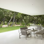
"There are no sliding doors in the glass, as these would have required framing, which would have detracted from the minimalist look," says the designer. "But being inside is just like being outside, especially with the butt-jointed corners on the glass walls. The house frames the view of the oak wood, directing the eye to what lies beyond."
A solid wall at right angles to the main axis cantilevers out towards the front of the property. The wall, which is clad in bookmatched Statuary marble, reinforces the floating analogy, and creates a sense of large planes sliding past one another.
"There is also a privacy aspect," says Hermann. "The wall runs between the great room and the master suite, screening the private rooms from the front entry."
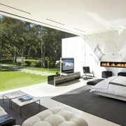
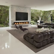
Similar Statuary marble wraps the fireplace surround in the great room. As the only solid wall on this side of the house, this form visually anchors the room, and conceals roof supports.
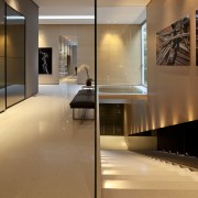
In keeping with the minimalist design, all the spaces in the house are voluminous, with 12ft-high ceilings. The hallway, for example, is 8ft wide and has a museum-like quality, which makes it an ideal gallery space, Hermann says.
The great room combines three rooms in one the living and dining rooms and kitchen. The separate areas within this space are defined by the position of the furnishings, including bench seats, large area rugs and a row of open bookshelves.
"Modernist houses are about seamless, flowing spaces," says Hermann. "For this reason, we have used the same terrazzo epoxy flooring throughout. It even features in the bathrooms, and the car showroom and office on the lower level."
Furnishings, including many vintage pieces, were also chosen to complement the architecture. The sectional sofa in the living room is an original 1970s piece designed by Mario Bellini for C&B Italia now known as B&B Italia. Hermann says sectional pieces were sourced from five different countries and reupholstered in leather. Similarly, the vintage Katavolos-Littell T-chairs in the dining room came from several different locations.
Contemporary Italian designer fittings in the bathrooms include a cantilevered vanity, and Antonio Lupi basins and tub in the master suite. To enhance the seamless, modern look, blinds are concealed within the ceilings when not in use.
Story by: Trendsideas
Home kitchen bathroom commercial design
