I cover the waterfront
Space is maximised in this multi-level home where vistas extend across/up through the interior and everything connects to the water views
Designed by SAOTA
From the architects:
Looking eastwards towards the Dubai skyline from the G Frond of the iconic Palm Jumeirah, this villa, conceived by SAOTA for developer Alpago Properties, in collaboration with Executive Architects CK Architecture Interiors (also the project’s interior designers and contractors) exudes sophisticated understatement in its unassuming silhouette.
The brief – to create a home that would maximise the allowable area and embody a sense of refined luxury – was open to interpretation from a design standpoint.
This allowed the team freedom to interpret the notion of residential luxury freely in the context of this exclusive enclave.
Not being limited by restrictions on the design itself, due to there being no designated end user, offered an opportunity to create something architectural and expressive while remaining in keeping with the prestige of the neighbourhood.
The team drew on the striking waterfront site – harnessing its considerable views – to design a villa that merges with the urban landscape and, in signature SAOTA fashion, seamlessly integrates indoors and out.
This was in fact a primary goal of the project – to introduce the landscaping and views in various ways, so they would become part of the inhabitants’ daily experience.
The initial building concept was cued by the site’s proximity to the water – in the form of a stacked structure designed to mimic travertine eroded over time (a reference to the developer’s Turkish roots) or the texture of coral (an allusion to the villa’s island location).
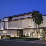
On first impression, the street-facing side presents a solid façade (an intentional design decision prompted by the need for privacy).
On closer inspection, this bulk is broken up to some degree by a deliberate fracturing of the form – with a combination of light and dark materials, vertical layering via expressed slab edges, metallic and matte surfaces, transparent and perforated detailing and solid forms balanced by negative spaces.
These contrasting elements introduce the idea of porousness present throughout the design.
This theme is extended, and expanded on within – the sense of solidity on the street giving way to openness on the sea-facing side, where the spaces ultimately become hyper transparent.
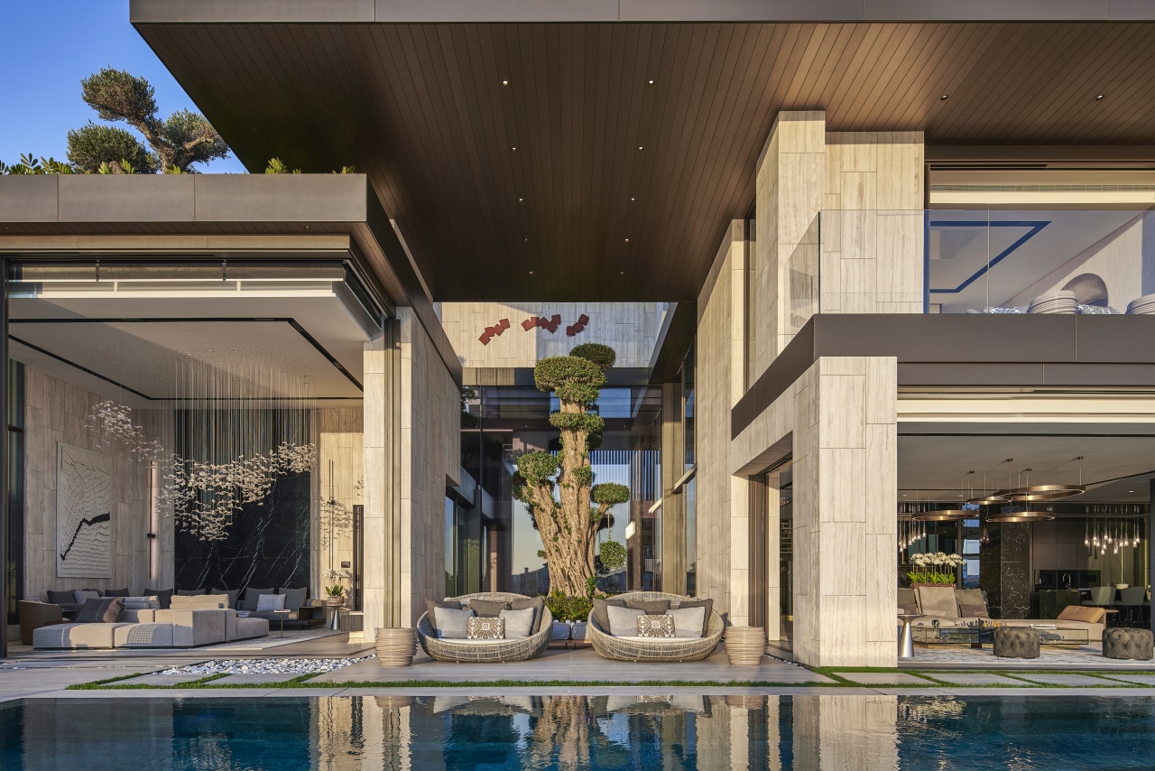
By carving out of the mass of the structure, the architects have created double-volume covered terraces and voids to inspire a sense of curiosity – through these, the landscape is visually woven through the space.
Once you step through the door on the ground floor, this sense of permeability becomes clearly apparent in social spaces centred on a triple-volume central landscaped courtyard that admits abundant light.
Spaced over four levels, the villa is designed to optimise the purpose of each floor.
The ground and first floors house living space and bedrooms with easy access onto the outdoor terrace; the basement level contains a garage and spa; while the bar, entertainment area and pool occupy the rooftop level and benefit from the view.
Working with a relatively small footprint, the challenge of ensuring a sense of expansiveness was overcome with an open-plan design that flows internally – not only creating visual connectivity (vertically and laterally) between spaces and floors, but also with the generous outdoor living areas.
To achieve this, the physical and material boundaries between indoor and outdoor living were blurred.
With no clear definition between the formal lounge and the terrace, the living space opens out, with doors slotting seamlessly into wall cavities.
The ultimate effect: a connection from the living space to the pool and landscaping, and in turn to the sea and skyline beyond.
The natural material palette reinforces this connection with the outdoors – large-format unfilled vein-cut travertine tiles, wood, and earth-toned marble are luxurious but not ostentatious and link tonally to the landscape.
Deliberately pared-back and quietly sophisticated in the public spaces to complement the sculptural character of the building, the materials are more opulent in the private zones to imbue these with an enhanced sense of luxury.
The outdoor areas – being so intricately linked to the indoors – were designed and optimised for liveability.
Pergolas and terraces filter and moderate light on the rooftop (necessary in this climate) while internal courtyards and deep overhangs contribute to passive cooling and facilitate comfortable outdoor living.
The setting-sensitive design allows the home's occupants to fully enjoy the views and the elements throughout.
Credit list
Architect
Interior designers
Contractor
Landscaping
Photographer
Architect of record
Development manager
Civil, structural and electrical engineer
Lighting design
Helpful links
Windows and Doors
Cabinetry Hardware
Spas
Home Builder
Roofing
Heating
Flooring
Taps
Kitchen Design
Home Design
Story by: Trendsideas
Home kitchen bathroom commercial design


