Honest expression
Modern addition to Victorian home


In times gone by, an addition to an historic home might have painstakingly matched the old with the new. Today, such renovations often take a very different route, consciously creating a dramatic contrast in styles.
The owners of this 1900s-era house had walked past architect Nicholas Murray's own reworked home and admired the results. In due course, they approached him to expand their house in a similar way.
The request was for an expansive addition to the rear of their brick house. This was to include new open-plan living spaces at ground level and a master suite upstairs. They also wanted a new carport and a lift this was to help future proof the residence, says Murray.
"Our first move was to add a traditional veranda, sourced locally, to the left side of the house. To make the entry more prominent, we pushed out the front door and bluestone sill. Further down the facade, a bay window was added to the study.
"On the other side of the house we put in a modern cantilevered carport in structural steel that appears to just touch the red brickwork, creating a contrast between the two structures."
With the new living spaces and master suite pushed to the rear, the existing interiors were reshuffled. The original kitchen is now a study, the living room has become an informal lounge, and the former master bedroom is now a guest bedroom. A glass-fronted lift was installed behind the contemporary carport.
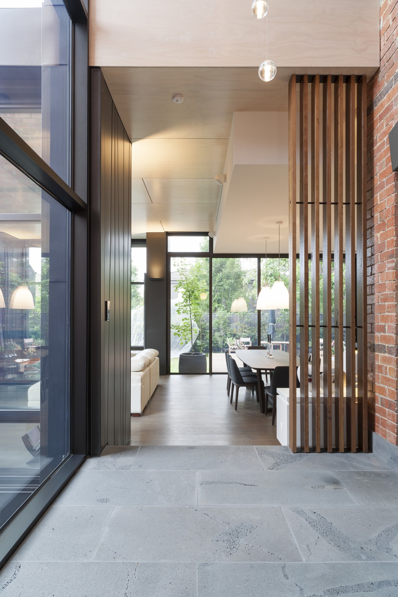
Much as the carport appears to just touch the facade, the extension also seems to stand close, but just apart from the brick structure. A soaring double-height void where the two meet emphasises the transition between old and new. Outside, a pool offers another visual divide, where the two structures diverge on this side of the house.
Past the void, the new open-plan space includes the brick rear wall of the original home as part of its internal fabric. An existing window in the facade was retained, and backed in mirror the reflection gives the illusion of looking out to the trees, says Murray.

"Four zinc-clad pillars here are another example of bringing the external cladding inside. We laid the zinc in tapering panels, to prevent the edges from flaring, or oil-canning, as they do on the exterior. This creates a more refined look, better suited to the interiors."
These pillars and a sharp rise in ceiling height over the living area demarcate this space from the dining area and kitchen.
For additional impact, the ceiling over the living area was limewashed. A wall of wooden shelves at the end of the room provides a showcase for the owners' photographs and objects.
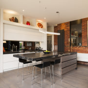
At the other end of the space, the kitchen island is clad in wooden boards similar to the flooring. These offer a durable surface and help the island blend into the space. The marble top is cantilevered at one end, so that it can be used for casual dining. A mirrored splashback reflects the views.
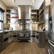
The clean-lined kitchen is ideally suited for entertaining all the cooking appliances are hidden away in the separate, highly functional butler's pantry behind.
Next to the kitchen is a reading nook and the outdoor kitchen is behind this.
Seen from the rear, the addition is a relaxed composition of geometric forms and planes. To the right, it is expressed as a square frame that edges out past the side of the original brick house and can be glimpsed from the street. From the garden, there is a sightline through the glass walls of the addition to the original brick facades.
"This form is cantilevered to give the appearance that it is hovering above the ground, adding to its almost surreal presence," says Murray. "At the same time, having the lawn extend underneath the form creates the illusion of greater space."

Cladding on the extension is a mix of zinc, timber and natural stone. Laid over plywood, the sheet zinc on the exterior warps at the edges to decorative effect. Murray says zinc is an ideal material for this style of renovation as it is extremely durable and has a matte, dark presence that recedes to the eye and doesn't overpower older materials.
"Another advantage of zinc is that it is self-annealing any scrapes or knocks will oxidise and return the surface to its original condition."
On the other side of the extension, the black zinc starts at the top of the building and zigzags down to complete the roof over the outdoor kitchen. This element brings additional visual interest and serves to draw the upper and lower levels together.
The outdoor kitchen is clad in bluestone, which also forms the sills on the original home.
"Bluestone has long been a traditional local building material. We introduced it here to bring texture to the stonework," Murray says.
The vertical strip cedar cladding used on the balustrade on the upper level and under the eaves also brings texture. The warm wood tones provide a contrast to the cool dark zinc surfaces.
"This renovation reflects an honesty of form and expression. The new sits in contrast with the old to the aesthetic benefit of both. Sympathetic tones and materials draw everything together."
Story by: Trendsideas
Home kitchen bathroom commercial design

Renovation Trends Vol. 30/5
Renovation Trends showcases innovative makeovers – big and small. The book features kitchens, bathrooms, interior makeov...
Read More