Home extension adds sunny new living space
This budget-conscious addition to a double fronted Edwardian has a focus on sun and sustainability

Architect: Ben Callery ArchitectsPhotographer: Tatjana PlittAbout the project (Text provided by Architects): Our clients recently returned to Melbourne from many years of travelling and working overseas 'chasing the sun.' They exuded that wonderful sense of optimism, enthusiasm and creativity experienced when travelling.
We wanted the extension to their Melbourne home to embody those dynamic feelings so that their sense of adventure could continue even when settling back in to life in Melbourne. Meanwhile we would need to respond to their brief for a house that uses environmentally sensitive materials and a creative form to harness the sun and be naturally comfortable.
Their ideals were minimalist in terms of material possession and need for space but expansive in desire for quality of experience and enjoyment of life. They wanted to keep the front four rooms of their existing double fronted Edwardian despite its bouncy floorboards and faux-tile pressed metal roofing.
It wasn't heritage, but the reasons to retain the front were compelling: Environmentally, it held significant embodied energy and materials that would contribute to landfill if they weren't retained. The hundred-year-old façade also makes a significant cultural contribution to the in-tact streetscape. And of course, retaining these rooms would save money in the tight ($350,000 incl gst) budget.
Spatially we placed an emphasis on less floor space, but more flexibility ' Our clients frequently work from home but rather than have one room dedicated to this, they were happy to have flexible spaces that could be bedrooms, living rooms and studies as needed now and into the future as their family may grow. The existing Edwardian rooms are well proportioned to provide this flexibility. There is no walk-in-robe or ensuite and so the location of the master bedroom is open to change.
There is one central bathroom and a separate 'wet room' (inspired by years of living in Britain) that is a laundry, powder room and second shower in one compact space. To minimise cost, the wet areas are intentionally located in the new extension so there was no structural or plumbing work required in the front four rooms.
Out the back, our clients wanted their own place in the sun. They noted that in their travels they were often 'chasing the sun'. Upon returning home, they wanted a place they could settle in that encapsulated that spirit, but with the permanence of a home.
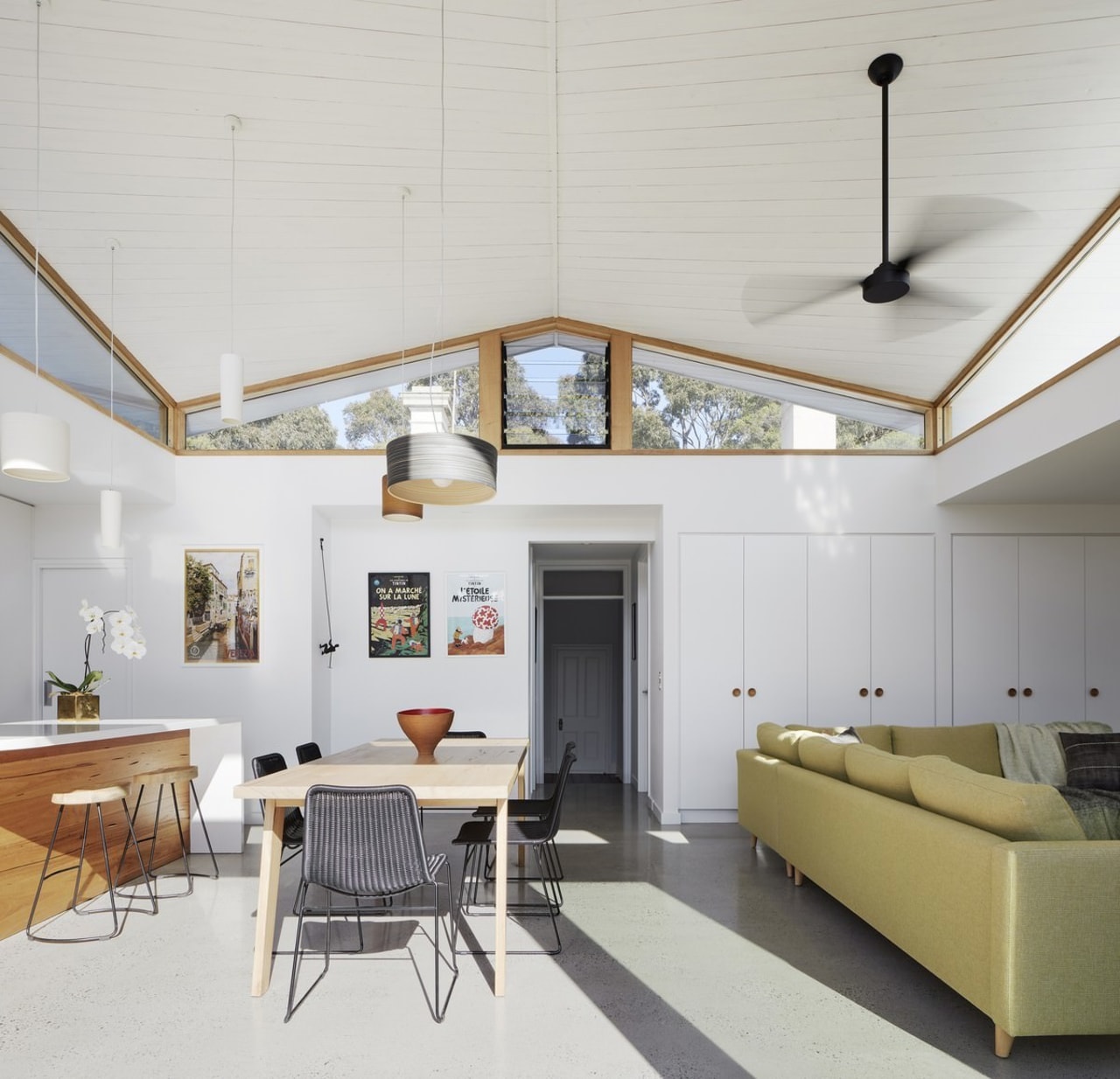
The sculptural roof glides over the extension responding to the elements while embodying their adventurous spirit. The roof twists symmetrically around a central ridge, soaring up and out over the backyard to embrace the winter sun.
At the southern end the roof gently wraps downwards to each side with sweeping eaves that shelter the house from hot summer afternoon and morning sun. Clerestory windows allow visual connection with street trees beyond and catch high southerly breezes to create cross ventilation.
The triangular highlight frames views of the old pressed metal roof and ageing chimneys. Like a traveller reflecting upon their hometown from abroad, we look back at the original part of the house, see its foibles and imperfections, and love it all the more for these eccentricities. Like travelling, the house offers a sense of discovery as it is moved through.
The darker front rooms exude nostalgia and are a place to display collected items. The threshold between old and new is signalled with two steps up that elevate you into the natural light of the new extension.
The materials are an eclectic collection (as is a traveller's way) selected to express and accentuate the form: The lines of the white timber ceiling express the shape of the hyperbolic paraboloid roof, using multiple straight lines at varying angles to create a curve.
The blackbutt timber shiplap cladding, charred as a natural preservative, has a rawness and tactility that expresses ours and our client's values and aesthetically contrasts the white ceiling to heighten the sense of lightness.
Recycled timber in the cabinetry, recycled brick pavers and timber windows with locally sourced hardwoods express our clients desire to re-use where possible and to source local materials to minimise their environmental impact. High levels of insulation, double glazing and thermal mass help maintain stable temperatures creating a naturally comfortable home that as our clients say is 'hard to leave.'
Story by: David Renwick
Home kitchen bathroom commercial design
'Hygge' in the highlands
Playing with blocks
Holidaying at home


