High contrast
Through textural contrast a minimalist kitchen design can be given visual definition, says Simply Kitchens

Minimalist kitchens are designed to present clean lines and an uncluttered appearance. This, however, does not necessarily mean a minimalist design must be austere.
In the hands of an experienced kitchen designer, a clean and modern design can be brought to life, says Sian Gillanders, designer for Simply Kitchens.
"In this instance, the clients wanted a simple and modern style with maximum functionality. We sought to replicate the home's exterior textural and colour contrasts in the kitchen," she says.
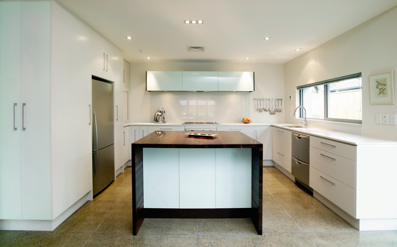
Exterior contrasts are provided by dark stained weatherboard and a smooth plaster finish. Inside, this effect is provided by House White paint lacquer over horizontal tongue and groove, combined with a feature, full wrapover wenge island with horizontal grain.
"The island brings the kitchen together as the central feature. It provides clear benchspace, contrasting in thickness, colour and texture to the 20mm quartz Snow benchtops around the perimeter.
"Pale glass cabinetry, framed in wenge, is a design feature that also provides storage space. It appears to float on the rear wall," Gillanders says
For further information, contact Simply Kitchens, Christchurch: 3/75 Blenheim Rd, phone (03) 341 1394. Wellington: 105 Thorndon Quay, phone (04) 380 0116. Website: www.simplykitchens.co.nz.
Story by: Trendsideas
Home kitchen bathroom commercial design


