Harbourside reflections
Dark cabinetry and reflective materials help this kitchen find empathy with its views
A kitchen that looks out on stunning scenery presents more than one issue when it comes to design. While the layout will usually defer to the views, the materials can find empathy with, or even accentuate, the sights beyond the windows.
The kitchen shown on these pages forms part of an harbourside apartment. The client asked the interior designer, Simone van der Plas, to create a space that was edgy and different. An office also had to be incorporated into the design.
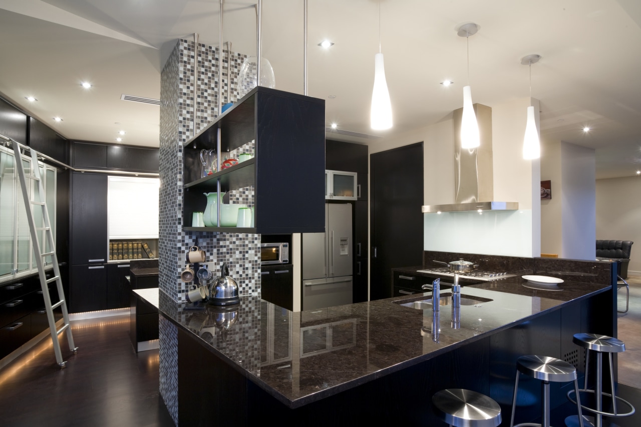
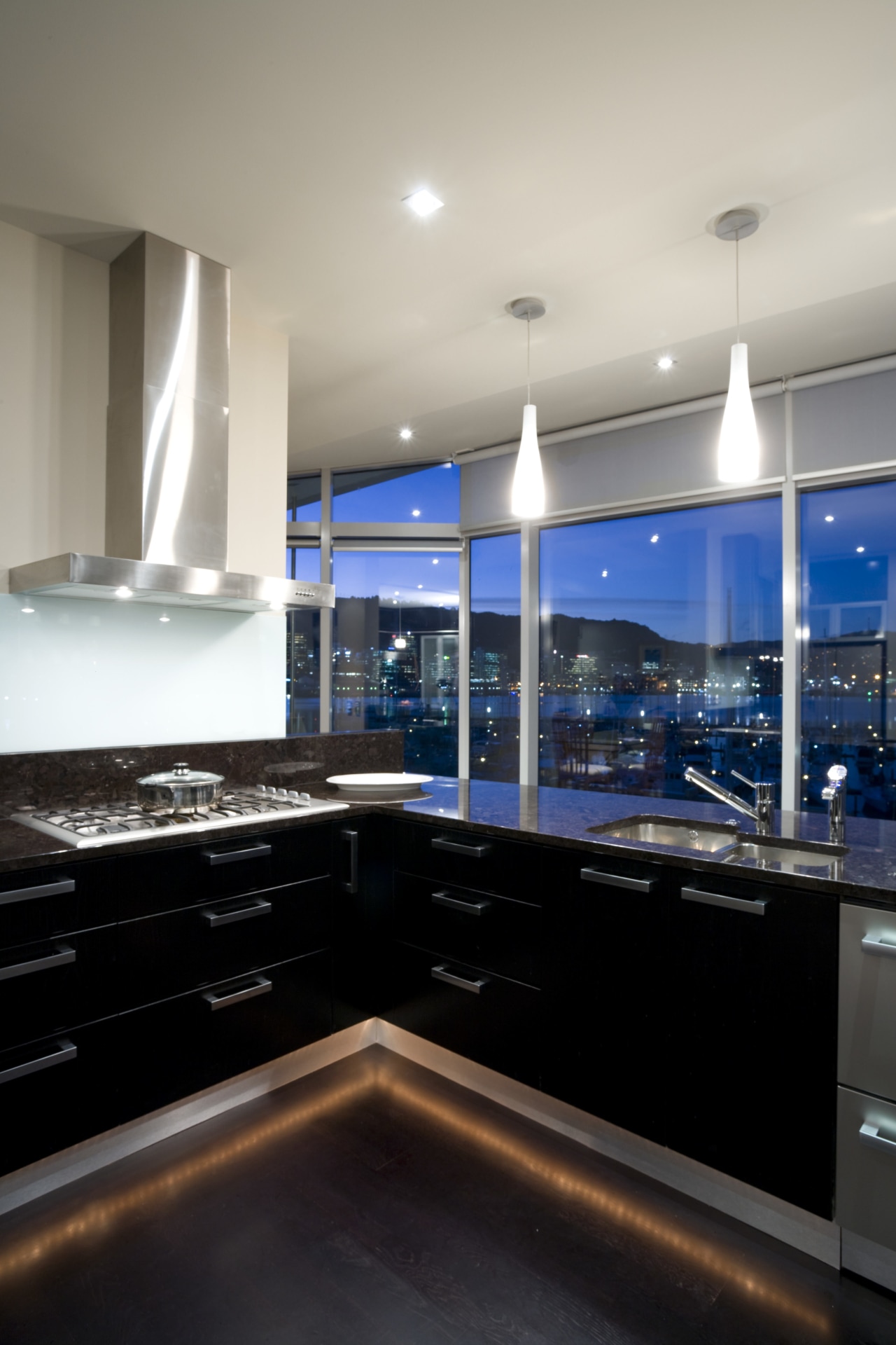
"Given the inner-harbour outlook, and in consultation with colour consultant Michael Nalder, I chose a dark material palette that wouldn't detract from the view," says van der Plas. "The moody, dark chocolate granite on the benchtops and office desk was the starting point. Then I introduced an oak veneer, stained near-black, on most of the under-bench and top cabinetry."

Both these materials have a reflective quality, like the sparkle of harbour lights, while at the same time the dark tones avoid drawing the eye away from the scenery. The designer says the grain of the oak and the patterning in the granite add subtle interest to these surfaces.
Stainless steel and aluminium also feature in the design. Appliances and some benchtops are in stainless steel, while aluminium is used for the glass cabinet frames, all cabinetry handles, the roller doors in the office area, and a movable ladder for accessing the top cabinetry.
"The ladder contributes to the aesthetics, as well as having a practical purpose in the kitchen," says van der Plas. "With the windows running floor to ceiling, I wanted to bring the cabinetry up to the same scale the upper doors reach a height of nearly three metres."

The vertical glass and aluminium cabinetry pieces were also introduced to provide visual breaks from the run of dark veneered facades.
"I created a series of operational areas from the bench at the rear, to the office counter, to a day-to-day prep surface by the oven through to the front granite counters," says the designer. "Stainless steel provides a material link through these different areas, while the layout and wall position mean you can stand anywhere in the room and still appreciate the views."
Lighting brings drama to the kitchen at night. Underlit toekicks give the entire space a floating quality, a little like a nightclub. Horizontally set lighting plays across the cove ceiling, to show off its angled architectural sweep.
Credit list
Architect
Kitchen manufacturer
Cabinetry
Kitchen sink
Splashback
Furniture
Story by: Charles Moxham
Home kitchen bathroom commercial design
Small space, big impact
Classic dovetails contemporary
'Worthy of Architectural Digest'


