Hands on, minds-on
Appealing to both the 'artist kid and the science kid' was part of designer Scott Parker's thinking when creating the colourful new science and technology centre at MOTAT


Designed by Scott Parker, Scott Parker Creative
Backgrounder
MOTAT’s new science and technology centre, Te Puawānanga supports and activates MOTAT’s promise of being ‘the science and technology playground of Aotearoa: hands on, minds-on, discovery for everyone’, underpinned by Te Whāriki (the early childhood curriculum), and aligned with the New Zealand school curriculum.
A large team of staff, contractors and contributors were employed to transform an existing 2200m² building into this landmark visitor experience, with Scott Parker, exhibition and experience designer, leading the design.
Of this place
With an overarching goal to inspire our young people to be the innovators of tomorrow – the core design team confidently shifted away from traditional science centre design to create something unexpected and confidently ‘of this place'.
With many experiences within the space, each one was outlined with a unique objective.
Working with multiple digital providers, animators and illustrators required astute levels of design management, clear succinct communication and also trust.
Each of the unique deliverables needed to align with a bigger design intention so that any visitor would be able to easily and intuitively move from one screen, space, activity or topic onto the next.

Design cues ease learners into complex concepts
Design cues such as colour, fonts and information hierarchy help ease learners into complex scientific and technological concepts.
Te Puawānanga is undoubtedly ‘of this place’, nurturing te ao Māori and paving the way for continued growth and development in the future.
It is an interactive and educational experience for all ages where colour is employed to delineate yet also proves vital in providing manaakitanga (care and support) while achieving kotahitanga (visual cohesion).
Colours were chosen to define and design three distinct exhibition spaces within this building.
Scott Parker and the design team followed cues within the spatial design and elected to use abrupt transitions between hues, for example a blackberry exterior wall meets an earthy orange interior and there is a crisp paint line where the two colours meet.
They identified colour as the most useful tool to align and amalgamate work being designed and built offsite, by multiple contractors and providers, across multiple digital platforms and material substrates
Te Tumu
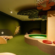
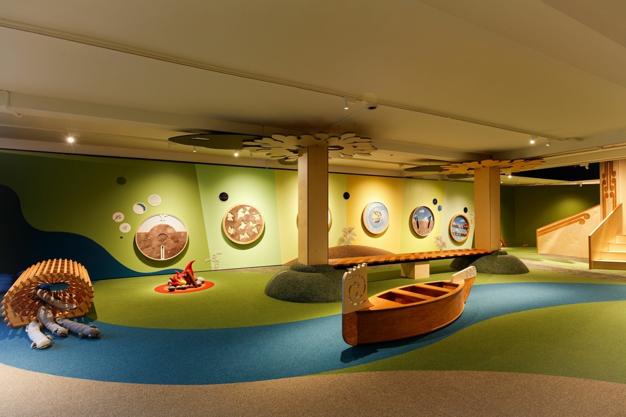
In Te Tumu, the highly tactile indoor playground for under-fives, the team crafted a calm, warm, biophilic colour palette to manaaki and welcome our youngest visitors as they start their journey with MOTAT.
Colour management enabled the harmonious combination of build, paint, print, Autex, timber, fabric, upholstery and flooring substrates.
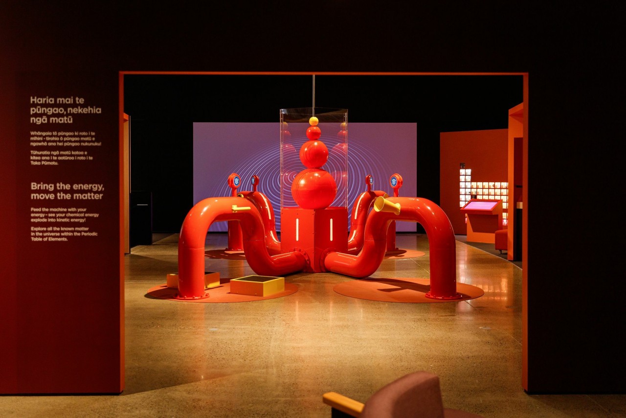
Te Puku
In Te Puku, the colour palette reflected concepts of the belly, gut and heart and they took cues from the architecture and content structure using high-contrast colour to define each of the key zones.
Colour management extends across joinery, print, multiple AV, digital and interactive experiences.

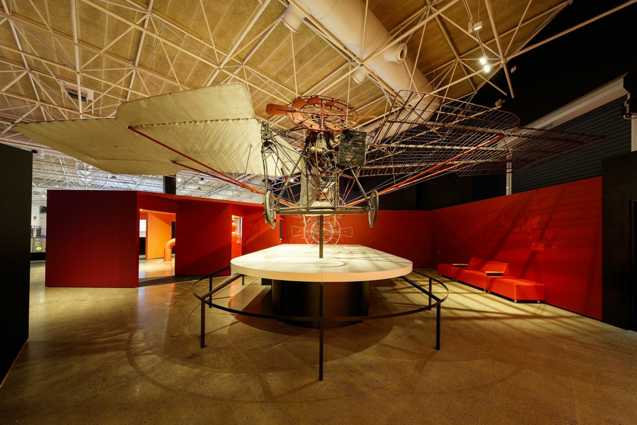
Te Waha
The stark colour scheme in Te Waha is a sharp contrast to the other two spaces, inspired instead by pragmatic mechanical drawings, engineers’ blueprints, and science laboratories.
In this space, colour management extended to substrate choices and enabled a seamless integration of digital and physical components each designed by different designers.

From Scott Parker – Independent 3D Exhibition Designer

With Te Puawānanga we had the luxury of working with such a large blank existing building as part of a bigger site experience.
A lot of other exhibition spaces need to cater to a range of visitors in one environment but with Te Puawānanga we could create unique experiences within the larger building and site.
It meant the design language could shift a lot and keep the visitor guessing what is next.
Early on we knew that colour and materials were going to play a massive part in defining each space both from a visual point of view but also from a tactile one.
Te Tumu takes direct inspiration from the natural environment around MOTAT and steers clear of primary colours whereas Te Puku and Te Waha use dark and light contemporary almost gallery tones and avoids stainless and materials traditionally associated with hands on science centres.
Sight lines & interior architecture
The interior architecture and strong sight lines from one space to another also sets up and reiterates what is happening within each area.
I always try to put people, place and story at the start of any project and Te Puawānanga is a direct outcome of that.
I wanted to look at who the visitor is, where they are from and how we can tell a story that lets them engage with science in a fun and inspirational way.
That may sound a bit curatorial but it really helped find the types of colours and materials to use, what is the lighting like, is there sound and how is the space constructed to encourage interaction between visitors.
I always had this image in the background of the artist kid (probably me to be honest) and the science kid (certainly our subject experts) on a seesaw and how design can sit and appeal to both in the middle.

Vertical rainbow
From a purely design or artistic perspective – a favourite aspect would probably be the vertical rainbow at the entry into the Te Puku space.
I feel like it really pushes how storytelling, sculpture, experience and science can come together and give the visitor something that is innovative and unexpected in a science centre.
I also really enjoyed the mixture of contractors and suppliers on this project.
I come from a hands-on background and I loved seeing the pride and enthusiasm from everyone both from the MOTAT team as well as external suppliers.
Credit list
Project
Designer
Helpful links
Windows and Doors
Cabinetry Hardware
Spas
Home Builder
Roofing
Heating
Flooring
Taps
Kitchen Design
Home Design
Story by: Trendsideas
Home kitchen bathroom commercial design
Eclectic meets elan
Best of both worlds
At home in the country
