Gracious welcome Peterssen/Keller remodel
this home benefits from reworked interiors by Peterssen/Keller
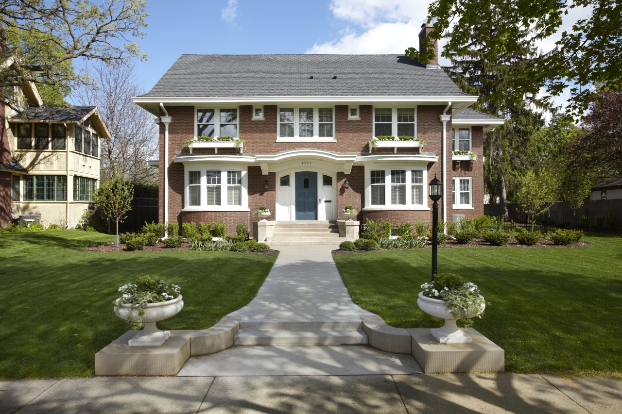
A remodel of a classically styled house often has to address claustrophobic interior layouts, along with under-considered refits. Faced with such hurdles, remodelers typically aim to sweep away clutter, and open up the interiors to let the good bones of the original architecture shine.
On this project, the owners had bought a Georgian house with a view to renovate. The Peterssen/Keller Architecture team of Gabriel Keller, Carl Olson and Lars Peterssen provided the architectural design, with interior design by Linda Engler and Emily Thull of Engler Studio.
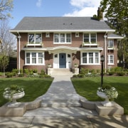
Keller says the house had an attractive, not too ornate exterior and a generous back yard.
"While there was not much that needed to be done to the facade, inside the spaces felt cramped and lacked flow for example, the modest, narrow kitchen was a dead end. Worst of all, an earlier addition on the rear of the home cut off the light and connection to the backyard.
"Perhaps the most overwhelming issue we faced was the dark, oppressive nature of the interiors. The restricted size of the connections between rooms, combined with somber paint tones and woodwork that darkened over time made the heart of the home feel fairly gloomy."
For the remodel, Peterssen/Keller removed the office and porch addition and introduced a new kitchen with an adjacent banquette breakfast area and a separate family room alongside.
"We took out a disused service stair and powder room near the old kitchen and put a large butler's pantry in its place," says Keller. "This expands functionality and storage in the kitchen, and is also perfect for entertaining. Now there's a relaxed circulation around the first floor, from the entry to the living room and kitchen, then back through the butler's pantry to the dining room near the front door."
Peterssen/Keller also added a mud room on the kitchen side of the house, creating a logical access to the back lawn. Next to the living room, an original sunroom was restored. It now incorporates French doors repurposed from the original master bedroom.
Other improvements involved replacing all the floors with stained oak, and introducing broad casements between living spaces to allow the light to penetrate right through the home. Rooms that experience the heaviest day-to-day wear the kitchen, mudroom and sunroom are finished in hard-wearing beadboard.
Bookshelves were added on the landing and some of the stained glass window panes replaced with clear glazing in this area to let in more light, says Carl Olson.
"We repeated existing crown mouldings and other classic detailing in the reworked spaces. And most of the heart of the home is now white, including the central staircase. Darker colors are only seen on surfaces that are often touched, such as the bannister, which is black. With these light-filled rooms, larger cased openings and updated color palette, the look of the home has been completely transformed."
Interior designer Linda Engler says the owners wanted understated rooms with a sense of quiet opulence.
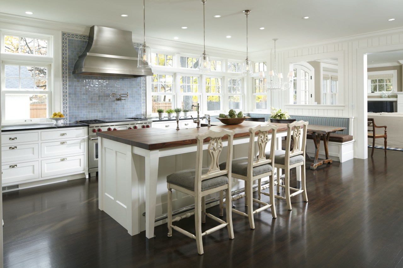
"In the kitchen, the custom range hood and Moroccan tile backsplash form the centerpiece. While the paneled cabinetry has a traditional air, the large hood offers a more contemporary aesthetic. The non-directional stainless steel finish has the lustrous look of pewter."
With the inclusion of a butler's pantry, it was possible to avoid upper cabinets in the kitchen, which would have blocked natural light. The white cabinetry and beadboard walls, along with a solid walnut countertop that acts as a butcher's block, give the kitchen a practical feel. But there are personal touches too, such as cabinet hinges modeled on icebox door clasps and antique posters sourced by the owners.
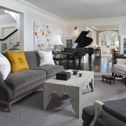
Interiors finishes are an eclectic mix of the traditional and opulent, and the occasionally surprising. A uniform palette of gray, white and turmeric, and a sense of common scale for the furniture draws the rooms together, says Engler.
"In the living room for example, the chairs have classically styled frames but are upholstered in hard-wearing materials. A coffee table with a gesso finish makes a playful counterpoint to the formal seating and grand piano."
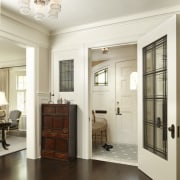
Understated contrast continues in the dining room. Engler custom designed the sideboard that sits beneath the stained glass windows, giving it a whitewash finish to complement the gray wash of the antique Swedish dining chairs. The rawness of these pieces is contrasted by the antique style of the extension table, the strongly patterned drapes, and the chandelier. The room's original light fixture is now in the entry.
The rejuvenated sunroom has also been a hit with the owners and visitors, says Engler.
"We initially drew a floorplan that included more furniture, but having decided it would make an ideal area for reading and reflection, the room now has just two chairs. The concrete tile floor is a departure from the rest of the home, and so is the ceiling. Porch ceilings are often painted pale blue said to keep bees away so I followed this tradition, but made a stronger statement, with a more intense blue."
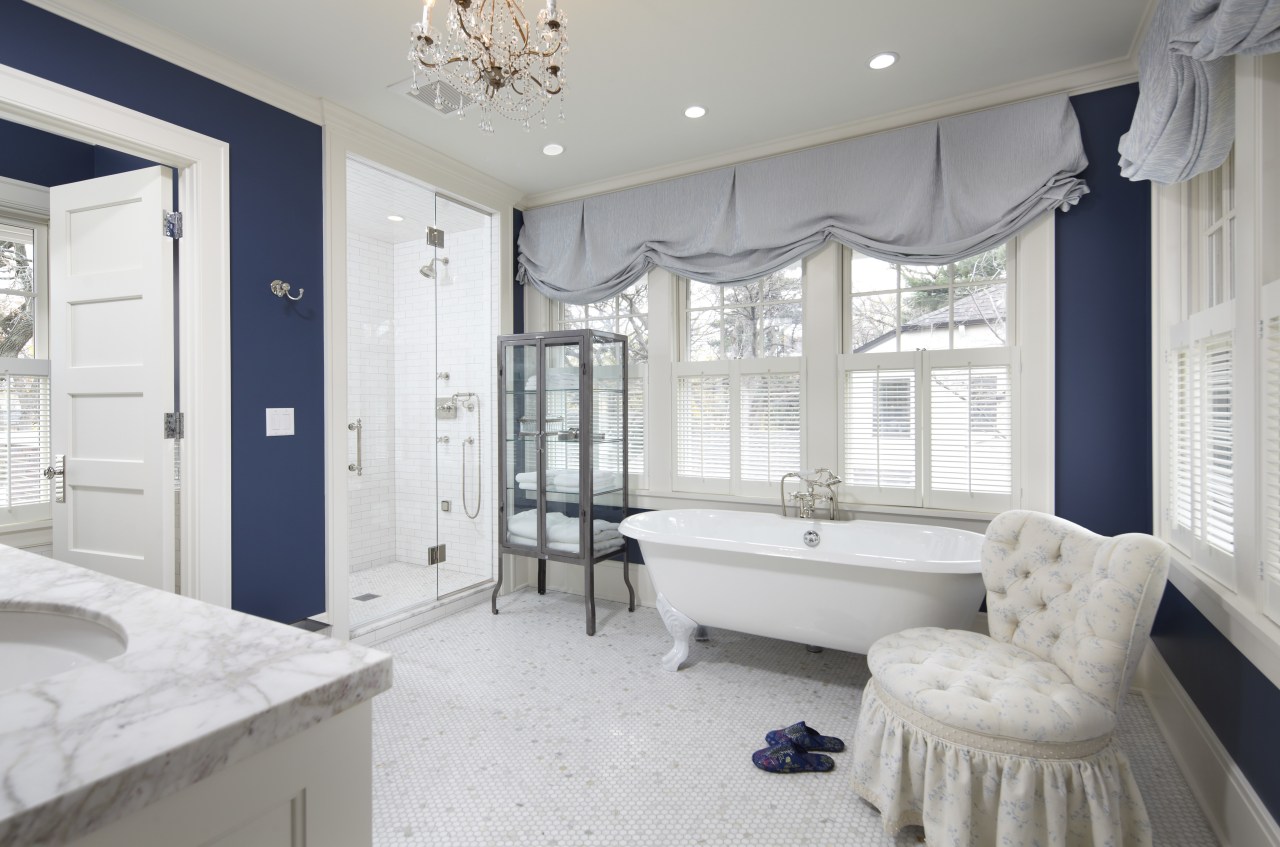
Upstairs, Peterssen/Keller created a spacious new master bathroom off the existing master bedroom, allocating the old bathroom space to walk-in closets.
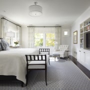
"We removed an open fireplace from the bedroom, allowing us to reorient the space more effectively," says Keller.
"For this master suite, one owner wanted a feminine, floral look and the other, some design punch. We were able to cater to both. The feminine side comes through in the furnishings, rug and drapery, while the bathroom is in a strong, punchy blue. This contrasts with the predominant white of the mosaic floor tiles, the marble countertops and the cabinetry. The chandelier and a clawfoot bath add to the resort-like feel of this space."
Outwardly refined, the house now offers gracious functionality on the inside too, say the owners. Once gloomy spaces are now light, bright and open to the surroundings, and the wall of windows at the rear of the kitchen draws the eye through the home.
"The banquette seating area is a favorite spot for family and friends. Whoever comes into the kitchen seems to automatically gravitate to this inviting corner."
Story by: Trendsideas
Home kitchen bathroom commercial design
US Home & Architectural Trends Vol. 29/11
Home & Architectural Trends highlights great residential architecture. This book provides prospective home builders ...
Read More