Good company
This kitchen has been reinvented by Leonie von Sturmer to better complement a large villa
In many older houses, the original kitchen is a small, utilitarian space. It's not surprising that a remodel of a traditional home often involves redressing inequities of scale and forming closer connections to adjoining living spaces.
This was the scenario when designer Leonie von Sturmer was asked to create a spacious new kitchen for a gracious old villa. The existing kitchen was small, with limited storage and an over-emphasis on rimu, says von Sturmer.
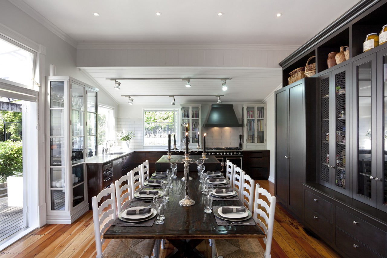
"To create a more generous volume and improve storage, we closed off an adjacent hall. We then placed a large dresser-style cabinet with cupboards, an integrated refrigerator and freezer in the newfound wall space. This piece provides a furniture-like transition between the kitchen and the informal dining room."
To the rear of the space, a laundry separated from the kitchen by a porch was appropriated into the design as a walk-in pantry.
"Although the owners said they wanted a country-kitchen aesthetic, I felt the size of the home called for something grand so the design has a refined, yet slightly rustic appeal," says von Sturmer. "The weathered and waxed wood on the existing table provided inspiration for the worked finishes of both the under-counter cabinets and the butcher's block. For balance, white, glass-fronted cabinetry above the counters has a lighter look."
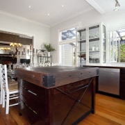
The centrepiece of the new kitchen is the substantial butcher's block. This is positioned within easy reach of other work surfaces and furthers the refined-rustic charm.
"The block and low cabinets are in torrefied ash," says von Sturmer. "Torrefaction removes moisture from the wood, enhancing the grain, and darkening its tone. The main advantage is that, unlike staining, the change in character runs right through the timber. Any chips or cuts remain true to the colour of the exterior wood."
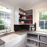
A subway-tile splashback, large rangehood and a farmhouse sink in the scullery all add to the provincial appeal. The mesh front on the dresser also contributes a country accent.
"The key to improving connections was simple we turned the dining table around," says von Sturmer. "To further optimise flow, we took out a small penninsular element that had obstructed the French doors. In its place, there is a tall, set-back glass-fronted cabinet that balances the height of the dresser opposite."
Story by: Trendsideas
Home kitchen bathroom commercial design
Curvaceous and connected
With deep affection
Radical yet respectful


