Future-proofed office in green gateway building with curved glass facade
Ricoh office building renovation and extension by Warren and Mahoney Architects with new central staircase, sustainable design initiatives

A gateway location is the perfect high-profile position for a business. But the prominence of the site also imposes a certain responsibility on the architectural design team, which has an opportunity to help shape a city.
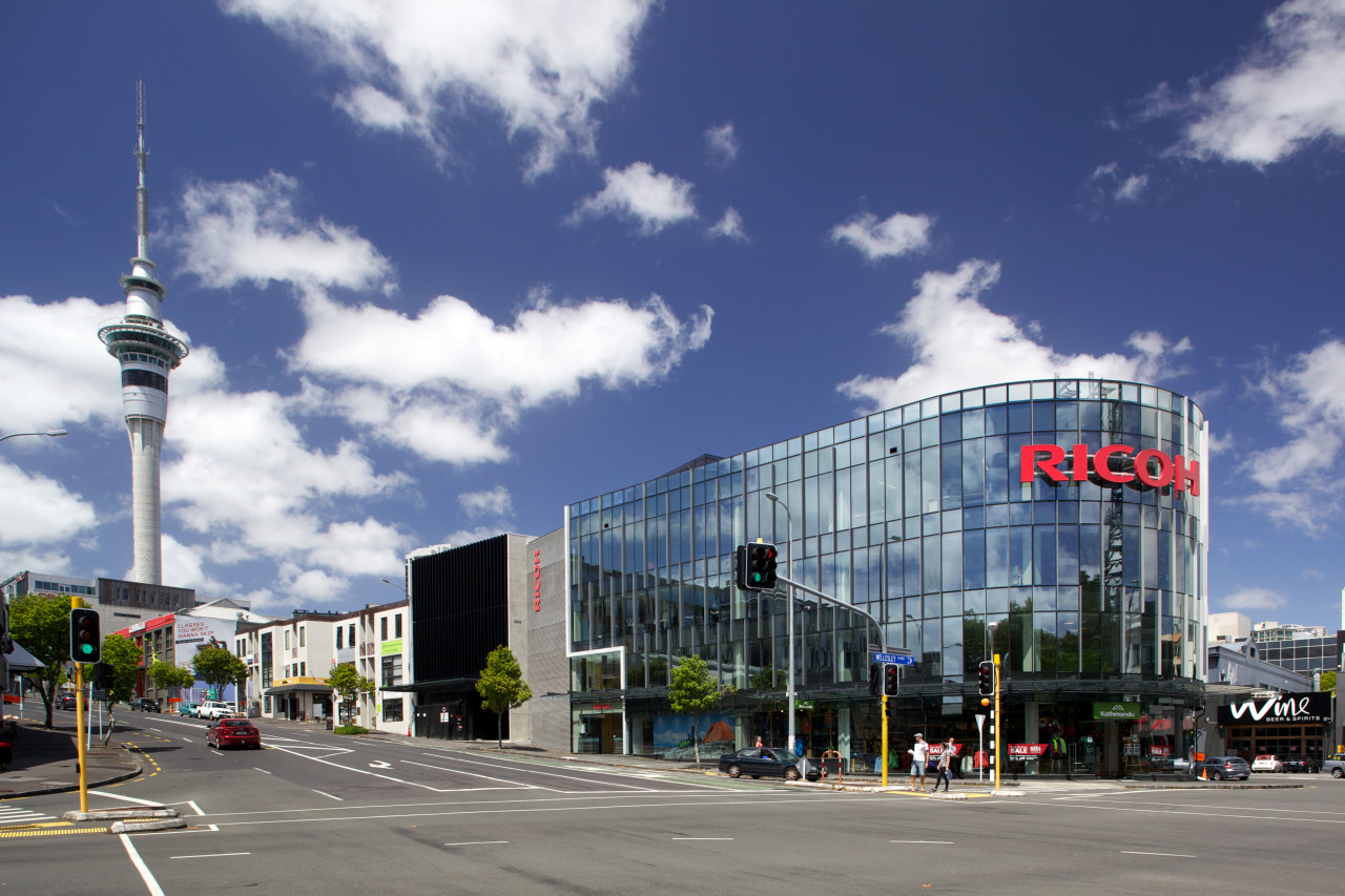
The Ricoh building, on the apex of Wellesley and Victoria Streets in Auckland, was such a project.
Design architect Shannon Joe of Warren and Mahoney Architects says the 1980s building was initially redesigned for Mainzeal, but completed only to the end of the first stage when that company went into receivership. That stage saw the original building facade removed, the interior gutted, floors levelled, the roof removed and two new floors added. More recently, the second stage was completed for the new owner Russell Property Group, with interiors designed for Ricoh by Hauraki Design, and all construction by Dominion Interiors.
"The original client wanted something quite courageous that would maximise the site's high exposure," Joe says. "We envisaged a fully double-glazed, curved facade, with low-e, low-iron glass that would provide an inviting transparency, and literally reflect the changing atmospheric conditions of the city the passing clouds, the blue sky. But the site is quite large and the sheer bulk of such a building occupying the entire site was a concern. We felt it could be too much for an iconic building the massing would be out of context.
"So we chose to accentuate three-quarters of the site with the multifaceted glass facade, which addresses the two key street frontages and provides a strong corner gesture."
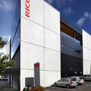
Joe says the other quarter of the site, completed in Stage 2, is a more textural design response in keeping with the infill building typology along the street. At the boundary points, a precast concrete blade wall appears to slice through the building, providing a bold vertical element.
"The site is located within the Victoria Quarter Plan, and is classed as a gateway building, which must have a strong vertical emphasis. The mullions in the facade were not enough on their own. The wrapping of the curve could have made this a rather horizontal building. So we added aluminium fins to reinforce the vertical grain and provide a sense of animation. We echoed this with black fins on the second stage.
"The entire building is highly legible, with this section having crisp and simple detailing. It also incorporates a new timber terrace that appears to have been punched out of the concrete wall. This looks back to the CBD and the Sky Tower."

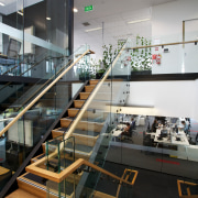
On the interior, the original building's rabbit warren of small rooms has been replaced with large open-plan floorplates. The centre of the building was opened up and a new timber staircase added, with clerestory windows above flooding the space with natural light.
Sustainability was a key driver for Ricoh, in terms of both the base building and fit-out the building is in the process of gaining 5 Star Green Star Design and Built certification. Managing director Mike Pollok says the move had been on the cards for quite a while, and Ricoh wanted to make sure it was done properly.
"We've future-proofed our business, just as we are doing for our clients. The remodelled building has more space, more sunlight, and is less expensive to run it uses only one-third of the energy required by the original building."
The redesign was also about consolidating staff from three different locations and creating a new, vibrant workplace that would be a showpiece for the company's innovative business solutions.
Interior designer David Evans of Hauraki Design says it made sense from a sustainable viewpoint to retain items from the original fit-out wherever possible, but it was essential to stamp the Ricoh identity on the office.
"Ricoh needed a transparent, open office that would reflect the way the business operates, so we introduced a lot of frameless glass walls. On the executive floor you can see through the perimeter offices to the view beyond. To ensure privacy in the presentation room on the client floor, we added a print of grass to the glass walls.
"The Ricoh business is also referenced in large murals that depict a variety of high-quality photographic images printed by Ricoh. This was a way for us to introduce colour to the office, which formerly had a sterile black and white fit-out. And the images reflect the company's green focus."
Evans says increased opportunities for staff interaction and informal meeting areas were another key part of the client brief.

The central staircase, casual seating areas and a cafe-breakout area on Level 2 help to address this.
Flexibility is also provided in the layout. The presentation room on the client floor Level 1 has large sliding doors that can open up the space to the entire room for large gatherings.
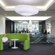
Curved green sofas aid the circulation flow on this floor and the executive floor, which is Level 3. They also add a pop of colour that complements the corporate red of the Ricoh signage.
"We introduced a lot of green, just as we have in Ricoh fit-outs throughout the country," says Evans. "It provides another link with sustainability."
In keeping with the eco-friendly requirements, the building has an advanced building management system that allows Ricoh staff to monitor their own impact on the building and environment. CO2 monitors in the meeting rooms automatically adjust the airflow to keep the environment healthy and staff alert.
Other sustainable initiatives include rainwater harvesting for toilet flushing, perimeter lighting that dims when natural light increases, sensor-controlled lighting, solar panels, and a sophisticated stormwater system that slows the rate of flow into the public system.
Credit list
Project
Interior designer
Project manager
Green Star consultant
Service co-ordination and commissioning agent
Fire-rated windows
Suspended ceilings
Joinery fittings
Plants
Security
Architect
Property developer
Structural engineer
Construction and fit-out company
Precast concrete supply
Metal decking
Aluminium composite panels
Glazing
Furniture
Signage
Photo-canvas art
Story by: Colleen Hawkes
Home kitchen bathroom commercial design
With deep affection
Sculptural centrepiece
Radical yet respectful
Commercial Design Trends Vol. 31/3
Commercial Design Trends is aimed at our professional readers, and showcases commercial buildings. The book features reg...
Read More


