Front to back new house by designer Jane Agnew
Interior designer Jane Agnew's own home

While the concept of the terrace house has been around for centuries, the idea of such a home having an open floor plan is relatively new.
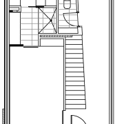
This freestanding house, designed by owner Jane Agnew of Agnew Interiors, is not technically a terrace house, but it does have a similar footprint on a long, narrow building site. And it was the site restrictions that posed the greatest challenge for the designer.
"The block is the last one in a row that was developed on former industrial land," says Agnew. "At 230m², the site was always going to be tight and it was clear the space would need to be maximised, both inside and out."
The designer says she did not want to reinterpret traditional terrace architecture. Rather, she wanted a very contemporary, streamlined design.
"However, I did want to incorporate an old drystacked stone wall along one boundary, which dates back to the 1890s," she says. "There was an opportunity to contrast the very old with the very new. In particular, I wanted a clean massing of streamlined materials that would create a sharp, minimal look."
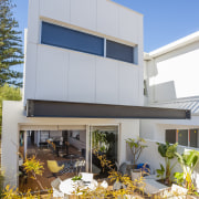
Black and white, a signature colour combination for the designer, defines the front facade.

"The upper level appears as a black box that protrudes out over the entry. In fact, the entire top level has been stretched at both ends to maximise floor space at the rear it cantilevers over the terrace to provide welcome shade."
Agnew says creating a transparency through the house was also essential, to provide views of a park over the road, and to draw the eye through the house in the other direction. To this end, she introduced tall windows beside the front door, that allow a view right through the house to the landscaped garden at the rear.
"There are also sliding doors to the office at the front of the house, which opens off the kitchen-living area. When these are open, there are views back to the park. Rooms come off wide circulation areas, rather than hallways, which not only saves space, but also opens up the house to the views and natural light."
To provide a sense of openness and space in the main living area, Agnew introduced a wide opening at the side, with sliding glass doors. These open onto a long, narrow lily pond and a decorative black powdercoated steel privacy screen.
"The screen is laser cut with a pattern resembling a Manchurian pear tree," the designer says. "It allows lovely filtered light to shine through, and provides glimpses of the limestone wall behind."
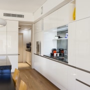
"A smoky mirrored glass splashback and matching front to the island reflect the screen and the natural light. These things make a huge difference to a small space," says Agnew.

In keeping with her desire for a simple palette of materials, the designer specified Brazilian stone for the benchtops and high-gloss white lacquered cabinets that also help to reflect light.
"I chose to have one lovely appliance on display the Gaggenau oven and integrated the rest with the cabinets."
However, bright colour accents do make an appearance. Agnew teamed charcoal-grey Italian sofas with a chartreuse chair and a colourful patterned rug with velvet cushions to match. Collected artwork and two brightly painted interior doors also enliven the interior.
"I wanted the outdoors to make a strong visual statement as well, so I chose a bright fuchsia pink shade for a wall at the rear," the designer says. "This gives the landscape a focal point and helps to draw the eye to the outdoors."
Story by: Trendsideas
Home kitchen bathroom commercial design
Sculptural centrepiece
Radical yet respectful
Curvaceous and connected


