Face to face
This apartment packs a punch with whimsical pop-art decor and a small galley kitchen

Good things come in small packages, or so the saying goes. And when it comes to kitchen design, there is no doubt that a small apartment can sharpen the most creative minds.
This show unit was designed for a new apartment building. Interior designer Hilary Loh of 2nd Edition says the apartments are just 187sq ft, and designed to appeal to fashion-savvy young urbanites.
"The building is located in an area that attracts a mix of trend-setting young professionals," she says. "Consequently, the apartment features bold graphics that reflect the high-fashion, high-tech interests of the niche market."

Loh says the open-plan living area, which incorporates the kitchen, was designed to work as one large entertaining space. A suspended breakfast bar, which doubles as a serving bar and work table, is fixed to a clear glass base. As well as making the room look more spacious and allowing a direct view into the kitchen, the glass base makes the bar appear to be floating.
A large mirrored accent wall features graphics based on faces a theme that reappears in the furnishings. Similarly, there is a circle theme that is repeated on rugs and walls.
"The mirrored circles provide visual interest on the wall," says Loh. "They also reflect the lush greenery that frames the balcony on the opposite side."

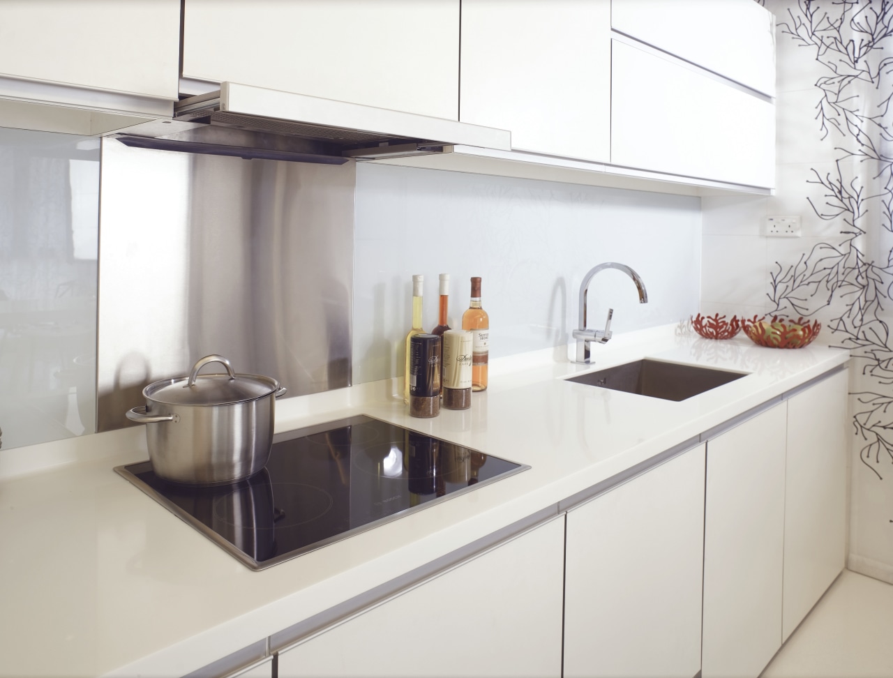
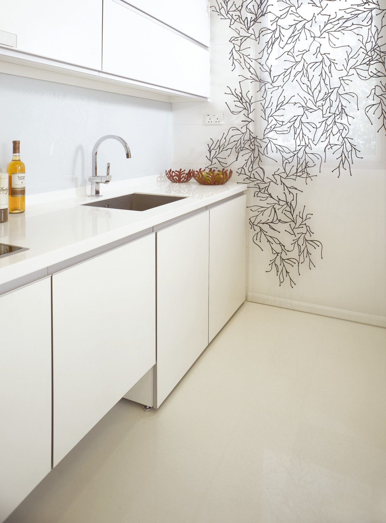
The kitchen cabinetry was designed to fulfill a similar visual role. Cantilevered from the wall, with a gap top and bottom, the cabinetry takes on a sculptural form.
"The unit appears to be floating," says Loh. "At nearly 12ft long, the cabinetry could have looked very heavy. Raising the unit above the floor helps to minimize its size. Maintaining a simple, single drawer front provides a very sleek, clean finish"
The cabinets provide storage solutions that make best use of the space. Drawers within drawers were specified to avoid extra horizontal lines on the cabinetry.
Story by: Trendsideas
Home kitchen bathroom commercial design
Radical yet respectful
Sculptural centrepiece
Vibrant spiral stairs improve penthouse connections


