Design studio with long timber spine to separate private and public areas of the office
Gaze office and design studio has retro feel, with dark-stained timber spine, fire station door, arcade machines, vintage furniture
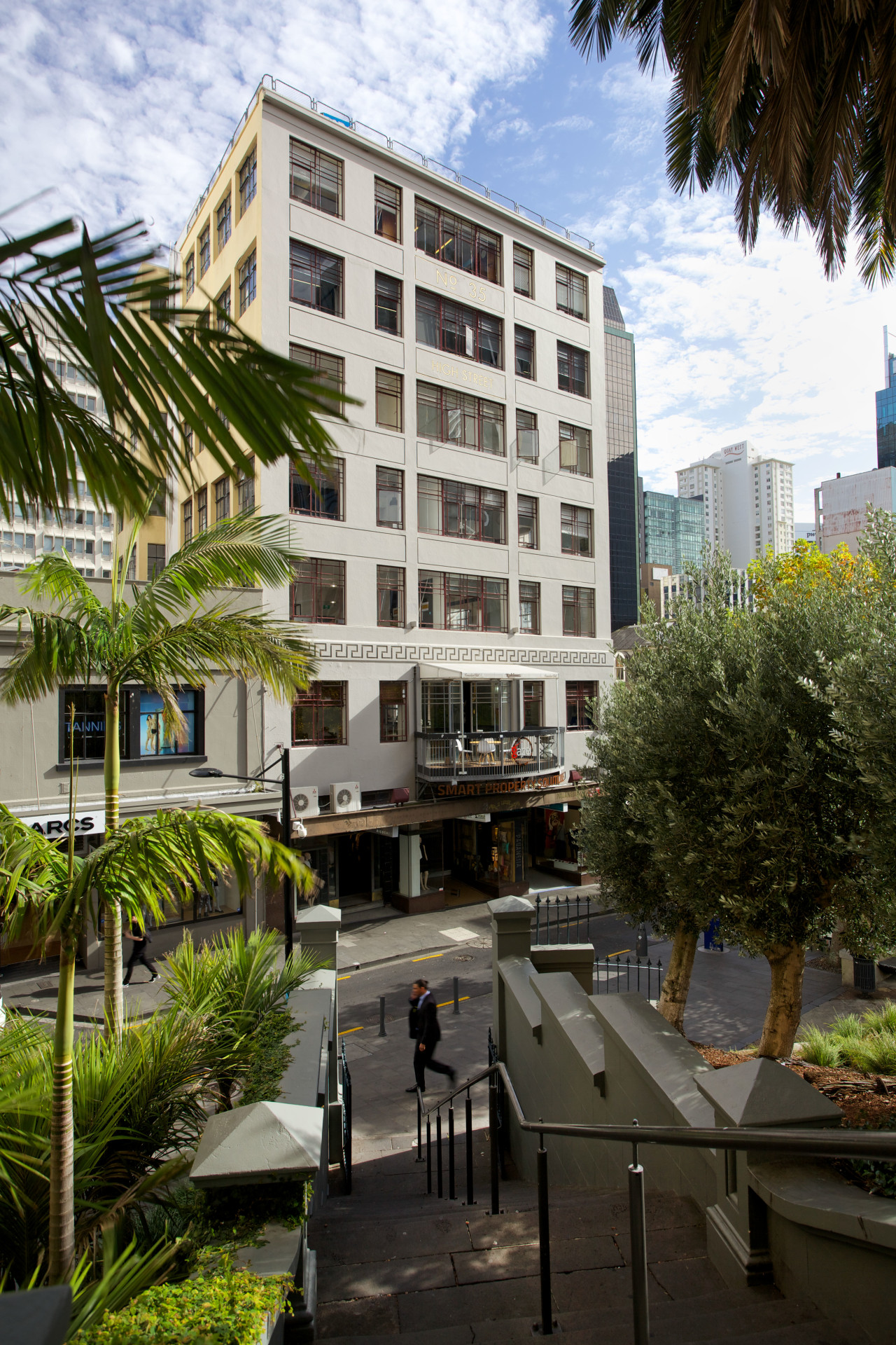
Just one look that's all it took to convince the new tenant of this office space that it was the right choice for a design studio.
Interior architect Siavash Momeny of Gaze says the 1930s building had good bones, with solid concrete beams and columns, steel windows and an Art Deco influence. The location, in High Street, Auckland, was also a plus it was central and the tenancy provided an attractive view of a park from an existing balcony.
"The space was familiar to many Aucklanders, being a former bar, plus there was a collection of small offices," Momeny says. "While we needed to gut the entire interior, we wanted to keep the integrity of the concrete slabs and walls intact. These were stripped back to expose the raw concrete. The floors were then polished and sealed, and because we wanted to respect what went before, even old paint marks were left in place."
The designer says it was important to create a warm, welcoming interior where people could feel connected and part of a team.
"Staff needed to be screened off from reception, yet still visible. And the reception desk itself had to be integrated with the work area, rather than a separate area. At 300m², the office is not huge, and we wanted to maximise the space."
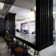
To organise the office, the design team created a dark-stained, rough-sawn timber spine that separates the work area from the public spaces and also has a practical role.
"The spine is the first point of contact for visitors, so it doubles as a reception counter," Momeny says. "It extends to enclose an alcove that can be used for a meeting area, then changes height to create a leaner for casual meetings and brainstorming, and finally forms a backdrop to the client lounge. But while the spine is a barrier, it's also highly functional you can work on it, lean on it, or drop things on it.
"The spine gives privacy for the studio, yet still provides transparency and allows access between the two spaces. And the open nature of the office encourages informal discussions and social interaction, which is invaluable."
Exposed nuts and bolts and vintage solid steel adjustable supports are other key features of the spine that enhance the distinctive retro feel of the office.
"Right from the outset we wanted the interior to read as a very different space from the outside," says the designer. "We wanted to give it a themed, almost theatrical presence."
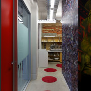
Bold graphics and artworks feature throughout the office and include a colourful mural that wraps around a corner of the office disguising a door to the staff kitchen. Two vintage Daytona arcade machines add further colour and provide a fun time-out activity for workers.
"We also introduced a small meeting area to a spare corner. This was designed to resemble a classic train cabin, complete with a video playing in the window' showing the passing scenery. It enhances the temporary nature of the space when you sit there, it feels as though you are just passing through. It's another little bit of nostalgia."

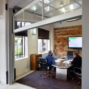
The boardroom is positioned at the front end of the office, near the balcony. A plastered wall within the room was stripped back to expose existing brickwork, giving the space a strong textural backdrop. An antique dyed Persian carpet adds further texture, and helps with acoustic insulation. Vintage furniture pieces reinforce the retro feel of the office.
"We had a little fun with this space also, adding a large fire station rolling door," says Momeny. "This gives us flexibility in terms of the way we use the room. The door can be closed for private meetings and pulled up on a Friday night to create one large open space for social gatherings.
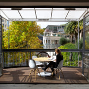
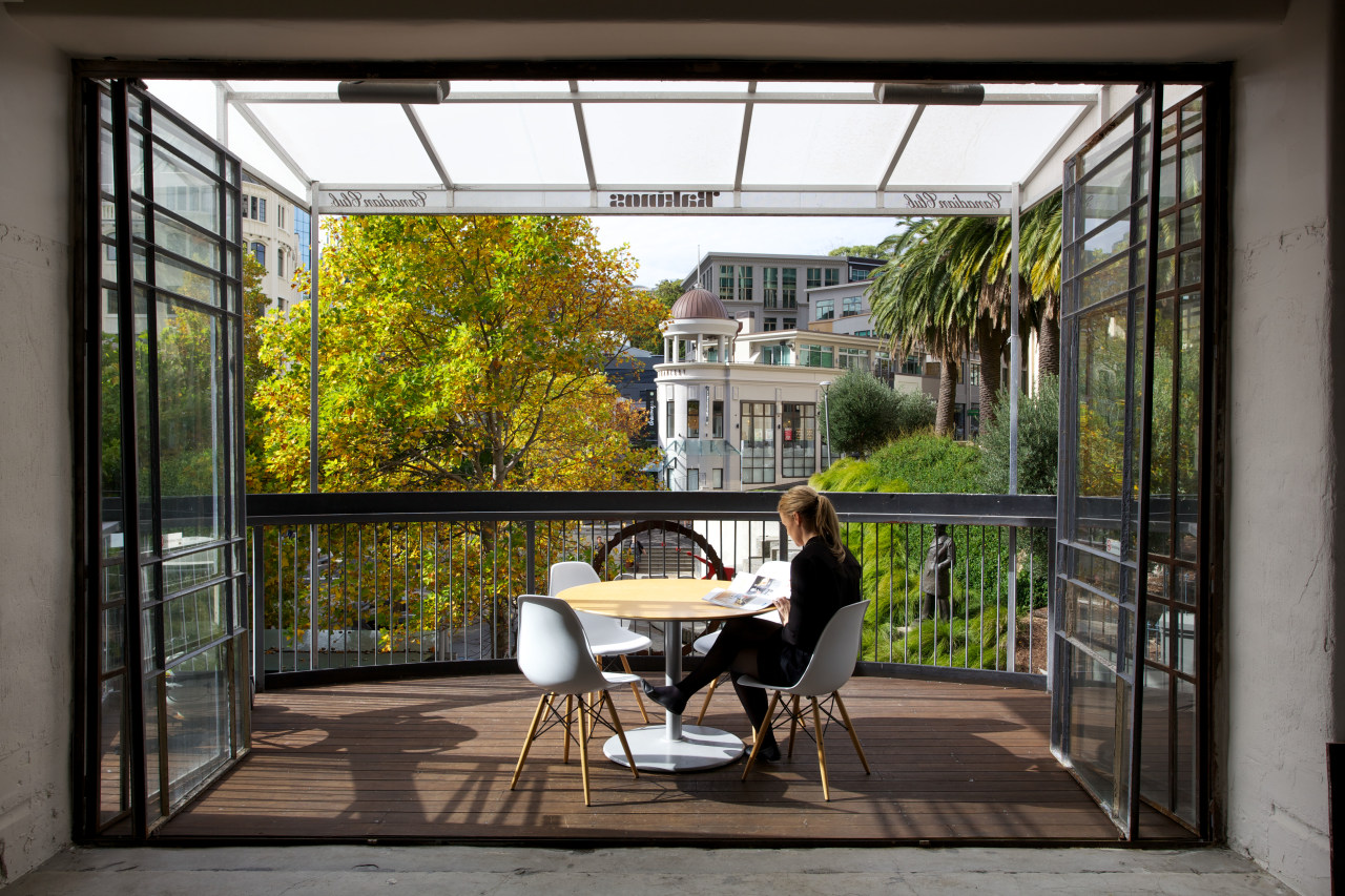
"The balcony forms part of this social space. It has a glazed roof so it is sheltered and sunny in the mornings, and of course the outlook is very pleasant. The large steel-framed doors to the balcony were existing, and work well with the other raw materials."
Momeny says the building is ventilated by fresh air through open windows, and because of the solid structure, no heating is required in the winter.
Owner David Gaze says the office more than meets the company's own brief.
"We wanted to ensure the office interior didn't offend propective clients, who range from barristers to advertising executives, and from developers to real estate agents. I believe we have well and truly met our goal the office emphasises a fun staff culture of work hard, play hard, while also being low maintenance and economical."
Credit list
Story by: Colleen Hawkes
Photography by: Jamie Cobel
Home kitchen bathroom commercial design
Commercial Design Trends Vol. 31/9
Commercial Design Trends is aimed at our professional readers, and showcases commercial buildings. The book features reg...
Read More

