Dark Victorian cottage transformed into light-filled home
The owner/architect of this once damp, dilapidated cottage transformed it into a flowing and uplifting home
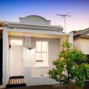
Architect: Apparte Studio About the project (text supplied): A cramped, dark and damp Victorian cottage is transformed into a light-filled, flowing and uplifting home, while referencing original features of the house. The project is unique in that the architect was also its builder and joiner, so this provided the opportunity to test out ambitious ideas and their consequence during construction. One of the special aspects about this project is the play of contrasts between the modest facade and what lies inside. Like a veil of camouflage, the front gives nothing away of its contents and remains perfectly anonymous.
Brief
This was an investment project for the studio so we set a hypothetical brief as follows. How might a professional couple live comfortably inside a formerly tight and dingy Victorian of 60m²? To add to the challenge, an extension was out of the question due to budget constraints, so all changes had to be made inside the existing envelope.
Plan
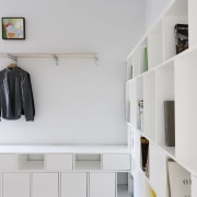
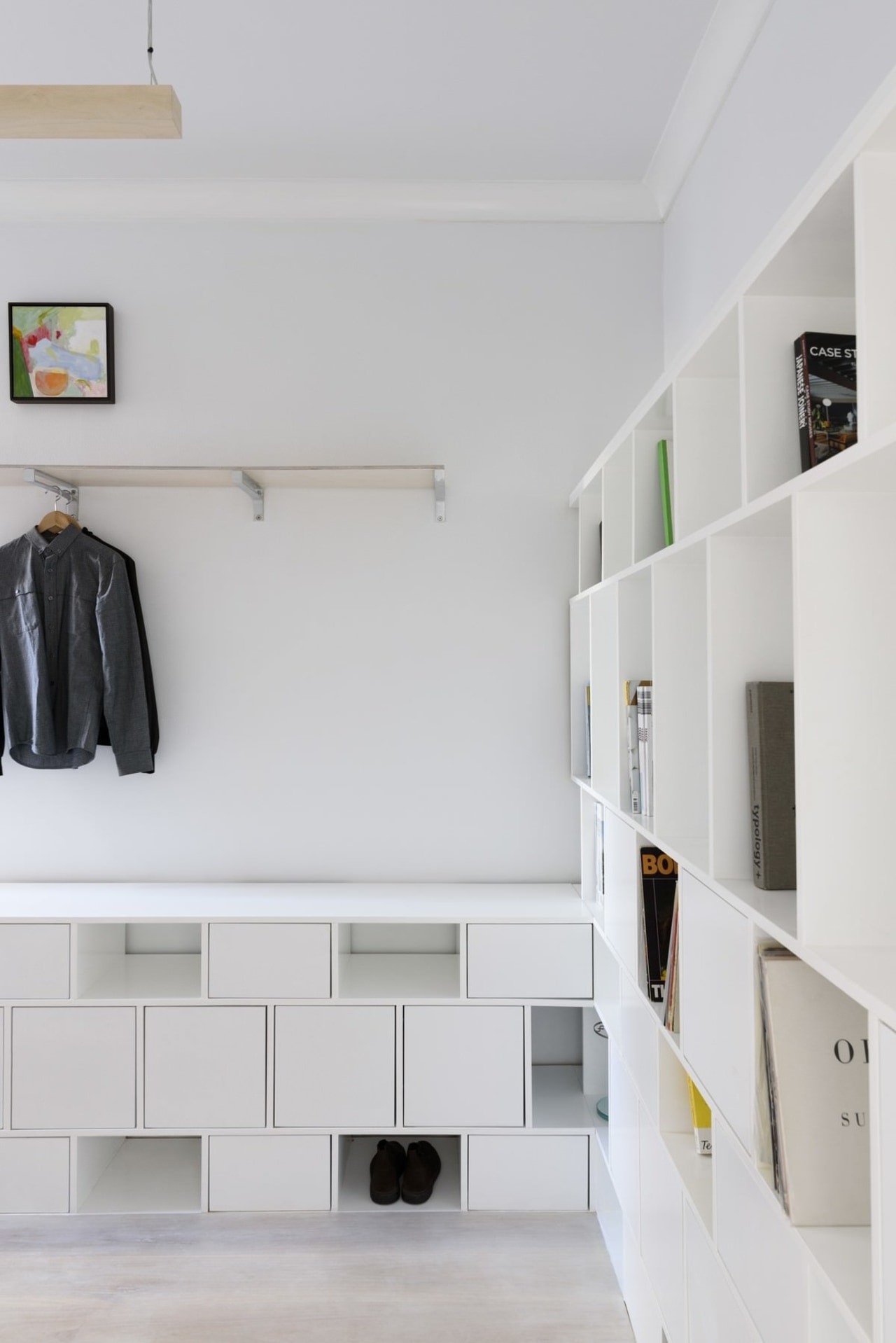
We felt a couple would only need one dedicated bedroom so the front room could be incorporated into the hallway and become a flexible and open living space. On the occasion that guests stay over, a curtain can be pulled across to 'wall' off a spare room.
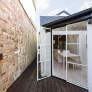
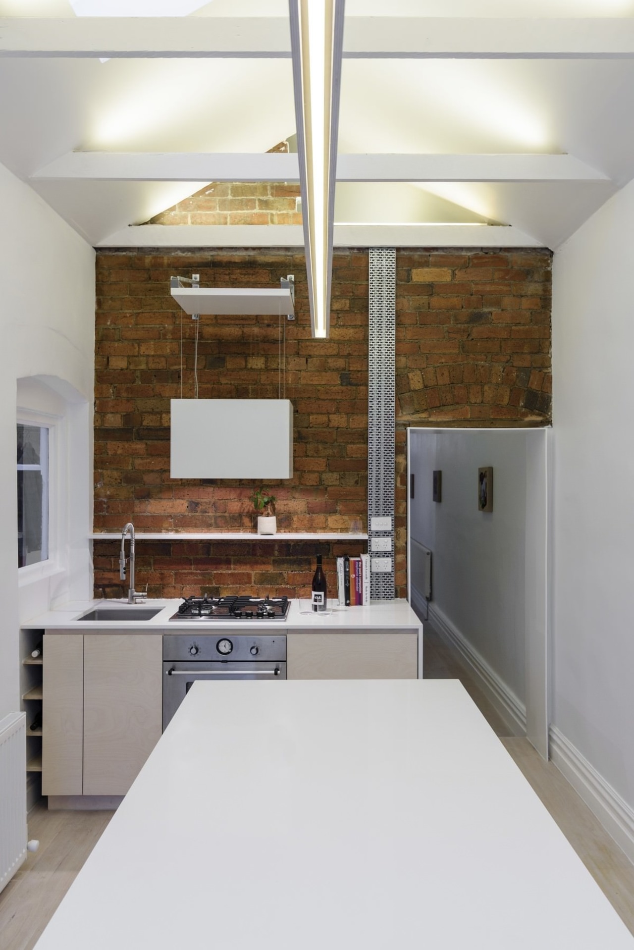
The kitchen was reconfigured to include a generous island for ease of circulation and encourage shared cooking. The dining area extends out from the island bench and provides a seamless transition to the courtyard.
Section
While we couldn't increase the square meterage of the house, we could add to the volume and feeling of space. We did this by lifting the ceiling to the line of the original rafters which created the opportunity to light the house indirectly by placing LED strips atop the newly exposed ceiling joists. In addition, a little quirk can be seen on the brick wall in the kitchen, where we punched a hole through at the top to add a further connection between front and back, while also providing an access point to the attic floor.
This connection can be felt when the light from LED's running around the bedroom perimeter are switched on. Light There are no downlights in this project and the entire house is lit indirectly with energy efficient LED strip lights shining up at the ceiling and reflecting back a comfortable warm glow.
Where task lights were needed in the kitchen and bathroom, we made custom linear pendants which complement the linear theme of the house. In the bedroom we flipped this pendant upside down to create an uplight which provides a softly lit ceiling ' perfect for making the transition into night. In the bathroom there are a number of lighting options.
During the day natural light shines down the rear wall where a skylight was cut-out over the shower. After dark, aside from the custom pendant, the shower screen can be lit, which has been fitted with an LED strip along its top edge and provides just enough light to use the bathroom in the middle of the night.
White translucent multi cell polycarbonate has been fitted to the entire roof section covering the dining area, providing enough natural light to illuminate the back half of the house well after the neighbours have turned on their lights.
Story by: David Renwick
Home kitchen bathroom commercial design
'Hygge' in the highlands
Playing with blocks
Holidaying at home


