Command central
A busy family gets a new kitchen by Toni Roberts
Undertaking a renovation project is a good way to address issues surrounding functionality within a home, especially for a growing family.
Kitchen designer Toni Roberts, principal of Kitchen Architecture, was asked to devise a kitchen that would easily accommodate the daily requirements of a family with three sports-mad boys, as well as sail through large-group entertaining.
The project included an extension to the house that would comprise a new kitchen and living area and which flowed seamlessly to an outdoor entertaining area.
"With the boys involved in cricket and rugby, it is not unusual for the whole team to descend on the home for post-game dinners or barbecues, so the new kitchen and living areas needed to be durable as well as capable of accommodating large numbers," Roberts says.
Focusing on practicalities, she anchored the design around an island that would provide ample preparation and serving space.
"Using a 3D modelling tool to render and develop the design, the island was conceived as layered planes of stainless steel and wood," says the designer.
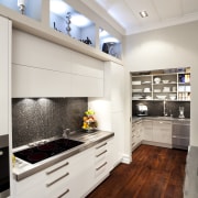
"The stainless steel bench with integrated sink defines the practical, working side of the kitchen, while the warm timber top is appropriate on the living area side."
An 80mm timber core penetrates the entire depth of the island creating a negative detail element, which has been mirrored on the sides of the perimeter cabinetry.
"To help brace the timber element, I included a vertical plane, which has the bonus of forming another durable surface against which a stray rugby boot may kick," says Roberts.
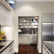
Both the wood and stainless steel act as counterpoints to the neutral base palette of the walls and cabinetry, which continues into the adjoining scullery.
"The generously sized scullery provides extra storage and allows for small appliances to be discreetly hidden. Its additional preparation and clean-up zones make it invaluable," says Roberts.
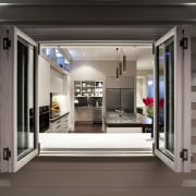
Ample storage was central to the design. Drawers in which to store crockery and other essentials are positioned beneath the servery-style window, for easy access to the outdoor areas. On the end wall, floor-to-ceiling storage provides myriad options, keeping a range of pieces on hand.

Another integral part to the space is the office hub, which is located on the periphery of the kitchen area.
"When considering the layout and design of the space, the first thing I did was analyse the organisational needs and daily routines of the family. In recognition of the value of the home planning role, a dedicated hub was developed. Here, the telephone, laptop, printer and all kinds of notices and notes are purposely housed to keep things in order," says the designer.
Aesthetically, the hub has been designed to complement and blend with the kitchen. The desk area is set at the same height as the adjacent benches and the thin-over-thick layering seen on the island has been repeated.
"It's about maximising the potential of the space, both aesthetically and functionally, to meet the need for a contemporary solution that allows for independent operation when all the family is in the kitchen together," says Roberts.
Story by: Trendsideas
Home kitchen bathroom commercial design
Light-hearted by the sea
Surface attraction
In tune with the land


