Colour counsel
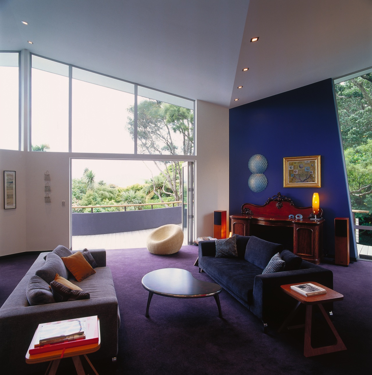
Increasingly, colour is used to complement the natural look of marble, timber and stone
As we become more aware of green design choices, we're seeking a look that will work for decades to come. That's the view of architect John Mills, who detects a move towards designs and materials that will stay the distance.
"We're looking at quality, with a corresponding increase in the use of natural materials like marble, steel and stone in our homes," he says. "People are not just looking at colours in isolation they're considering how they might look next to a metal like copper, which develops a patina over time, or a richly grained timber."
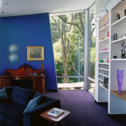
Translated into colours, that means complex neutrals and cool shades such as marine hues, blues and greys are becoming popular. However, safe choices are routinely challenged by Mills, who encourages his clients to be more adventurous in their colour choices. That may mean steering someone towards darker and more saturated colours, or even towards a lighter palette if the client hasn't considered that option.
"That way, I can draw out their personalities," he says. "Typically, clients will come back to me in two or three years' time and say how pleased they are that I pushed them on a particular colour choice. They can see that the colour makes them feel good and helps to restore their spirit."
For anyone undecided about the exact hue for their home, Mills advises checking out colour options at sunset, when people are likely to be relaxing after work or entertaining friends and want their home to look its best.
It's a test he carries out with his own clients. Having agreed most of the colour scheme, Mills will leave a couple of important feature walls until last and do a few test panels in the early evening, when the sun warms the colours up.

"The darker, cooler colours work really well then, as they tend to have more character and personality," he says. "In my view, colour should make an individual statement it should be something special, with energy and excitement."
Story by: Trendsideas
Home kitchen bathroom commercial design


