Classic outside – lux modern inside
Around the corner from London's Hyde Park, two upmarket townhouse front doors open to a combined, transformed lux interior

Interior architecture and design by Knof Design
From the designer:
Knof Design, an international design practice founded by Susan Knof and based in Miami Beach, has just completed a major London commission – the unification of two separate townhouses near Hyde Park to create a single 700m² family home.
Retaining only the façade and demolishing and rebuilding the rest of the property from scratch, the new super-luxe residence has retained all its original external period elements, including both original entrances, preserved to maintain the properties’ historic wedding cake frontage, while a brand new, spacious and modern home now sits just inside.

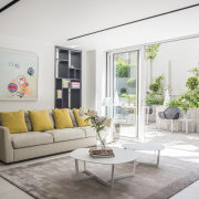
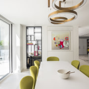
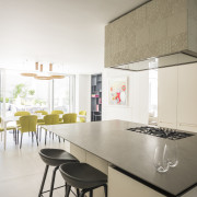
The new interior boasts two grand staircase lobbies; a full-service lift; formal open living, lounge, and dining rooms with built-in onyx bar; a wine cellar; a black-out cinema room; five bedrooms with en suite bathrooms and dressing areas; a children’s playroom; kitchen, family dining room and study area; a newly-excavated utility basement and an increased sunken outdoor area.
"The homeowners are a London-based international family who purchased one original property in 2009", Susan Knof, Creative Director and Founder of KNOF Design explained, "which I completely redesigned for them while based in London at that time.
“The owners loved the property, but their growing family required more space and so, when the opportunity came up to purchase the neighbouring property and combine the two, they seized it and came back to us with the great opportunity of realising their extended vision.
That new vision allowed for an expansive open interior, with a double-height grand entrance area and new skylights, plus a sunken rear garden, creating an abundance of natural light."

To future-proof the new scheme, the intricate interior has been designed and detailed to function either separately or as a whole, involving two separate mechanical and electrical systems and structures, so that the home can be re-sold either as a single or multiple properties, should that be required.
With the retained front entrances, the new interior, therefore, had to integrate two full-height vertical stairways, which created a natural division of space.
From an interior architectural standpoint, the main challenge was the overall space-plan of the two buildings and especially how to connect each floor with a dividing corridor connecting the two stairwells, although this in fact encouraged the team’s creativity, especially on the top two floors.

"It seemed logical to approach the project by creating a hierarchy of entrances, with one double-height formal entry, plus a secondary entrance for day-to-day use. The two new connections create a continual, flowing loop, from side to side and from the top to bottom floor of the property."
The main entrance, ground floor, and first floor, with its master bedroom, en suite, and wardrobes, dictates the main design story of the property – open, elegant, light, and luxurious.
The lower ground and second floor have a slightly less formal, more familial approach. We also looked to ensure the new children’s areas had personality, with strong and punchy colours, especially for the bedrooms and playroom."

Story by: Trendsideas
Photography by: David Cleveland
Home kitchen bathroom commercial design


