Call-centre fit-out emphasises versatile work practises
A company’s biggest asset is its people – a truism reflected in the human-centred design of IAG’s three-levels of offices at No.1 Sylvia Park. A strong sense of community, resizable desking options and quiet, intimate spaces all add up to an interior design path that puts staff wellbeing first.
When IAG sought to consolidate its staff from seven offices to two fringe city call-centre Hubs, they asked Unispace to create the same theme and look for both spaces, albeit in quite different envelopes, or buildings, says design principal Sarah Langford.
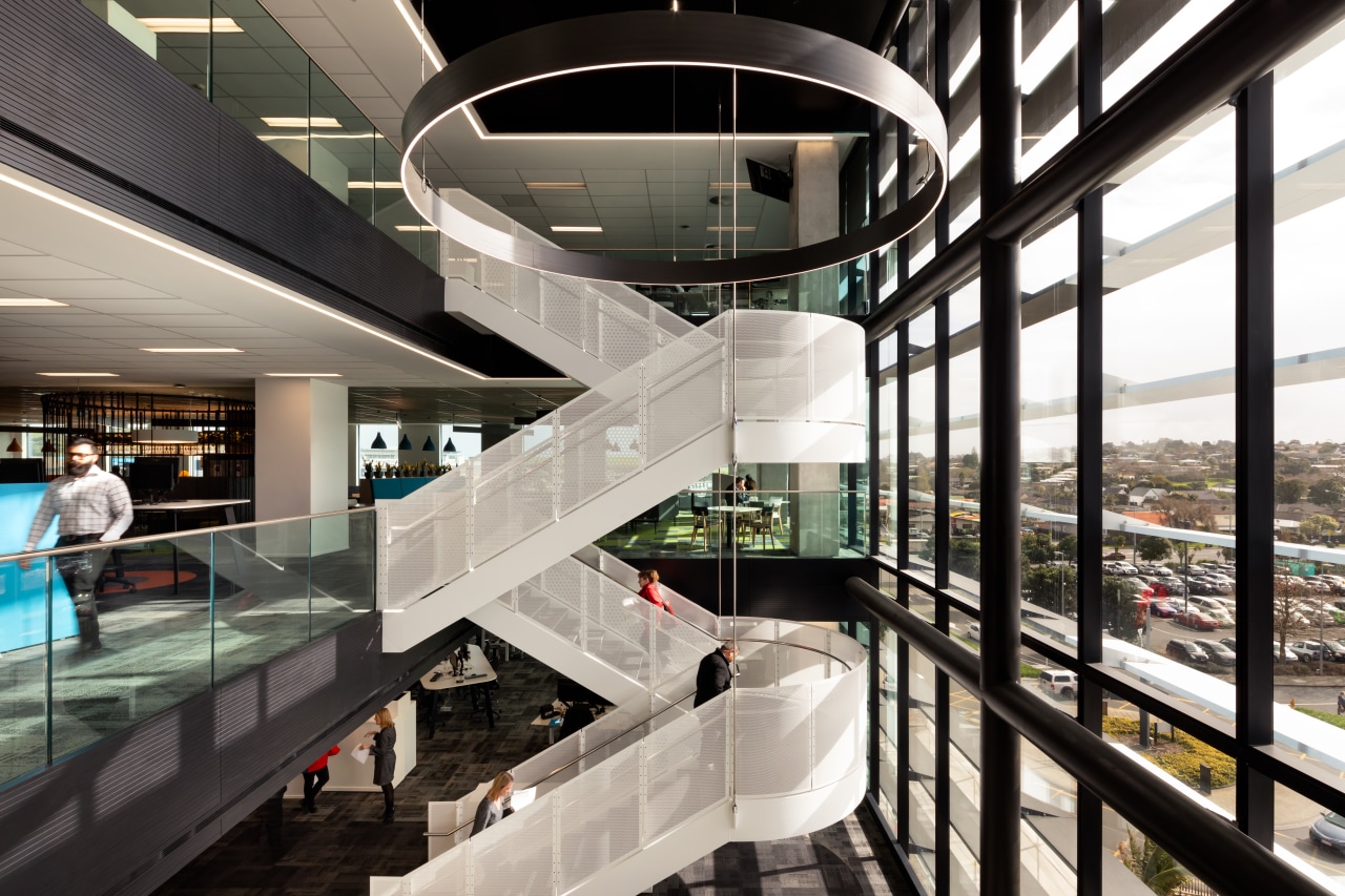
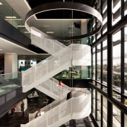
This fit-out is in No.1 Sylvia Park, a new building designed by Architectus, and covers levels two, three and part of four of the building.
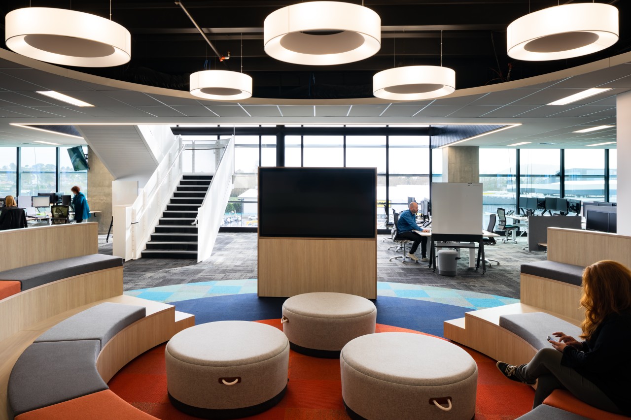
Given its prime function as a call centre, the Hub doesn’t have a formal reception area, but level three is where visitors might arrive. The central area on this floor is called The Campfire, and provides a clue to one aspect of the design scheme.
“The IAG Hubs are purposefully away from the city centre, and are more destinations in their own right, albeit close to shops and transport hubs. Staff were able to choose which Hub they went to,” says Langford. “The sense of people coming together in an open, healthy, flexible environment lead to the loose analogy of a colourful, playful fit-out themed on camping and campfire camaraderie.
“Initially, the analogy was used to explain to staff how the hub’s new flexible, unassigned way of working would be employed and these ideas became part of the project’s common language.”
However, in real terms the aesthetic speaks most strongly to IAG’s business colours and iconography, underpinned with only subtle nods to the camping analogy, such as the naming for certain areas and the evocation of some iconic outdoor elements.
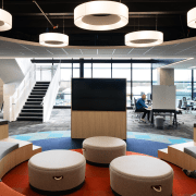
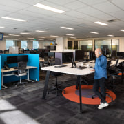
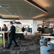
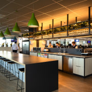
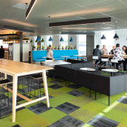
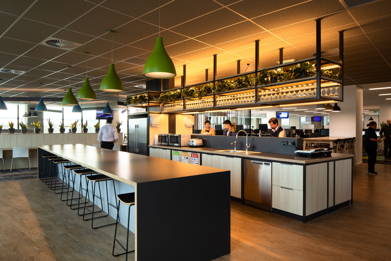
As a result, the Hub’s floorplans are broken into neighbourhoods, or campsites, each with various meeting spaces. Elements such as rounded walls of suspended ropes – evoking rope swings – and even a circle of green, suggesting grass, set the scene. Some slatted wood tables have the look of picnic tables while most workstations have rounded corners, another subtle evocation of the soft lines of the natural world. The cafe features plenty of stainless steel, suggesting a canteen or mess, and even the main carpets have a tundra-under-foot appeal.
“We sought to activate staff wherever possible. For instance, we optimised use of Architectus’ linking base-build central stair by locating the canteen cafe on the mid-level third floor as a destination to walk to, eat in and congregate at.”
In terms of work itself, the fit-out is equally agile and light on its feet.
The neighbourhoods are designated as quieter or louder, with the louder/noisier zones near the bustling cafe. Staff can choose from a variety of unassigned workstation options as well, from sit-to-stand and user-adjust to fixed-height workstations.
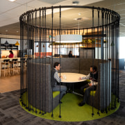
Quiet rooms, the library included, are used for more focussed activities such as writing a report. Centrally located banks of lockers provide a home for personal staff items, while wellness rooms and the focus rooms are near the floorplate cores.
Much front-end strategy work was done to determine the right mix of focus and collaboration spaces to align with the teams’ ways of working.
One sustainable aspect of the project for Unispace was working with existing workstations and some soft furniture, which were retained from IAG’s previous offices.
As well as zoning for relative quietness of tasks, comfortable noise levels were achieved through the choice of high-backed booths, plenty of soft furnishings, high-spec acoustic panelling and the sheer size of the floors – with plenty of open space.
“A great deal of attention was paid to acoustic performance generally,” says Langford. “We’ve designed the rooms to avoid reverberance.”
Together with the camping/outdoors theme, IAG’s own branding contributes greatly to the look of the Hub. There are even slightly differing brand colourways, differentiating between corporate, community and employee. Purple is the common colour to all, signifying leadership and strength for the company. Various versions of corporate and internal brand colours have been applied to establish IAG’s presence in this otherwise neutral palette. These colours are celebrated predominantly as bold circle patterns seen in the carpet and in bright, colourful furniture elements. The circular motif is reinforced by ring pendants in strategic places.
“The open, colourful and highly flexible fit-outs of the Sylvia Park Hub and near-identical Albany Hub represent a fresh, human-centred approach to call centres,” says Langford. “Ongoing staff satisfaction, productivity and wellbeing is put first at every turn.”
Credit list
Project
Lighting consultant
Ceiling tiles
Paints
Vinyl plank flooring
Clipwall
Window treatments
Kitchen appliances
Furniture suppliers
Interior designer
Carpet tiles
Surfaces
Lobby booth rug
Accoustic pin boards
Wellness room curtain fabric
Lighting
Wellness room appliance
Story by: Charles Moxham
Photography by: Jason Mann
Home kitchen bathroom commercial design
More than an addition
Eclectic meets elan
Best of both worlds

Commercial Design Trends Vol. 35/1C
A new commercial office building can sometimes be more than just a place to work – it can also be an integral component ...
Read More