By invitation only remodeled interior by Buckingham Interiors + Design
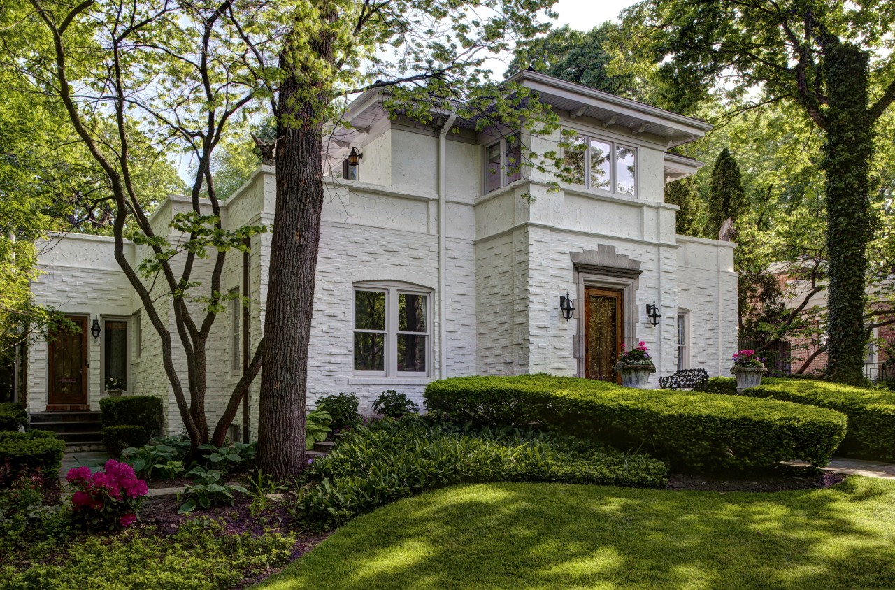
1920s remodel had speakeasy in basement


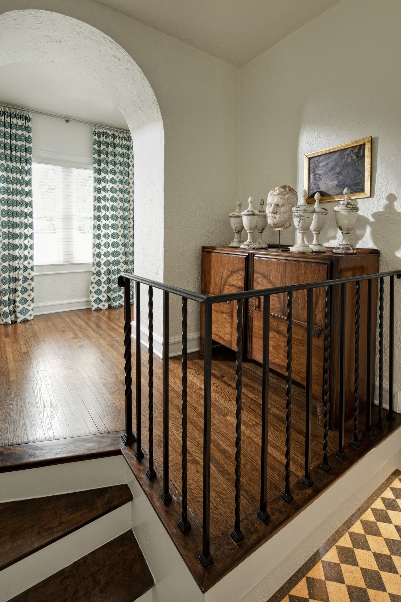
Back in the 1920s, visitors to this house would have needed a special knock or maybe a password to enter. And when they were admitted into the house with the speakeasy in the basement, they would have come into an entry that remains largely unchanged today.
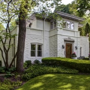
The Corinthian barley twist columns, arched openings, heavily textured stucco walls and checkerboard terrazzo floor were all elements that sold the Mediterranean-style house to its new owners. But they also posed the biggest challenge for interior designer Julia Buckingham Edelmann of Buckingham Interiors + Design.
"At first glance, the entry was very daunting. The original interior colors were very dark and it was clear we needed to make the interior a lot lighter to balance the visually heavy look of the terrazzo floor that flowed right through the house."
Drs Egon and Anne Doppenberg, the new owners, say they fell in love with the European character of the house and its history, and wanted an interior that would complement the decorative features.
"We started by painting everything white to offset the bold, graphic nature of the flooring, which could otherwise have been overpowering," says Edelmann. "Because the stucco is so textured, other colors can appear dirty. The white gives it a very fresh look and is in keeping with the Mediterranean influence."
Furnishings were then layered into the space, using a mix of antique and modern furniture, lighting and accessories. The designer says the furnishings couldn't be too modern, but she also didn't want the interior to be too predictable or themed.
"The house also had to meet the needs of a growing family, so it had to be able to withstand a few knocks."
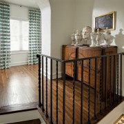
In the entry hall, two existing curved consoles are shaped to fit the concave walls. To further define the sense of symmetry, Edelmann suspended two sculptural wall hangings with inset round mirrors.
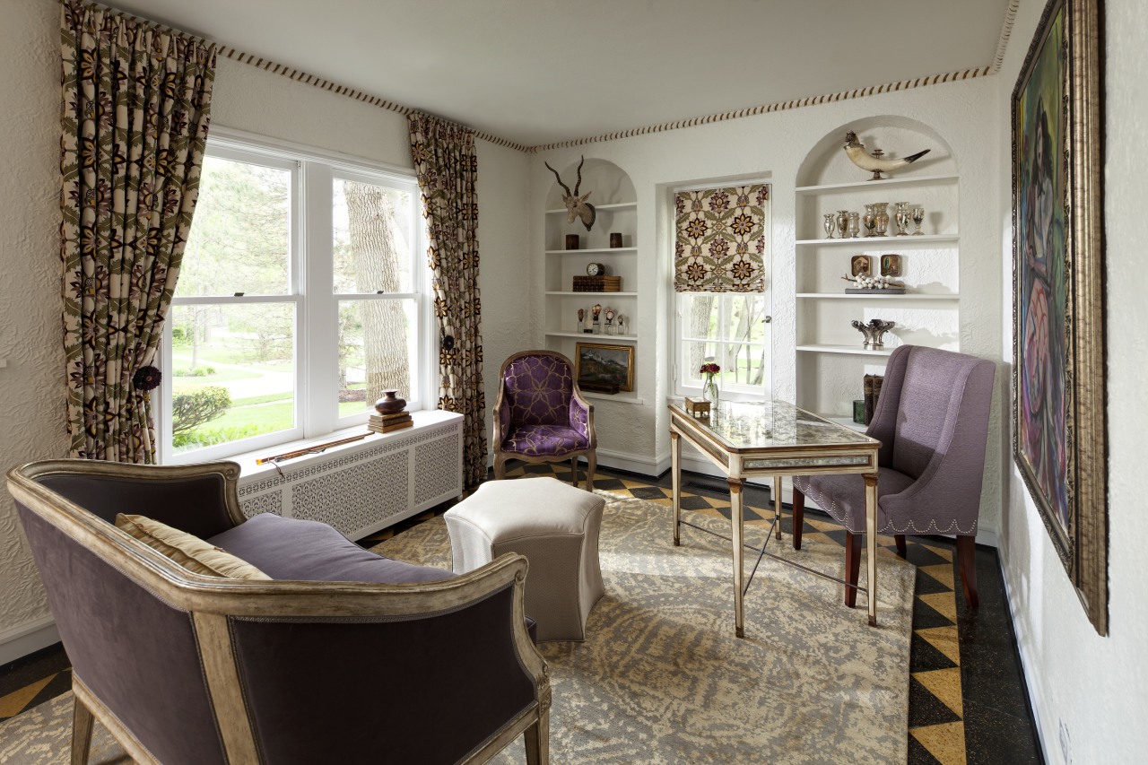
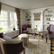
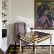
Arched openings lead to the living room on one side and a small parlor now a study on the other. Here the color palette sets the scene for the rest of the interior. Soft lavender shades are mixed with plum, and the soft sand tones of the distressed furniture.
"This is Anne's personal space in a house full of boys," says Edelmann. "We wanted it to be fit for a queen."
In the living room opposite, the palette deepens to include navy blue sofas, bright fuchsia pillows and a dark eggplant-colored rug, which helps to tie together the diverse elements. The materials are also practical, says the designer.
"The two custom ottomans were made from vintage boxes. Burlap features on the upholstered tops the textural contrast helps to balance the slight sheen of the sofa fabric and the plush velvet. It also ensures the room is not too feminine."
Edelmann says the interior also reflects a sense of fun it was important that it didn't take itself too seriously.
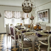
"The dining room, for example, has a custom light pendant put together from pieces of vintage chandeliers. We teamed this with three tables that can be joined to create one large table. These are made from wood finished in silver leaf. We also used three different styles of dining chairs, including six antique Italian chairs that still have their original silk and horsehair seats in a bronze shade."
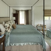
In the master suite on the top floor, which opens to terraces on two sides, pale aqua is teamed with a deep orange, which provides another visual link with the terrazzo on the floor below. A slim iron four-poster bed helps to make the room feel more spacious.
Credit list
Kitchen designer
Flooring
Lighitng
Drapes
Story by: Colleen Hawkes
Photography by: Eric Hausman
Home kitchen bathroom commercial design