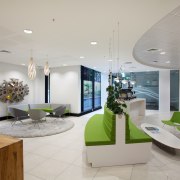
BP New Zealand head office by Unispace
New BP New Zealand head office by Unispace features spiral staircase with timber treads, timber reception desl, circular layout of workstations

Keeping one step ahead of the competition is a hallmark of every successful company. But being progressive isn't just about business acumen; it's also about an effective, highly efficient workplace.
BP has long recognised the importance of the work environment in terms of productivity and attracting and retaining talent. The company also recognises the nature of the modern-day workplace is changing there is a much greater need for worker interaction, collaboration and the cross pollination of ideas and resources.
Frank van Hattum, New Zealand general manager convenience retail and asset management for BP, says merging the company's two offices was an ideal opportunity to explore such a workplace design. BP commissioned Unispace to come up with an appropriate interior for a new head office in the Watercare building in Remuera, Auckland.
Design director Sarah Langford says BP's former offices were traditional and compartmentalised, with high partitions between work spaces.
"Even so-called open-plan offices designed just 10-12 years ago don't suit modern work practices," she says. "This new office was a chance to further break down barriers. But the design also needed to fit with BP's corporate workplace and global standards, so we had many strategy meetings to discuss the overall vision with company representatives."
Langford says linking the two separate floors of the new office was the first priority.
"We opened up a 6m-diameter circular hole in the upper floor to create a void, and designed a wide spiral staircase. This forms the central node of the office, around which everything revolves. It also provides opportunities for staff interaction as they move through the office."
The staircase features sustainably sourced black beech timber treads, and forms a sculptural centrepiece in the reception area. Bands of black beech timber also curve around the spiralling glass balustrading.
"We deliberately chose B-grade timber for its textural look," says Langford. "The holes and knots in the wood add visual appeal. The same timber clads the curved wall accommodating the reception desk. For added interest we created arrow-shaped joins where the planks butt up against each other.
"On an abstract level, the raw, organic materials reference BP's involvement in the harnessing of natural energy. Similarly, the round motif recalls the sun, which BP incorporates into its branding, as the ultimate source of all energy."

The motif is repeated in an extra-large timber-lined circular light fitting above the stairwell.
Green, a BP corporate colour, is also referenced, in a band around the balustrading. Green appears in the reception area furniture as well, where it is teamed with white for a fresh, crisp look.
Langford says workers have swipe cards to pass through Gunnebo Speedstiles beside the stairs. The rest of the lower level is designed to provide clear access for visitors to meeting rooms, a client lounge and a Wildbean Cafe test kitchen.
"Coffee is a big part of the BP culture," says the designer. "Every employee is trained to make a perfect barista coffee when they start with the company. So the coffee machine is a vital part of the service provided at reception."
Changes to the workstation environment can be seen readily on the upper level. Opting for a true open-plan environment, BP has placed all workers on the same footing. The executive team sits on the main floor alongside other staff.
"There is a concession, in that each manager is seated close to one of the non-bookable, non-allocated quiet rooms," says Langford. "These can be used by all staff at any time, for private calls and concentrated work."
The designer says surveys have shown that while collaborative work is on the increase, approximately 70% of the work that most people do in an office is some form of focus work. So there is a need to minimise visual and noise disturbance.
"We have provided for activity-based working, but recognise that collaborative areas will involve more noise. So we created concentric zones where the noise levels diminish the further away one gets from the central stairwell. Collaborative meeting tables are positioned closest to the central stair, while the quiet rooms are right out on the perimeter of the space.
"The meeting tables at the front of the office are splayed to echo the curve of the balustrade. Desks behind this follow the same layout, which also avoids any suggestion of a row upon row of chicken-coop workstations."
Workstations can be raised or lowered by workers so they can be used sitting or standing the mobile cabinets are higher than conventional units, which makes them more accessible.

Langford says the "busy-ness" of the office is reflected in the carpet tiles, with colourful green and yellow tiles clustered around the main circulation area at the top of the stairwell. The coloured squares gradually drop off the further one goes back into the office.
The staff kitchen-lunchroom on the upper level is positioned so the staff can enjoy a green outlook onto a tree canopy. The area was designed to double as a function space.
"We had a limited amount of space to work with in the office, so it made sense to combine these two functions," says the designer. "The space is also well suited to entertaining. Sunlight streams through the trees creating changing light patterns throughout the day."
The design team added a baffle ceiling to the lunchroom, which provides acoustic insulation and helps to define the area within the overall office.
"The dark fins also make the space a lot more interesting visually," says Langford.
The designer says Unispace was also involved in helping manage BP's move to the new office Unispace change management strategist Stella Green worked closely with the company. With the head office being relocated from Wellington, the move was a significant one for many of the staff.
Frank van Hattum says everyone is enjoying the new space, and appreciating the different options.
"The changes were huge for many of the staff, but the response has been extremely positive from all three groups the Auckland and Wellington employees, and the new staff. Every aspect of the fit-out is working as planned. People appreciate being able to get away from their desks to spend time in other areas, including the lunchroom."
Story by: Trendsideas
Home kitchen bathroom commercial design
Commercial Design Trends Vol. 30/12
Commercial Design Trends is aimed at our professional readers, and showcases commercial buildings. The book features reg...
Read More


