Blank canvas
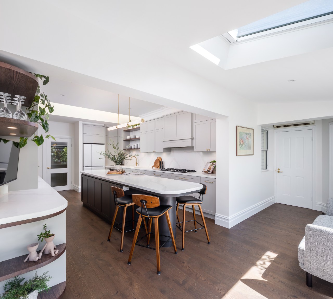
With all before swept away, this new kitchen creates balance, flow, functionality, and improved entertaining connections – along with plenty of warmth and natural light


Designed by Carmen Hansberry Design
From the designer:
Owner's brief – how it was achieved and renovation constraints overcome
Upon initial meeting and noting the owner’s main objectives, the main items that were to be addressed and/ or upgraded in the proposed new design were:
1. Take out existing slate flooring (which ran throughout most of the ground floor) and replace with warm timber flooring.
I suggested and recommended using a prefabricated timber flooring, due to the following attributes:
• UV resistant – as the large glass doors to the side sitting room, were replaced, and consequently brought in more daylight.
• Ease of installation – as the clients were living in their home during the construction, this floor being prefabricated eradicated the downtime of sanding and varnishing that solid timber involves.
• The colour is consistent and no change of slight variations, so the clients knew exactly what they were getting.
• The textured oak grain – which is the most stunning feature. This texture can only be achieved through prefabricated timber flooring.

2. Eradicate the existing corner pantry to square off the kitchen space overall – then repurpose more accessible and functional pantry storage elsewhere.
During the design process, I engaged Lux Interiors (builder) to come to site and inspect whether the walls that enclosed the pantry were load bearing – I figured no point going down the design track if it blows the owner's budget if a structural steel beam is required. At that same time, I also ensured the small nib wall to the fridge recess could be eradicated with minimal fuss.
Once it was established the proposed demo building works could easily be carried out, I sat with the owner and looked at the whole space as a clean canvas.
Knowing the flooring was being modified too, it really provided a blank space for me to suggest moving the sink to the same run as cooktop.
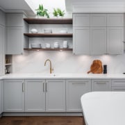
By doing this we created a great workflow between the sink/ cooktop while also creating the perfect space on the left-hand side for tall pantry storage.
I suggested mixture of base cabinets and tall overhead doors to break up the cabinets, so that the tall overhead doors could be set back ever so slightly.
Having shallower cabinets, not only in my opinion looked better but also ensured the cabinet for everyday pantry food was the perfect depth so items couldn’t get lost at the back.
3. Add more natural light.
I suggested the two interior house doors situated in the kitchen be changed to have glass panes, so that on all sides of the kitchen there was space for the natural light to shine through, together with suggesting eradicating the old blinds in the existing skylights, then adding the kitchen jewellery – a feature pendant over the island.

4. Provide casual seating space for a minimal of 4 people comfortably without interrupting with flow of the kitchen.
In the existing/ old kitchen, the casual seating was to the rear on a U-shaped island bench.
Because of the way the cabinets were set out there, it only allowed two adults to sit on the outside part, and the owner to move another stool on the kitchen side to entertain and face her company.
This wasn’t ideal, as she complained about her legs hitting the cabinets and when she was entertaining it was awkward with cooking etc.
So, after some discussions, and explaining the kitchen workflow, I suggested that the casual island seating essentially be situated at the end where it was, though to modify the island so the whole kitchen became a galley kitchen.
By doing this it would ensure that, when entertaining, the kitchen workflow would not be interrupted.
And this move, together with having a curved end, just makes that space easy for four adults to sit comfortably and not be on top of one another.
I curved the other end of the island to match, then added a 300mm diameter leg to really make the island feel almost like a piece of furniture.

5. Provide a space for small everyday appliances to be stored. This space needed to be able to be closed off when not in use, but cabinet facing be designed as such that it is easy to manoeuvre to open, together with not looking unsightly (as most appliance doors do) and keeping consistent with kitchen cabinet facings.
At the end of the kitchen to the right-hand side of the fridge, I suggested using a swing-pivot pocket door. This move allowed the right amount of space for the owner to store her everyday expresso machine/ small appliances and enabled easy use of the space but also meant it could be shut off easily.
6. Provide a technology hub for existing items such as their “Google Home”/ TV to be permanently situated. This was to be easy to access from the casual seating area but at the same time not detract from the look of kitchen.
I suggested the benchtop area to the left-hand side of the tall pantry storage would be a great overflow space for these tech items to be stored/ used as it was positioned close to the casual island seating area. Also, by placing the TV on that wall, it ensured it was an ideal viewing position for the cook.
Installing the TV on the wall and not placing it on the bench – as with the previous kitchen – also frees up the benchtop for a further ideal spot for the bar/ drink prep area, which can be utilised by others, while entertaining without interfering with the cook's workflow.

7. Update the current kitchen drop zone, so benchtop runs at a higher, useable height. Build in a drop file drawer for everyday mail/ bills. The rear of the desk was to have a pin-up board, which had to again be consistent with the kitchen’s style and not look 'bitsy'.
By raising the benchtop of this nook at the entry of the kitchen to run in line with the surrounding kitchen, not only did it connect the space, but also provide more useable storage underbench for a bank of drawers. The larger drawer on the bottom for drop files (allowing the filing cabinet to go) and two smaller drawers for all those loose items like keys/ wallets/ sunglasses that tend to accumulate on the island bench, and that you don’t want to store near the front door.
I suggested the rear splashback area be essentially a cabinet glass door frame, so it was cohesive with the cabinets, though by making the insert a pinup board, ensuring the high function of this small area.
Credit list
Designer
Cabinetry
Benchtops/splashback
Oven
Ventilation
Dishwasher
Lighting
Builder
Cabinetry hardware
Kitchen sink
Cooktop
Refrigeration
Flooring
Awards
Home kitchen bathroom commercial design
