Black kitchen in black house designed by owner-designer David Ponting references the '50s
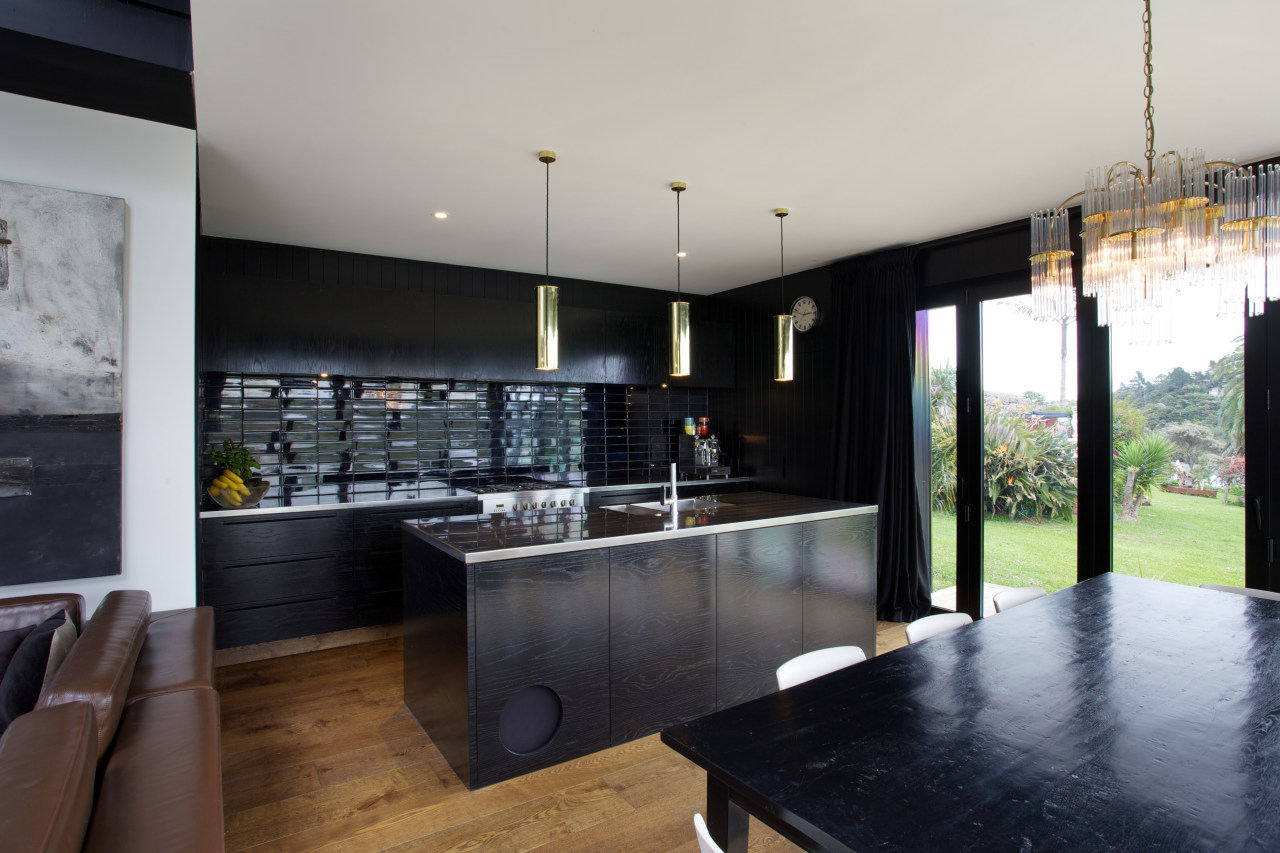
Black oak veneer cabinets, black grooved ply walls and stainless steel benchtops feature in this modern kitchen by David Ponting

Seen in isolation, this black kitchen is a real conversation piece. But it's not so surprising when you come from the outside in the house itself is entirely black and wrapped in corrugated steel.
But the architecture was not about making a bold contemporary statement, says designer-owner David Ponting of Ponting Fitzgerald.
"It was more about making a reference to the location. The house is in a street of 1950s brick-and-tile homes, beside the water. Both these elements have influenced the design of the house and the kitchen.
"The house resembles a coastal barn, unashamedly inspired by the Team New Zealand boatsheds in Auckland, while the interior was generated from the simple Kiwi ideals of the '50s and '60s."
Ponting says he and his wife Atlanta Miles wanted a pre-loved look.

"We chose materials and products that enhance a sense of items collected over time, a cobbled-together look. The doors in the house are from an old bungalow, and the walls, which are painted in high-gloss black, are vertically grooved plywood reminiscent of tongue-and-groove boards."
In keeping with this theme, the cabinets feature oak veneer over plywood. The oak was wire brushed to strip out the soft grain, and hand-painted to achieve a black gloss finish.
The cabinets are teamed with stainless steel benchtops and hand-glazed inky blue tiles on the splashback.
"We wanted the space to be dark and moody a little bit theatrical," says Ponting. "The tiles create a touch of drama. They reflect the estuary beyond, and the varying tones create a lovely ripple effect."
Doors on either side of the kitchen open to a pantry and refrigerator respectively.

"The space accommodating the refrigerator space pops out from the side of the house, much like a traditional food safe in an older home," the designer says. "Although this wasn't designed for that reason; it was simply the best way to maximise the space."
Ponting says every item was chosen to reinforce the sense of old meets new, including the choice of a range over a built-in oven.
"We didn't want a slick, contemporary kitchen. While this kitchen is modern, it has the relaxed, nostalgic character of a much older home."
Credit list
Designer
Cabinetry
Splashback
Refrigerator
Awards
Kitchen manufacturer
Benchtops
Taps
Dishwasher
Coffee machine
Story by: Colleen Hawkes
Photography by: Jamie Cobel
Home kitchen bathroom commercial design
Home Trends Vol. 31/6
Trends Home brings you the best homes, kitchens and bathrooms, both local and international. Each issue is packed with g...
Read More


