Beside the sea cottage remodel
Cottage remodel by Robert Hidey Architects

While a seaside cottage that serves as a vacation home may be charming if a little rough and ready there comes a time when more comfort is called for.
Architect Robert Hidey says this was precisely the case with his own family's vacation home, which dated back to 1946.
"With its solid redwood construction, the house had served us well over the years, and we still appreciated the small-scale cottage detailing. But many of the rooms were substandard, including the bedrooms, bathrooms and kitchen, which was in a separate room. And the flow was not ideal the rear bedroom was reached through a second bedroom-office space."
Hidey says the position of the front door, at the side of the house, was also awkward guests were squeezed into an unappealing 3ft-wide alley space.
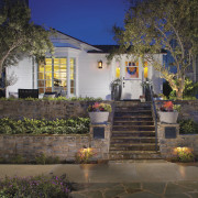
The architect consequently moved the entry to the front right side of the house, where he created a transitional lobby space. The entry now lines up with the stairs leading up from the street, and creates a much stronger sense of arrival.
"Fortunately, the structure of the house had not deteriorated, nor had the exposed beams and tongue-and-groove ceilings on the interior," says Hidey. "There was a character and a quality to the framework and form that I could work with."

On the exterior, siding was replaced as required, with new horizontal clapboard at the front, and vertical batt and board at the rear.
"There had been several additions to the house over the years and there was a subsequent mishmash of window styles with many inconsistences," the architect says. "I felt it was better to start over, with new doors and windows, and white-painted shutters that enhance the coastal aesthetic. It's a very clean, fresh look that complements the cottage style of the houses in the neighborhood."
On the interior, Hidey removed a central fireplace to open up the great room. The existing bay window the only original window that remains was remodeled and is now a key feature of the room.
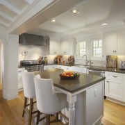
The kitchen area was also absorbed into the great room to provide a social center for the family.
"The island may be of a small scale to suit the proportions of the house, but it is very effective at creating a buffer between the living area and kitchen," Hidey says.
Shaker-style cabinets teamed with gray quartz countertops and traditional hardware complement the authentic cottage feel. And new radius-curved openings to the hallway provide another nod to the traditional vernacular.

"The ceiling in the hall is much lower than in the great room, and this difference is disguised behind radiused openings," says the architect. "The curves also add character and introduce a little nautical attitude."
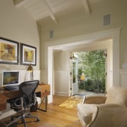
The architect extended the hallway to link up with the end bedroom, which is now the master suite. The office is open to this passage, with double French doors leading directly out to an outdoor living area. Similar doors open from the master suite, which was enlarged with a new bathroom addition.
Interior designer Cee Atcheson of Objekt Designs was commissioned to furnish the interior for a tenant.
"Everything had to be of a scale that would work with the proportions of the rooms," she says. "I chose a lot of soft white and off-white linens, so there would be no distraction from the architecture it is all very light and airy. I introduced bright color accents through the art and accessories. There are a few oversize items also, such as the butter leather ottoman, which ensure the look is also very cozy."
Story by: Colleen Hawkes
Home kitchen bathroom commercial design
US Home & Architectural Trends Vol. 29/11
Home & Architectural Trends highlights great residential architecture. This book provides prospective home builders ...
Read More


