Balanced outlook
This remodeled kitchen by Colleen Shaut sets off the owner's pottery collection

In a time when the kitchen plays a primary role within the home, it makes sense that your personal passion would be on show there. The design question is how to put both your kitchen and the display objects in the best possible light.
For this remodel, designer Colleen Shaut was requested by the owner to transform her awkwardly laid out existing kitchen. This had suffered from bright, white cabinets, worn granite counters, linoleum floors and from having all appliances, and the sink, aligned on one wall.
"I asked Colleen to transform the kitchen, without changing its galley layout, into a more inviting and efficient space importantly, my prized collection of Bill Campbell pottery had to take center stage," says the owner.
In response, Shaut separated out the function of the kitchen, with the cooking station on one side and sink and washing-up zone on the other.
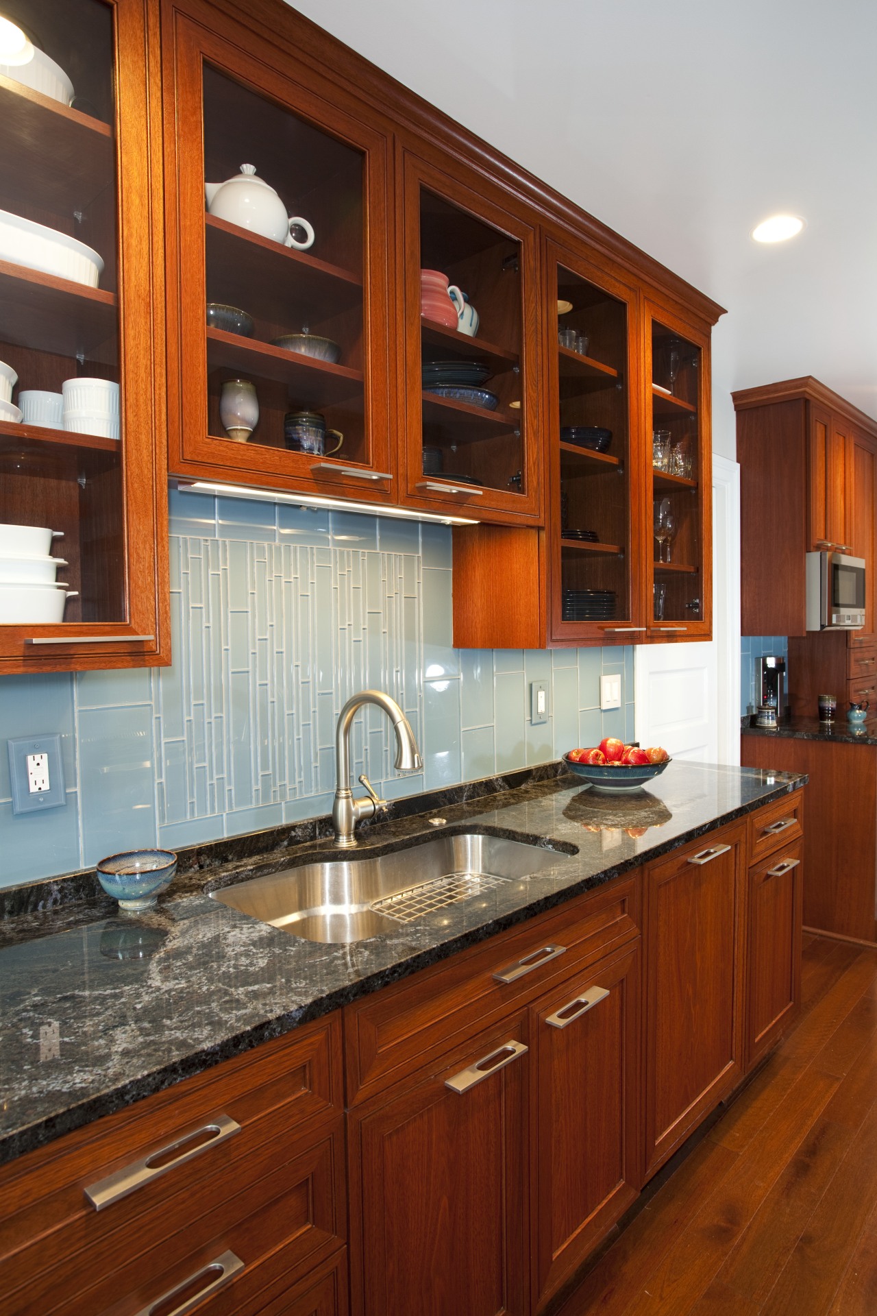
"This allowed me to give the substantial range breathing space so it could take precidence within the design," says Shaut. "Large open shelves on this wall provide ideal places to display the pottery pieces. However, galley kitchens are all about balance, so I set most above-counter cabinetry on the opposite wall to off-set the display shelves. These upper cabinets are glass fronted as, in turn, I didn't want that side to appear heavy."
The kitchen showcases the owner's pottery collection in another way, too.
"Inspiration for the rich wood cabinetry and floors, the blue tiled backsplash and textured granite countertops all came from the pottery's vibrant hues," says Shaut. "The backsplash is in two tile formats, with narrower pieces placed to create a waterfall effect a feature version is seen behind the range while the other, smaller one is behind the sink directly opposite."
The kitchen celebrates great function as well as good looks. Shaut even integrated a washer and dryer behind cupboard doors at the end of the space saving the owner a two-level traipse down to the laundry room. Replacing the lower cabinets with large drawers allows easy access to pots, pans, small appliances and bakeware.
The owner says the once claustrophobic, overly bright kitchen has been transformed into an airy, pleasing kitchen she loves working in.
Story by: Trendsideas
Home kitchen bathroom commercial design


