An elegant turn for the better
A sculptural stair is just one strong, dextrous move in this refined transformation. To update an existing home in Forest Hill, Toronto, Reigo & Bauer executed a total renovation and interior design that unifies formerly disparate areas, modernising them functionally and aesthetically
Architecture and interiors by Reigo & Bauer
From the architects/designers:
To update an existing home in Forest Hill, Toronto, local firm Reigo & Bauer executed a total renovation and interior design that unifies the home’s formerly disparate areas, modernising them functionally and aesthetically.
Reigo & Bauer has imbued a thoroughly contemporised space with subtle references to traditional design elements, resulting in an interior that feels modern, dynamic, and very liveable.
Reigo & Bauer engaged long time collaborators Amantea Architects to take the lead on the built-in millwork elements throughout the house, as well as to design the new exterior landscape and pool pavilion.
Their close working relationship on the interior ensured a seamless integration of millwork with the architectural language.
The collaborative approach to project delivery enabled the team to create a cohesive design both inside and out.
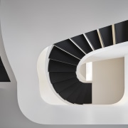
Foremost among the interior architectural changes is the insertion of a central curving staircase with open risers that offer longer sightlines through the main foyer, replacing a traditional closed, rectangular stair.
In two sweeping runs, this sculptural staircase knits together the rooms of all three storeys around a single gesture that maximises both tread width and overhead clearance.
At the rear of the main floor, Reigo & Bauer repositioned a powder room and removed a dividing wall along the boundary of a small elevation change.
This adjustment allows for a nearly unbroken expanse of windows onto the backyard, where Amantea Architects’ landscape design extends the elevation change’s feature stair element onto the patio, neatly linking inside and out.
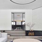
The move also broadens views from the sunken family room to the breakfast area, vastly improving the overall sense of openness and connection while a new wet bar, backed by a low bench, adds a visual barrier between the family room and kitchen.
Other structural changes include the insertion of a two-car garage in place of a formal dining room, and the merger of a living room and study into a more flexible living–dining space connected to the family room via a new doorway and stairs.
From its position between the living room and steps to the family room, the dining area creates a transition between programmatic zones while capitalising on sightlines that give it a vantage point on multiple areas of the main floor.
On the second floor, meanwhile, Reigo & Bauer divided a shared bathroom into two private bathrooms and reconfigured the master bath and walk-in closets.
The insertion of the garage and redesign of the main entryway and second-floor bay window also offered an opportunity to make aesthetic updates to the façade.
The ground-floor masonry that flanks the entrance now extends to the roofline, replacing stucco, while the bay window’s soffit and flashing now match the new garage’s blackened zinc cladding and doors.
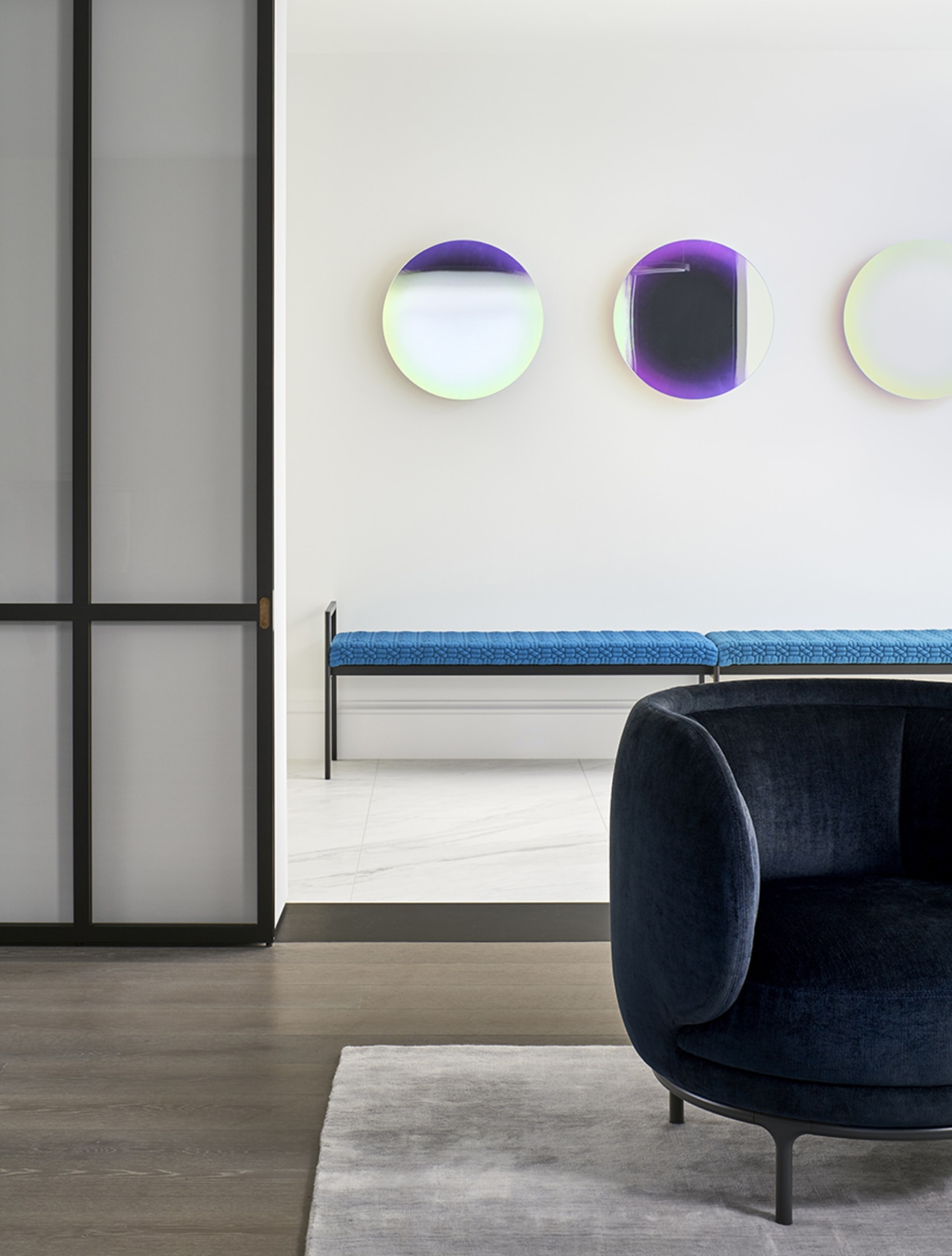
While the interior is strikingly modern, traditional elements subtly reintroduced in unique ways suggest a harmony between new and old.
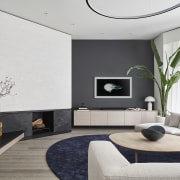
Blank white sections of the main floor walls seem to sit slightly in front of a second, charcoal-coloured plane with ornamental baseboards, representing the existing shell of the house; these layered white insertions define the charcoal-coloured accent walls, frame the fireplace, and create proscenium-like borders for prominent doorways.
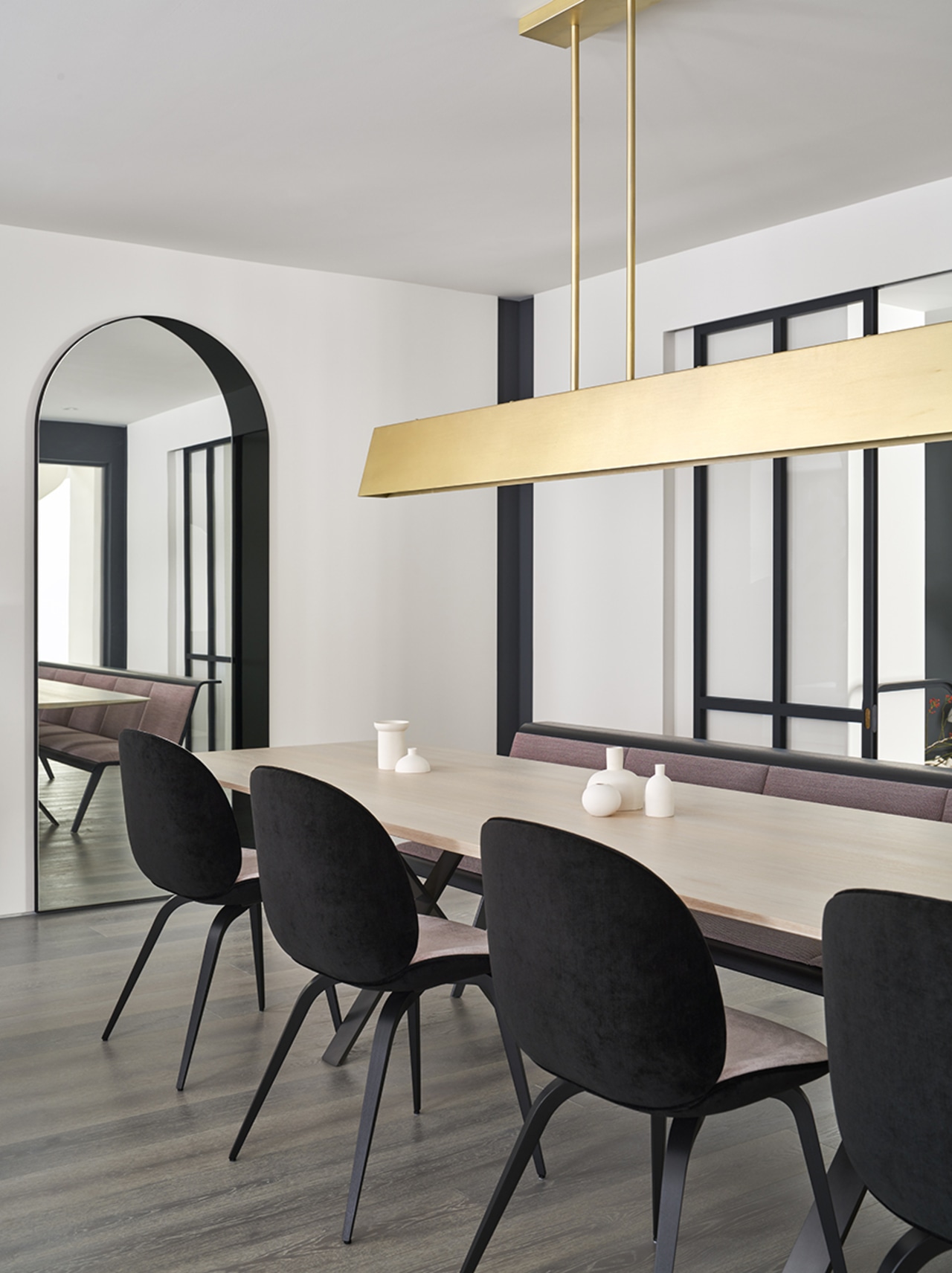
On the main floor, sliding doors with large glass panes framed in black steel likewise pair modern minimalism with traditional panel-door proportions.
Upstairs, the classic Victorian four-panel door is reinterpreted in bedroom doors incised with half-round grooves in place of panels, enlarged and reframed to extend the layering motif.
Everywhere, the use of colour is highly controlled. Against a predominantly white backdrop, a limited amount of charcoal and black is used in striking counterpoint, distinguishing the doors and window frames, stair treads, thresholds, kitchen backsplash, and the frames of most furnishings.
This high-contrast palette is softened by the judicious use of textured, pale neutral finishes, including pewter-toned hardwood on the main floor, sand-coloured hardwood on the second and third floors, bianco marble on the foyer and the kitchen floors and island, and driftwood-coloured veneer for storage cabinetry throughout the main floor.
A garnet-coloured powder room on the main floor notwithstanding, the colour accents that top this neutral canvas are dark blue and pink, appearing in wallcoverings, area rugs, and furnishings. In specifying all of the house’s furniture, Reigo & Bauer drew from multiple sources to assemble a diverse collection of soft yet clean-lined seating with highly textured fabrics – in some cases, as with the black and pink-upholstered dining chairs, customising unique combinations that epitomise the interior’s distinctive use of colour, contrast, and line.
Credit list
Architecture & interiors
Structural engineer
Millwork fabrication
Millwork design
Construction
Story by: Trendsideas
Photography by: Doublespace Photography
Home kitchen bathroom commercial design
'Worthy of Architectural Digest'
Small space, big impact
Classic dovetails contemporary
Trends 37-02
With a Basalt cliff directly behind, how would your house design respond in terms of form and materials? Check out one b...
Read More


