Action stations – 8 sculleries to impress
Whether behind closed doors or visually connected to the main kitchen – or both – these sculleries combine designer good looks with chef-friendly functionality
1. All in the family

This kitchen's colour scheme follows through into the adjacent scullery and laundry, with predominantly lighter materials in the smaller rooms and only faint accents of black tying all three areas together.
Designed by Gunnar Friese, Hewe Architectural Cabinetry
Photography by Jamie Cobel
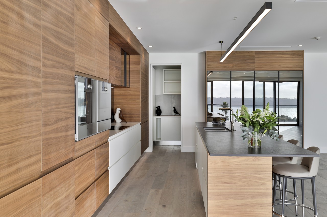
2. Part of the woodwork

Not only does this scullery disappear into the cabinetry, when it is left on show its veneer wall finishes offer a seamless, cohesive continuation of the kitchen's own livery.
Designed by Jessica Valintine, Jessica Valintine Design
Photography by Jamie Cobel
3. Light relief

While this kitchen is an easy balance of dark stained timber and pristine white, two tones gives way to predominantly pale tones towards the rear of the adjacent scullery.
Designed by Leonie Hamill, Cube Dentro
Photography by Kallan MacLeod
4. Quiet performer
While a floor-to-ceiling wall of warm wood cabinetry hides design issues for this penthouse kitchen, the scullery continues off to one side in understated fashion.
Designed by Melanie Williams and team, Matisse
Photography by Jamie Corbel
5. Serenity plus
White cabinetry with warm wood accents and an eye-catching mosaic splashback all feature in this spacious scullery, a material match with the kitchen out front
Designed by Landmark Homes
6. Tall, dark and hidden

The height of elegance – three floor-to-ceiling cabinet panels in American Oak with black carbon Woca Oil finish reveal that one of these things is not like the other.
Designed by Suede + Stone
Photography by Emma MacDonald, Fotographicnz
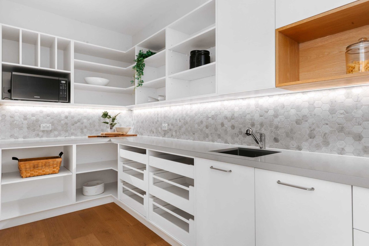
7. Making most

If you're going to tuck the workhorse of your kitchen out the back then make sure it's fit for purpose – plenty of benchspace and open shelving coupled with a generous sink are a great head start.
Designed by Damian Hannah, German Kitchens
Photography by Paul McCredie
8. Less becomes more

With a sweeping back of cabinetry doors, this scullery doesn't so much back up the kitchen as form part of it – this arrangement not only makes everything look more spacious, it also floods the scullery with natural light.
Designed by Mark Bruce, Designmarked Kitchens
Photography by Mark Hamilton
Story by: Trendsideas
Home kitchen bathroom commercial design
