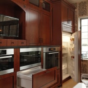
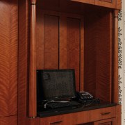
A Biedermeier-style kitchen in a Rosewood finish by Jennifer Gilmer
This large transitional kitchen, in a Neo-classic style, achieves an easy balance between tradition and modernity.
Biedermeier was an influential furniture style popular in Germany from 1815 to the late 1840s. Based on utilitarian principles, and celebrating Neo-classical design, it is noted for a generous use of wood and pared-back detailing. Today, such features evoke a more transitional flavour and the Biedermeier look translates well into classic and modern homes.
This was the style the clients requested when commissioning Jennifer Gilmer for this dramatic remodel. The existing kitchen had a large obstructive island and white laminate cabinets that had become outdated, says Gilmer.
"As the kitchen doubles as a through space, I replaced the single island with two units to create an easy flow from the entry to the dining room. At right angles to this, there is a strong central axis from the dining room entrance to the double-height Palladian window opposite."
Most appliances, including a television, are at one end of the kitchen, while the large range and custom hood are at the other.
"We took the graceful curve of the central window as our inspiration and repeated this in the arc on the alcove that houses the television, as a decorative element on the hood, and again in a similar design feature on the rear wall," says Gilmer.
"Because the kitchen gets plenty of light, the cherry wood cabinetry doesn't look too heavy. Dark beading on most of the door panels also helps offset the expanses of wood, as do the white benchtops on the islands. However, we chose black granite for the perimeter benchtops, as more white surfaces would have detracted from the richness of the Biedermeier style."
For the same reason, Gilmer specified the eye-catching tile splashback in a predominantly black hue with a white trim.
"The work triangles are efficient, and with cabinets on three walls and more in both islands, this kitchen offers plenty of storage."
Story by: Trendsideas
Home kitchen bathroom commercial design
Thrice as nice
Marvellous in marble
How to get your bathroom right
Home Trends Vol. 30/2
Kitchen and Bathroom Trends features top locations from New Zealand, Australia and the rest of the world. Kitchen and Ba...
Read More


