Stone cottage-style new home
This new home has all the character of an older, historic residence

Which is preferable, the warm appeal of a classically styled home or the convenience of a streamlined modern residence? This decision is mulled over by home builders every day. One approach is to choose a traditional facade that gives way to more user-friendly interiors.
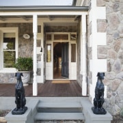
Seen from the street, this new house is a picture of historic charm. Designed by owner Dana Lane, who also completed the interior design, the home has front and side facades that have all the hallmarks of old-world architecture. The brick frontage is fully clad in hand-laid stone, with brick quoin corners painted white. A finial sits atop each of the steeply pitched roof forms, and turned posts support the rustic veranda. Old-fashioned double-hung sash windows feature on the front and side walls of the house, and stone greyhounds stand to attention on either side of the solid front door.
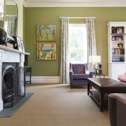
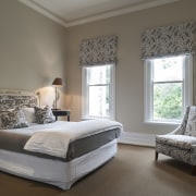
Dana Lane says her family loves the classic aesthetic, which continues into the front rooms the master bedroom, three other bedrooms and a sitting room. Crown mouldings, high skirting boards and vivid colours that contrast the crisp white ceilings are all seen in these less frequently used spaces.
However, this is only half the design story of the large, single-level house.
"Overall, we wanted this newly constructed home to look like an old building, but with an unashamedly modern rear addition," says Lane.
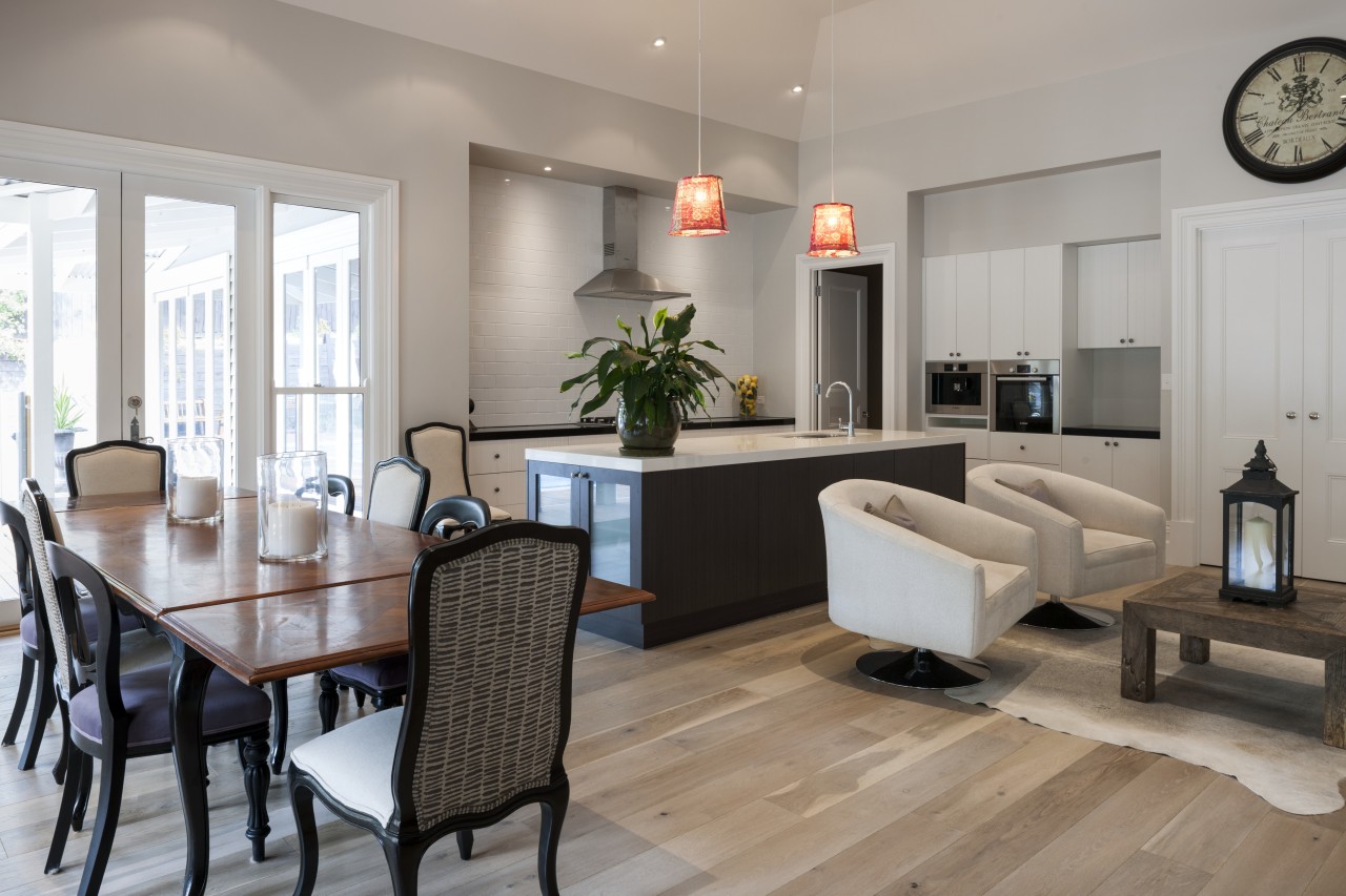
To this end, the back of the house comprises one large, open-plan room that incorporates the kitchen, dining and living areas spaces that are in constant use by the whole family. The light-filled volume has a wall of windows looking out to the rear deck and pool, a bell-shaped central ceiling that soars to nearly five metres at its centre, and clean, unadorned window and door openings. While all the front rooms feature strong colours, for the sake of tradition and because they have a more internal focus, the open-plan rear volume is finished in a light grey that merges with the white ceilings, allowing the external views to draw the eye.
"With such a marked change between the front and the back of the house, we chose some elements to draw the two together," Lane says. "Smoked oak floorboards run through most areas, and the high skirting boards seen in the bedrooms and sitting room are also continued through to the rear."
"Other crossover elements include signature black doors in most areas of the house. The entry to the butler's pantry to the rear of the kitchen, and doors to a study nook just outside it, also feature ornate trim and panelled doors."
The demarcation between old and new extends into the furniture and furnishings, with some areas featuring a little of each.
In the kitchen the rich grain of the stained timber on the contemporary island contrasts with the classic subway tile on the feature splashback. A beadboard finish and traditional handles can be seen on the rear perimeter cabinets, while the side cabinets have a modern flat profile.
The living area has an old-fashioned sofa with rolled arms and castors that sits alongside a clean-lined, modern sectional couch. These comfortable but contrasting pieces connect through shared colours and scale a microcosm of the greater interior.
And while the front rooms favour a stronger palette over the pale walls at the rear, there are colour connections between them, says Lane.
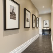
"For instance, there's a generous use of black and white in most rooms everywhere from the cabinetry and benchtops in the kitchen, to the picture frames and matts in the hallway, and the traditional two-tone floor tiles in the master suite and main bathroom.
"Lighting also played a part in drawing together different areas. For example, the watermelon hues of the lamps over the kitchen island and living area are echoed in the pink settee in the sitting room."
Story by: Trendsideas
Home kitchen bathroom commercial design
Rounding on the scenery
A beacon on the landscape
Hamptons high life
Trends Vol 31 No 2
Whether a large sleek contemporary, a cottage with a warm traditional aesthetic, or a glass-walled apartment high above ...
Read More
