Urban eyrie apartment interior by Robert Kaner
Warm contemporary apartment interior

Modern apartment interiors are invariably crisp and sleek. But they can also be cold when form becomes more important than function.
There was little chance of that happening in this New York apartment the owner made it clear he was not interested in a clinical white box. In fact he wanted just the opposite, says interior designer Robert Kaner, who worked on the project with architect Rafael Berkowitz.
"The owner was extremely engaged in the process," says Kaner. "He compiled an inventory of inspirational images for us. These had a very clean, contemporary, yet warm language. It became clear the interior needed to have a cocoon-like feel. Our focus was on creating visual warmth and providing a seamless, open living space."
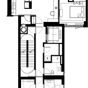
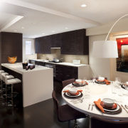
The designer says the team was able to reconfigure the layout before the new apartment was completed, to better integrate the kitchen with the living area and to conceal several unsightly structural and mechanical elements.
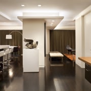
"A lot of visual tidying was required to create a sleek, contemporary interior," Kaner says. "For example, there was an awkward, bulky column in the centre of the apartment, which Rafael enclosed within a vertical structure that incorporates a niche for a bar. The bar itself is cantilevered so it appears to float between the walls these are lined with bronze glass.
"The haphazard design of the ceilings was also changed. There was an oddly shaped diagonal beam cutting right across the living space, and other oddities related to the mechanical services. We rationalised the design, creating shallow soffits to streamline the whole look."

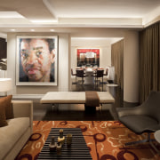
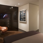
In the living room, teak panelling on two walls creates a warm, inviting sitting area. These panels conceal a Murphy bed behind the television, which sits on a track and can slide out of the way. Concealed storage is provided on either side.
"The width of each teak panel is relatively narrow, so the scale is in keeping with the size of the space," says Kaner. "This helps to make the room seem larger. The extensive use of the veneer and the rich, dark sapele wood floor enhance the warm intimacy of the space."
So, too, does the furniture, and a large area rug, which reflect the earthy colour palette.
"The palette was inspired by a leather swatch in a rusty, orange-brown shade that we found very early on in the process," says the designer. "With slight variations, this colour echoes right through the apartment it conveys the warmth and the emotional qualities we wanted."
The furniture includes a Fritz Hansen bench seat in the living room.
"This piece speaks to the architecture of the apartment, which is all about layers of overlapping planes and rectilinear elements," says Kaner. "It appears to float in the centre of the space between the dining and living rooms."
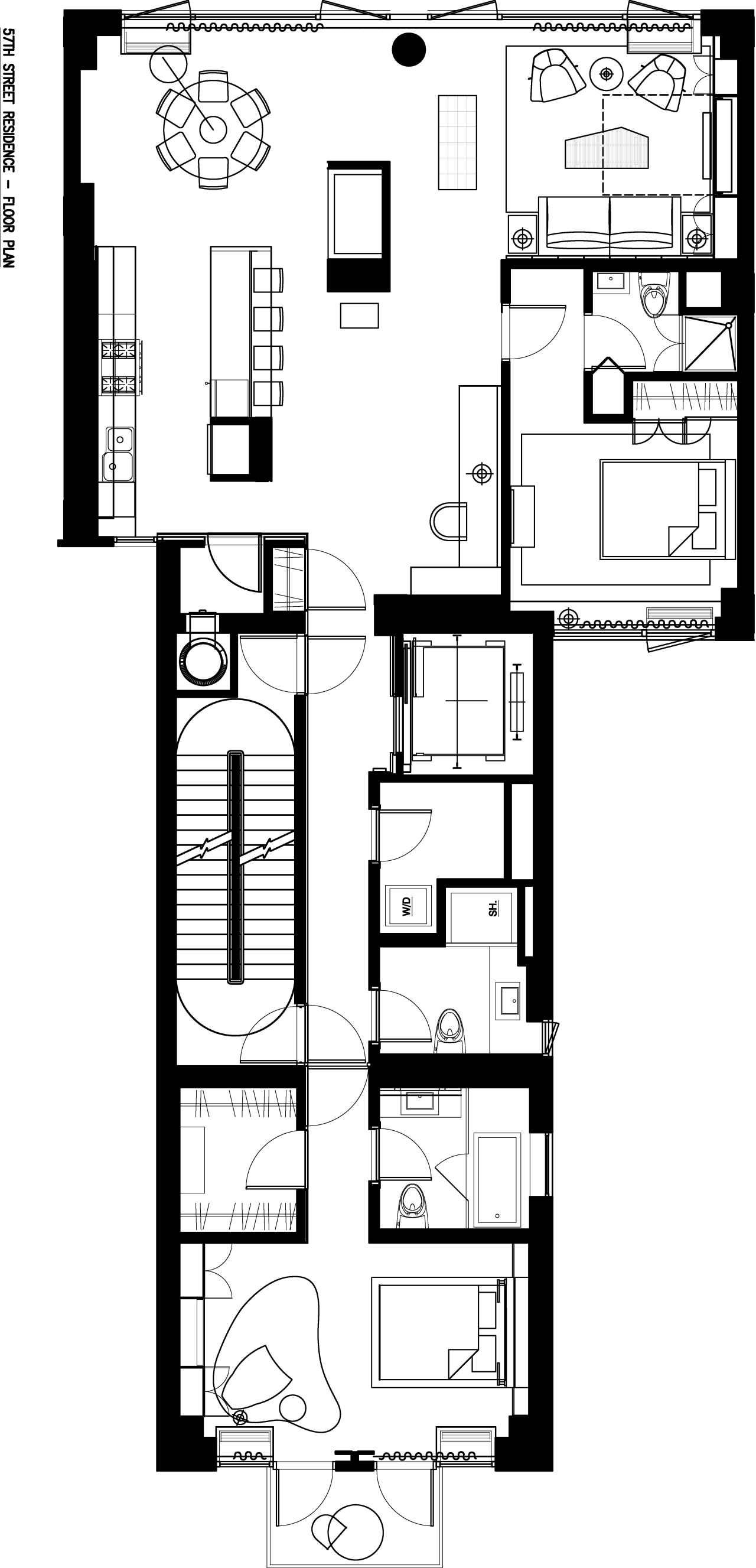
The bench seat is teamed with two lounge chairs by Dordoni that have a more organic form, and a Magnum sofa by Flexform.
"The owner was conscious of not making the space appear too masculine," says Kaner. "So we have introduced softer forms in some of the furniture pieces in the living area and master bedroom."
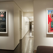
Wood veneer also features in other areas of the apartment. Teak wraps around the home office in the open-plan living space, mimicking the meeting of the vertical planes in the living room. Because this area is close to the entry, the designers kept it sleek and contained.
The kitchen, opposite the office, was changed extensively from the original. It now features an extra-long island that connects with the rest of the living space. Cabinetry with a dark wenge wood matches the flooring. Joinery in the bedroom was also stained to echo the colour of the flooring, enhancing the sense of retreat.
Story by: Trendsideas
Home kitchen bathroom commercial design
Silver moons rising
Vibrant spiral stairs improve penthouse connections
Radical yet respectful
