True colors
The original Victorian layout of this kitchen has had a contemporary update
Marrying modern functionality with period character is a delicate balancing act at best. Do you strive for a 50-50 mix, or do you sacrifice one for the other?
Such was the conundrum facing the owners of this turn-of-the-century property. The one point they were adamant about was their wish to achieve a kitchen that was personable and different to the usual kitchen remodel, says designer Andrew Cox.
"In so many cases when colonial-era homes are remodeled, any semblance of the original character is replaced with a standard modern veneer. Instead, color, a family-friendly focus and a respect for natural materials were the driving forces behind this project."
The first decision was whether to retain the chimney as an original feature, says Cox.
"While it was agreed that the chimney was a integral part of the character, it really did impede the overall functionality of the space, so it was decided to remove it.
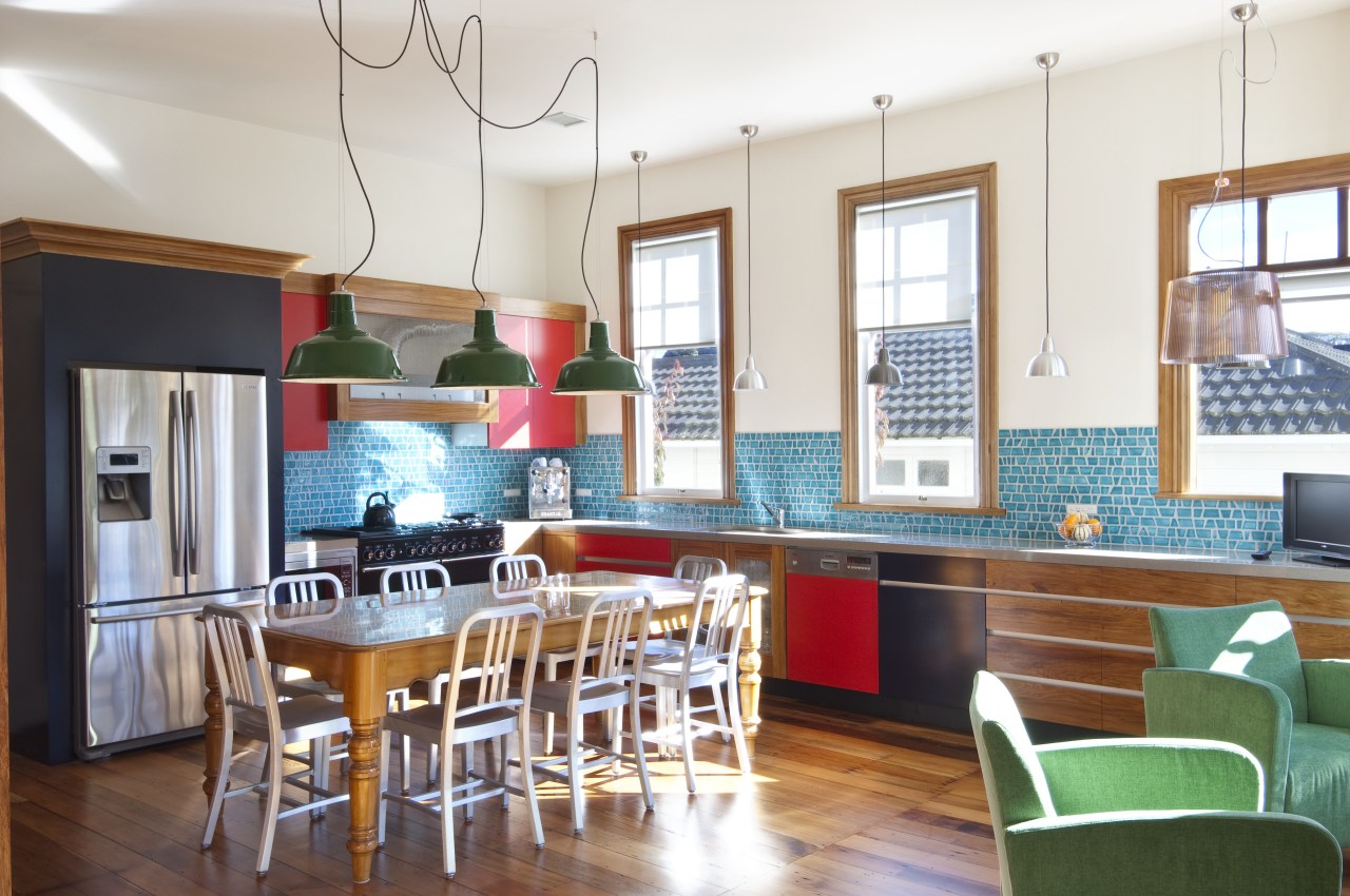
"As the clients rarely use the formal dining room, we brought the table into the kitchen to create a more relaxed atmosphere. It also negated the need for an island and lends the room a traditional farmhouse feel."
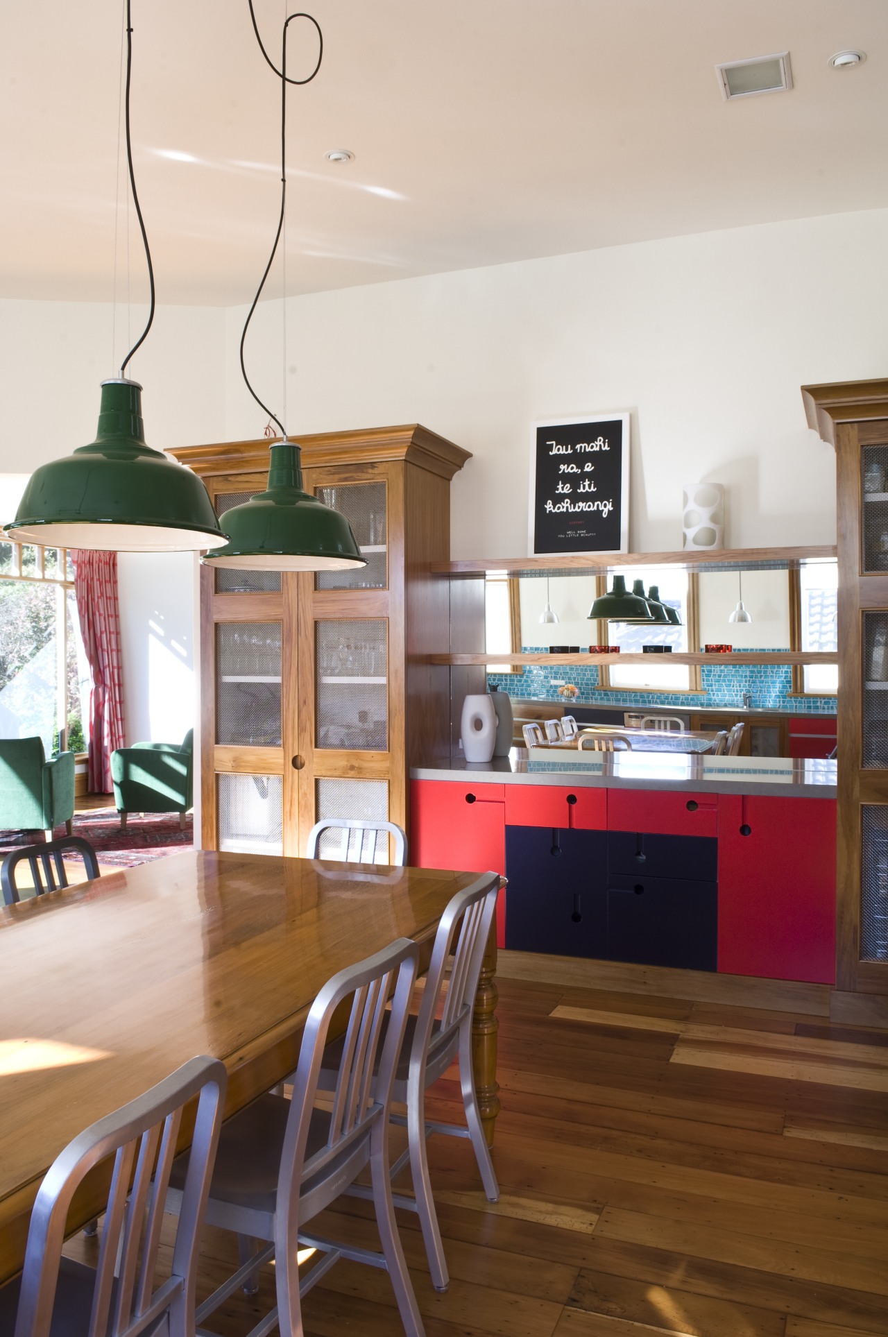
Rimu and matai hardwood are features of the home, so Cox chose to use rimu for the kitchen cabinets, offsetting these with lacquered fronts in red and blue.
"Alexander Calder and his use of primary colors in mobiles and sculptures was a strong influence, and a bold use of color is my trait. I like to create layers of color. If everything was white you wouldn't notice the individual features. With color, your eye is constantly moving around the space searching out detail."
Industrial touches, such as the metal lamps above the table and visible duct work on the range hood impart further visual interest to the design scheme.
Story by: Trendsideas
Home kitchen bathroom commercial design
Small space, big impact
Tranquil waters
Continuity meets subtle separation


