together apart
This contemporary addition to a classic entertainment venue celebrates its differences but finds connections through scale and materials
Extending reception options at an entertainment venue set in an historic structure can be tricky. Often the existing building has to retain its original integrity, and then there is the question of introducing a separate addition that looks the part. One response is to create a distinctly modern yet complementary design.
The addition of Lady Mary's Pavilion to Curzon Hall, a 1900s castle appropriated as a reception venue, was undertaken by Tanner Architects, with David Sutherland as project architect.
"Much thought was given to the new building's setting," says Sutherland. "The previous largest event room in Curzon Hall catered for 150, but the new pavilion had to hold 300 and with these larger numbers came a council requirement for an additional 110 car parks. Our solution was to design two levels of basement car parking and then build Lady Mary's Pavilion over the top."
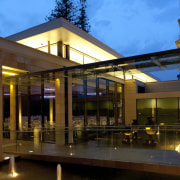
The pavilion is reached from Curzon Hall via a small bridge and colonnade that separates the old and the new. The large, airy space and connecting walkway have an angular, clean-lined aesthetic but tie back to the hall through a sympathetic use of sandstone and a sympathy of scale the roof line of the pavilion is aligned with the balustrade of the hall.
The pavilion's simple design achieves both optimum functionality and a dramatic aesthetic. Solid walls on the street and residential side of the building allow for acoustic separation and placement of services. However, the side facing Curzon Hall is a picture of floor-to-ceiling glass. The glazed walls and clerestory windows on all sides of the building ensure the new reception space is bathed in natural light.
The windows look out to the landscaped gardens and back to Curzon Hall. Those approaching along the promenade have a preview of the gracious interiors.
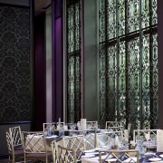
"With its lofty ceilings, high-tech functionality and opulent interior featuring ornate screen grilles, the venue provides a contrasting yet complementary response to the beautiful old hall," Sutherland says.
Story by: Trendsideas
Home kitchen bathroom commercial design
'Hygge' in the highlands
Playing with blocks
Holidaying at home


