Time and space
Creating this modern kitchen within a Victorian-era house meant pushing past the boundaries of the original

Perhaps the biggest lifestyle change since the turn of the 20th century and today has been in our relationship with interior space. While we are happy to live in open-plan spaces, our Victorian-era predecessors preferred to be closed in.
Not surprisingly, homes from that time are a conglomeration of contained rooms designed to serve a sole purpose. The kitchen, for example, was just that, somewhere to prepare food.
Nowadays it would be uncommon to find such a kitchen in a contemporary home, which is one of the reasons the owners of the featured property wanted to open their kitchen to the dining room, says architect Nicholas Murray.
"The house is a freestanding Victorian home that was undergoing an extensive remodel and the owners wanted to create a connection between the kitchen and adjoining rooms.

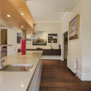
"The first step was to remove walls. Not only did this give the link the owners wanted, it also meant we could extend the countertops past the original space."
Murray lowered the original ceiling in this area to create a bulkhead to house air-conditioning services. A load-bearing column replaces the walls as a support for the ceiling and provides visual interest. The only other addition to the kitchen is an overhead display cabinet.
"The idea for the cabinet actually came about after the space was opened up. The clients decided the space was too open and required an element that would add to the architectural styling of the kitchen without impeding the visual flow."
The layout within the kitchen area has remained the same. Murray has even replaced an existing butcher's block with an island of the same dimensions.

"The clients were happy with how the kitchen itself performed, so very few changes needed to be made within the space," says Murray. "Additional storage and counter space were sought: both have been addressed, and added amenity was also a consideration."
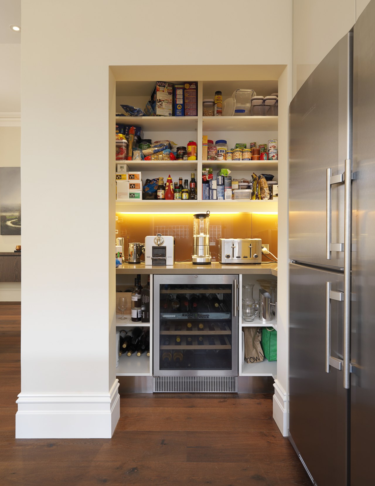
Murray opted for an open pantry for ease of access, and the island aside from providing extra storage helps break the space into working zones. Two sinks add to the functionality of the kitchen.
"The restrained material palette and minimal detailing help reinforce the sense of space although at 65 sq ft, the kitchen is far from small," says Murray. "The color scheme was decided after the design was complete, and ties in nicely with the original features and modern styling."
Story by: Trendsideas
Home kitchen bathroom commercial design
Small space, big impact
Classic dovetails contemporary
Tranquil waters


