Take two home renovation by Donald Billinkoff
Architect's own home remodel
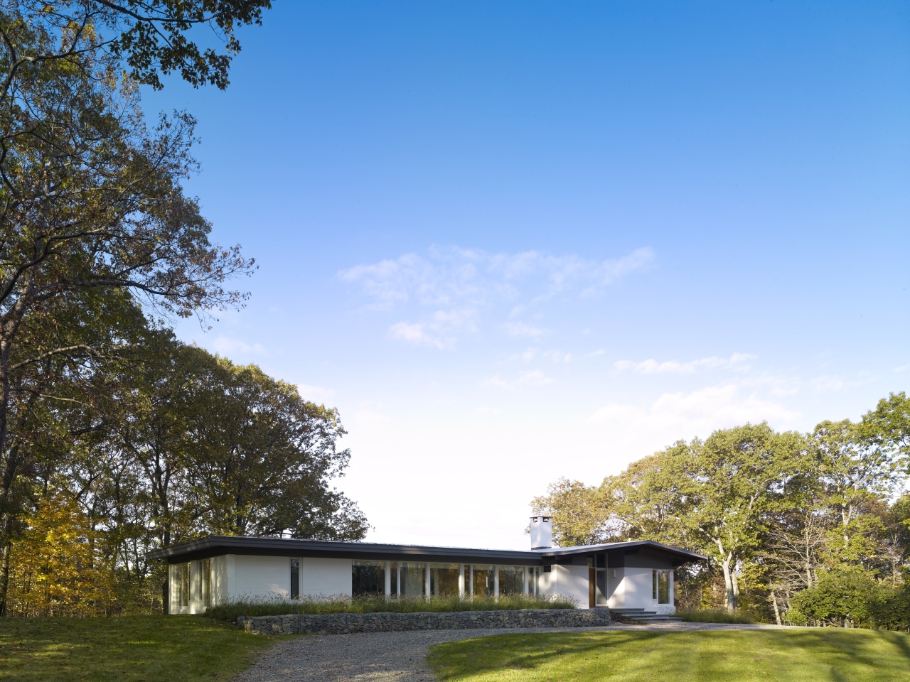
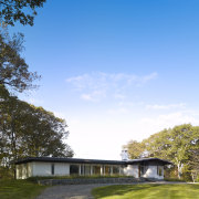
There can be many design influences that determine the direction an architect takes for his own home. In 1968, when Connecticut architect George Lechner built this house for his own use, it was the work of Mid-century Modernists that inspired the design.
But that wasn't the only influence, says architect Donald Billinkoff, who recently remodeled the house for his own family.
"Lechner was an architect working on education facilities, notably high schools. This background was evident in the design. For example, while windows on one side were large to provide valley views, on the other side the front elevation they were high and small, so the house had a penitentiary look, and much of the view was simply blocked off."
Billinkoff says the house aspired to Modernism, but was hindered on the interior by a collection of small rooms.
Not surprisingly, the remodeling was all about opening up the house to the spectacular forest and valley views, and opening up the interior.
"We reworked the perimeter of the house in terms of the fenestration, bringing windows right down to ground level on all sides," says the architect. "The front of the house now looks a lot less like a school building."
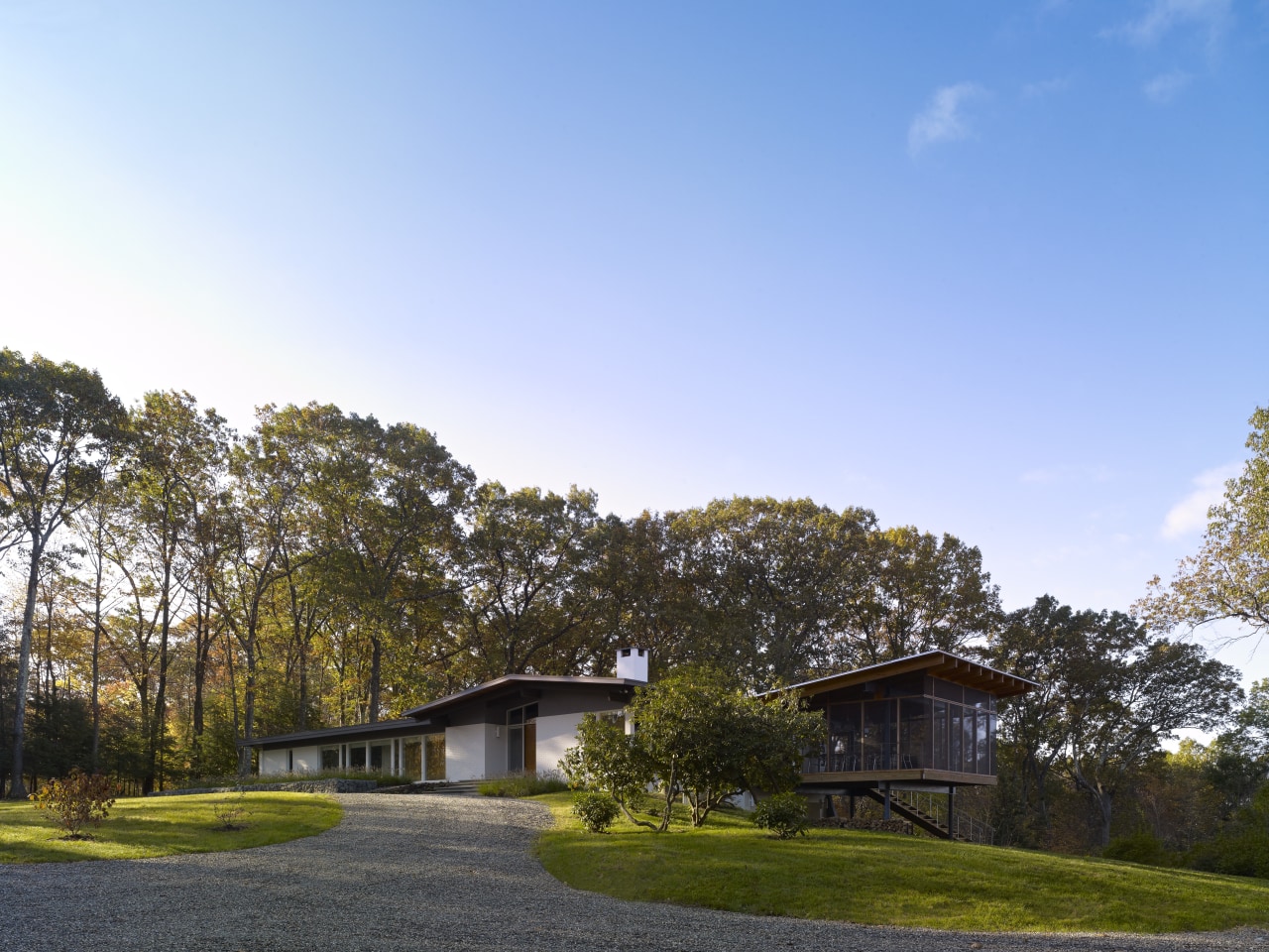
To further maximize the view, a large screened porch was added onto one end of the house, stretching out towards the view. With an outdoor kitchen, dining and seating furniture, the porch is an extra room where the family spends most of the summer, says Billinkoff.
The entry hall was made to appear more spacious walls were removed, including a wall that enclosed the stairs leading to a guest suite on the lower level.
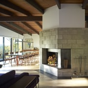
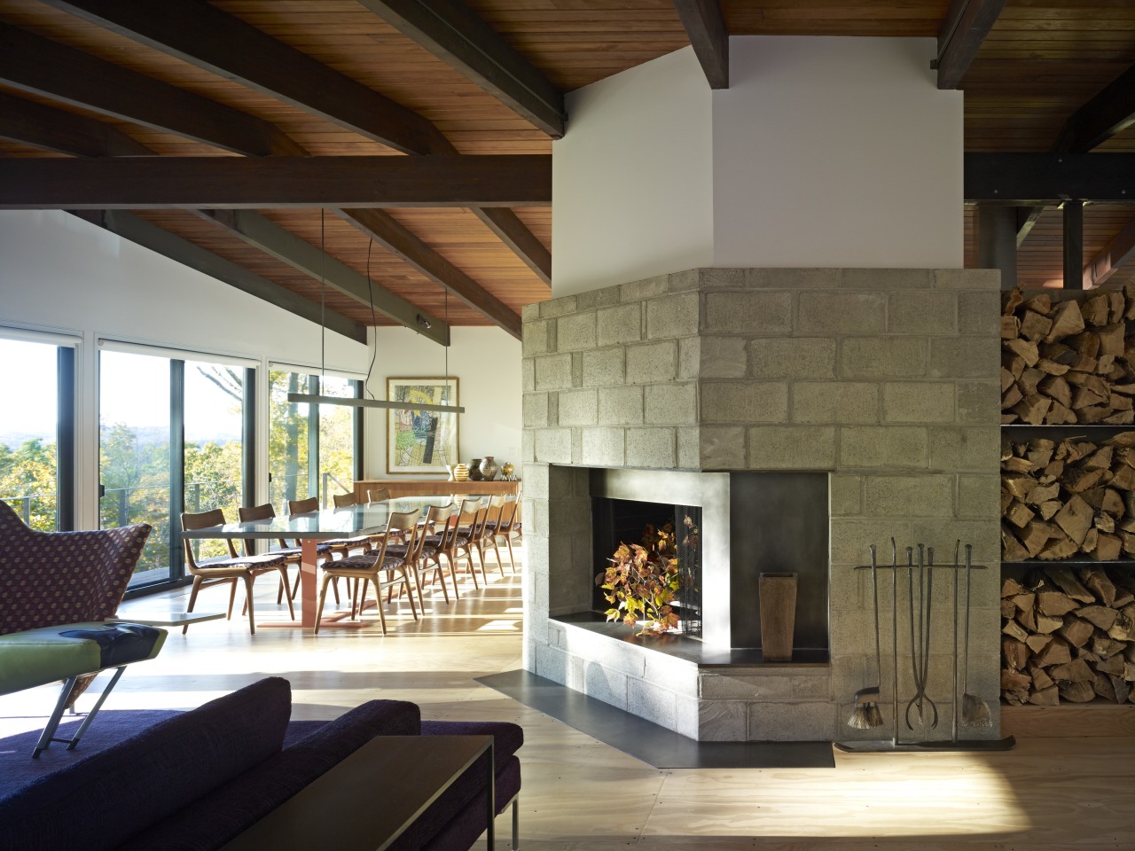
A wall closing off the kitchen was also removed to open the space up to the wider living area. The architect says taking out the walls to create one large, open-plan room has put the spotlight on the original wood-lined ceiling, with its dark-stained beams. This has become a significant feature of the interior and an important link with the forest beyond.
Another prominent change to the living area involved the fireplace.
"This was an awkward Mansard shape, and was covered in ceramic tile," Billinkoff says. "But when we came to remove it, we found it was too difficult. The house didn't just look like a commercial building, it was built like one it is a real fortress."
Consequently, the chimney element was not removed, but was covered over with a concrete block wall that sits over a blackened steel fire surround. These raw materials, and the stacked firewood, add a strong textural quality that balances the more streamlined aspects of the design.
Further changes were made to the long bedroom wing, which featured rooms off one side of a 40ft corridor.
"The wing had a motel quality that was not appealing," says the architect. "To reduce the apparent length and narrowness, we made the first room a TV room, swapping the original door for a wide, sliding door. The entire room is open to the circulation area, but can be closed off if required. We also removed the wall to another former bedroom, creating a study with windows providing views out both sides of the house. These changes have created a lot more light and space."
The large master suite was another focus of attention.
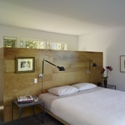
"The most significant change to this oversized room was the addition of a freestanding plywood closet," says Billinkoff. "By stopping it short of the ceiling, we have ensured it doesn't block the light, and there is still a view of the trees."
Billinkoff says natural, eco-friendly materials were used wherever possible. He also installed a solar heated hot water system there are panels on the roof.
"The house has been brought right in to the 21st century, both functionally and aesthetically," he says. "But while it now provides a contemporary loft-style living space, much of the original design detail has been retained."
Story by: Trendsideas
Home kitchen bathroom commercial design
Renovation Trends Vol. 30/5
Renovation Trends showcases innovative makeovers – big and small. The book features kitchens, bathrooms, interior makeov...
Read More