Securing the future
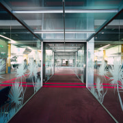
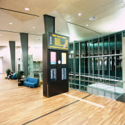
A new double-decker transit area at Auckland International Airport not only provides separation for inbound and outbound travellers it also highlights a fresh approach to terminal design
Designing for the present while taking into account both the past and the future was partof the challenge for the project architects. Over the past 10 years, Stephenson and Turner has designed multiple stages of the terminal building. Director Ken Stanton says the staged construction is due to many factors, including costs, demand and practicality.
"The pier segregation is part of the continuing airport development a factor that influenced its design," he says. "We had to deliver a building that would be contemporary, yet also sympathetic to the existing building. As well as designing within those constraints, we had to ensure the building would also allow for future growth."
Stanton says the expansive view to the west was the driving force behind the pier design.
"We wanted to maximise the outlook over the airfield and the spectacular views to the Manukau Heads," he says.
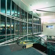
The design solution provides two two-storey voids with full-height glazing. Stanton says the voids already existed as part of the pier structure, which made this an economical design element.
"The voids also offer transparency between levels, providing people with a view of the interior, creating an intuitive path through the building."
Stanton says the stepped ceiling highlights the transition between the two levels, and links the old space with the new. Its curved shape is reminiscent of waves or clouds along the coast, and is consistent with other curves within the building.
"Curves suggest movement they help direct you through the space. At the same time, they create a calm, comfortable environment, where there is no suggestion of being hurried along."
For more details, contact Stephenson and Turner, PO Box 1830, Auckland, phone (09) 303 1249. Website: www.stephensonturner.com.
Story by: Trendsideas
Home kitchen bathroom commercial design


