Razzle Dazzle – a colour essay from Who's Afraid of Pink, Orange and Green
There are safe colours – and then there are bold, out-there colours. Enjoy this excerpt from Who's Afraid of Pink, Orange and Green, an exploration of colourful living and interiors.
From Swedish architect Duo Bolle Tham and Martin Videgard: excerpt from Who's Afraid of Pink, Orange and Green
The Swedish architecture duo designed this surprising loft flat for a young Swedish family.
RAINBOW FISH
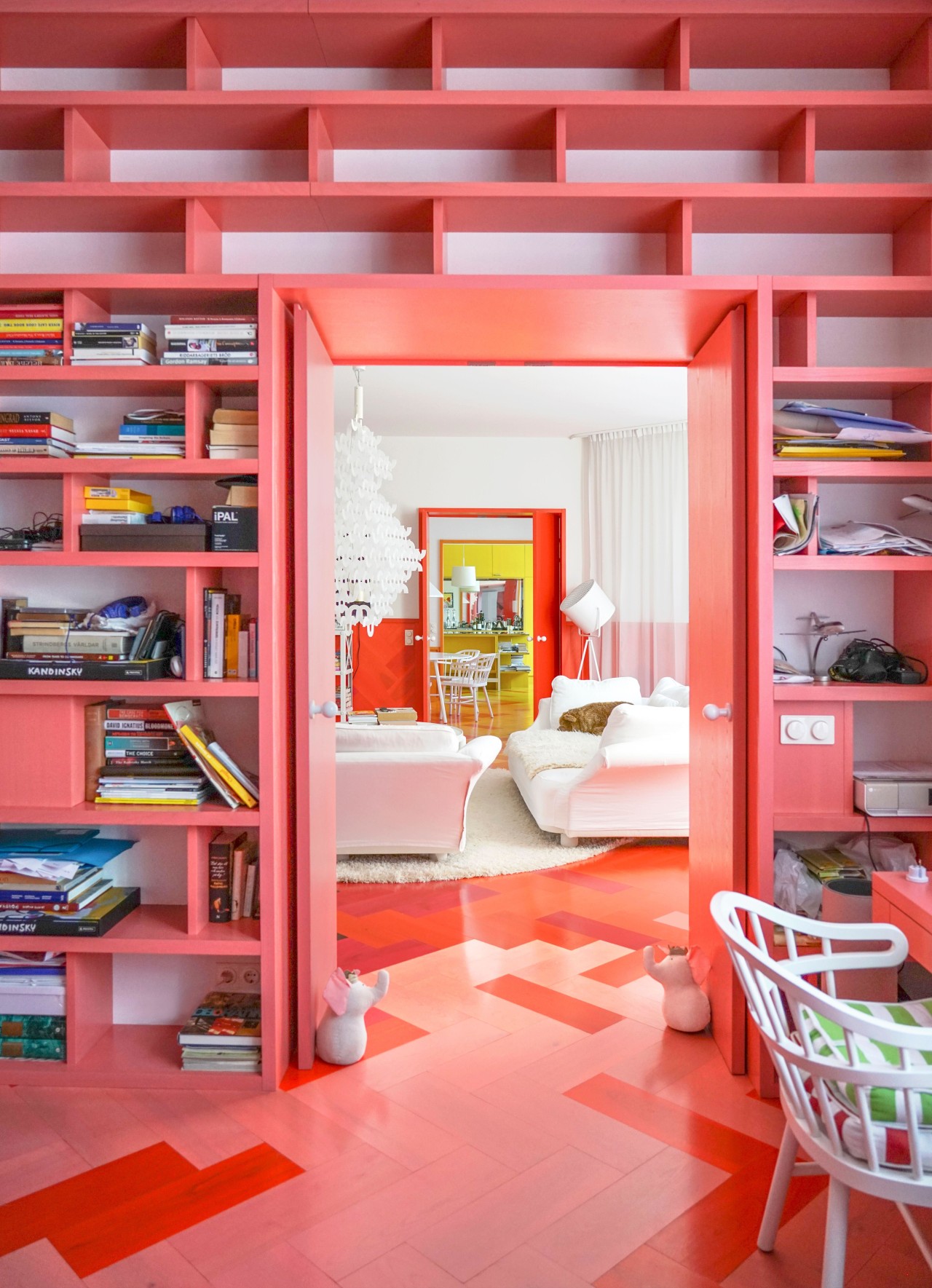
Anything but a typical Scandinavian interior with a lot of white and blank wood – those were the instructions the architects at the Tham & Videgård architectural firm received from the flat’s owners.
Instead, they were asked for something contemporary, even experimental. They were also requested to base their use of colour on Jewish architect Josef Frank, an Austrian emigrant to Sweden who presented a freer, more artistic version of modernism and became known mainly for his colourful prints.
The architects also took into account Russian artist Wassily Kandinsky’s well-known theory about the emotional effects of colour.
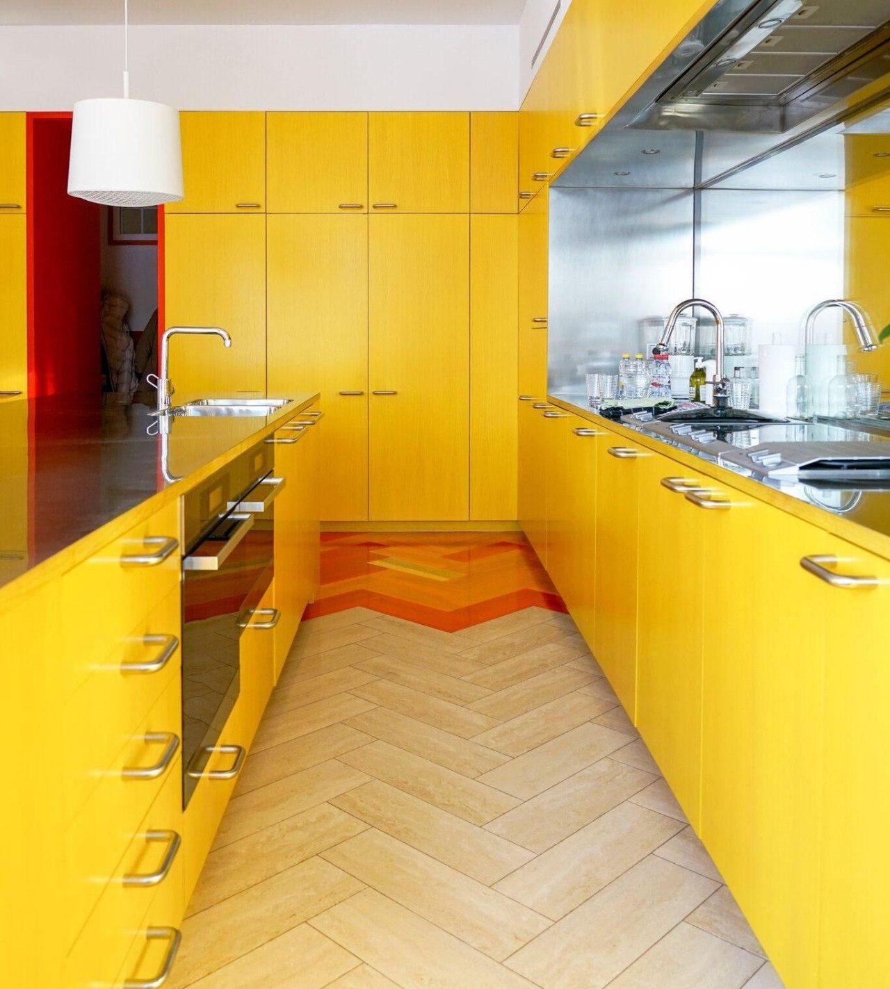
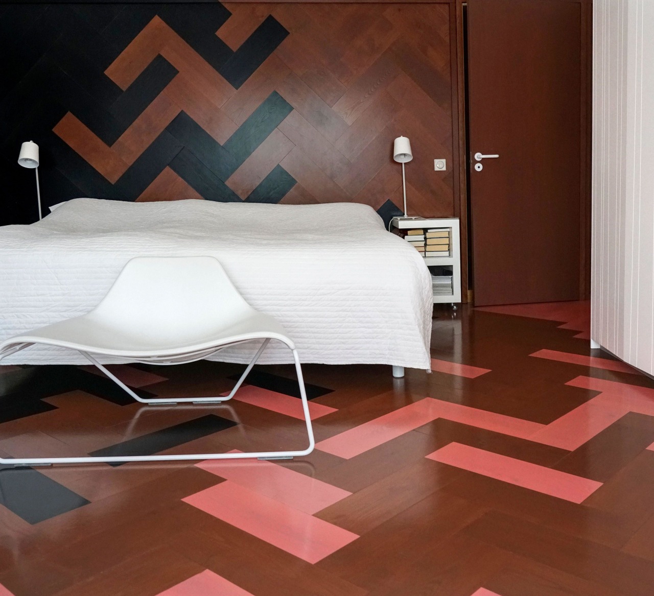
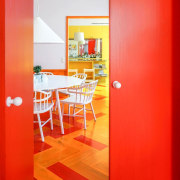
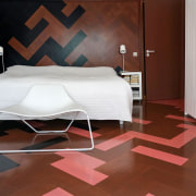
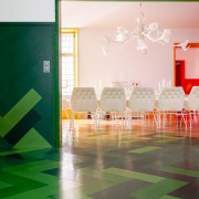
All of this is reflected in the Technicolor parquet flooring. The extra-big boards, arranged in a herringbone pattern, meander their way through the flat, morphing along the way from red to yellow to pink to black and so on.

RED WITH WHITE DOTS
Of the original flat – late Art Nouveau, from the 1900s – little was left.
“It had been completely renovated, even serving as a hotel for a while. A blessing in disguise, actually, because it’s a protected building, and if it had still been in its original condition, we wouldn’t have been allowed to renovate it,” says the architect.
The original leadlight windows were retained, however, to preserve the facade.
To unify the furniture, which comes from very different periods, the architects used only white pieces. This makes it possible for the vintage furniture pieces to suddenly go perfectly well with the octagonal bench in the entrance that was originally designed by the architects for a museum in the Swedish city of Kalmar.
LITTLE RAY OF SUNSHINE
Although the owners didn’t order natural colors, nature is closer than you think.
“All the colours in the flat come from nature: yellow from the sun, orange and red from autumnal forests, brown and black from the earth, green from the grass and the leaves, and pink from those long, calm summer sunsets,” says owner Inna Sundstrom, who lives here with her husband and children.
These tints draw nature in: from the nearby park, where colours change with the changing of the seasons.
COLOUR ROOMS
Isn’t it a bit too much, having a jawbreaker for a living room, we wonder.
“On the contrary,” says Inna. “The colours are addictive. Now that we know what it’s like to be surrounded by such an abundance of colour every day, we have trouble imagining life without it.”
However, the colours are more than just decoration. They give structure to the flat and indicate the different functions in the otherwise open space.
...................................................................................................................................................
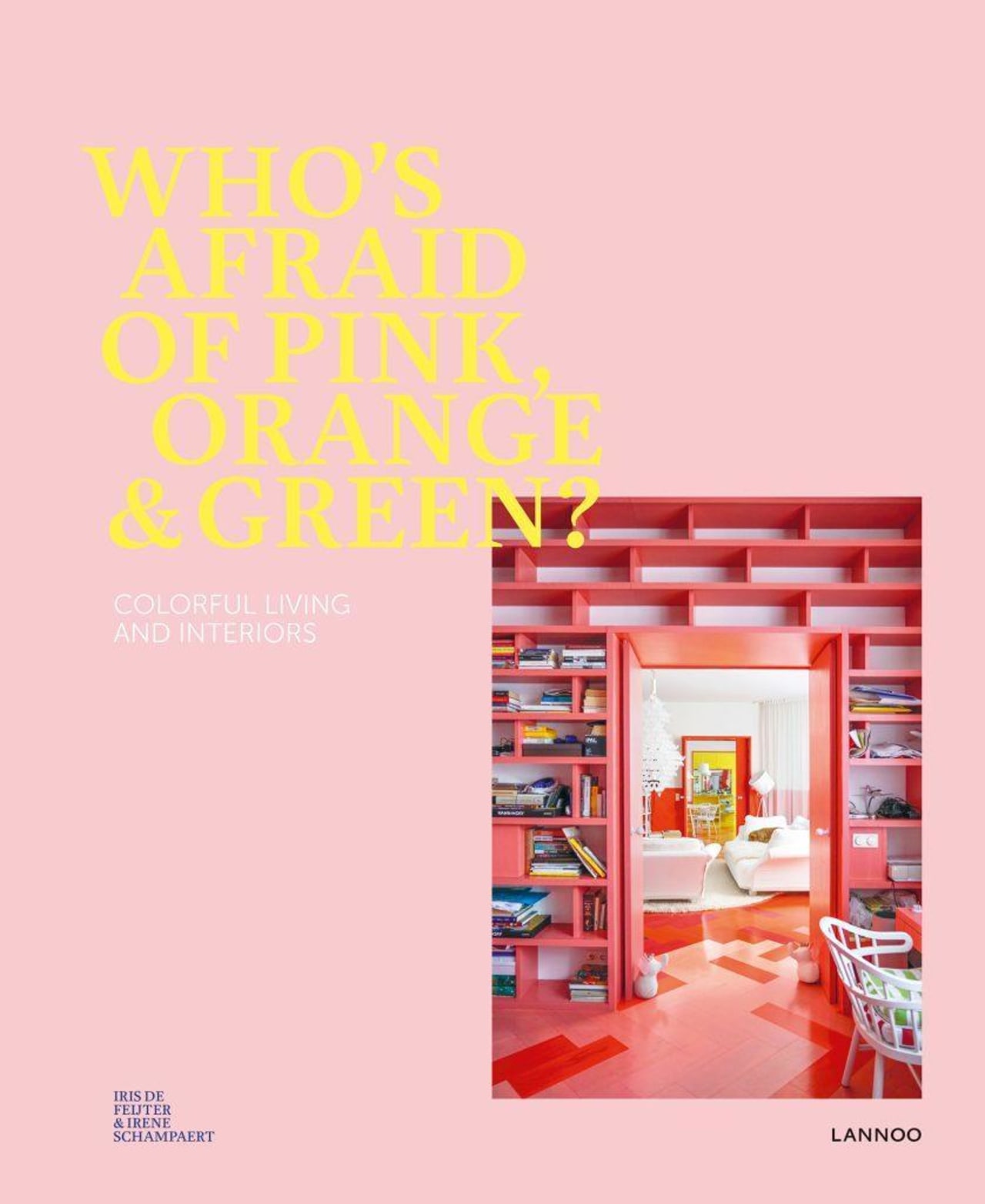
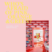
This excerpt is taken from the inspirational Who’s Afraid of Pink, Orange & Green – an out-there design book that will thrill you with its brilliant use of colour that breaks the safe and traditional décor mould you’re used to.
With sections like, “Out of the blue,” “La vie en rose,” “Color me happy,” “Room with a hue,” “Puzzle perfect,” and more, this book will help you be bold, brave, and fearless. The work includes more than twenty international interior designs, five interviews with acclaimed designers, and illustrates how to use colour to create a perfectly balanced and funky interior.
You can buy Who’s Afraid of Pink, Orange & Green from the Lannoo Publishers website here or from Amazon here


Story by: Trendsideas
Photography by: Tekla Evelina Severin & Tham & Videgård, Courtesy of Lannoo Publishers
Home kitchen bathroom commercial design